Paul Schütze online

schutze.jpg

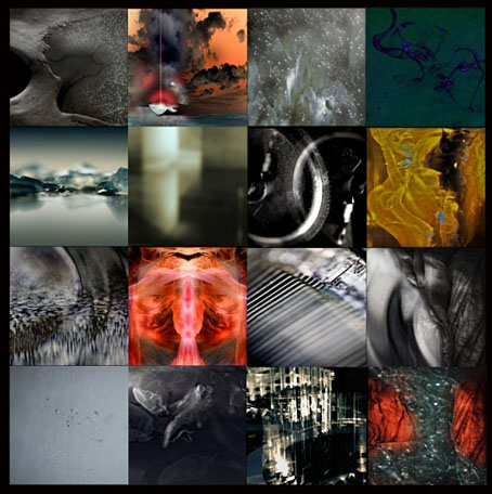
One of the drawbacks with recommending Paul Schütze‘s music lately has been a lack of availability, with most of his CDs being out of print. That changes this month with his back catalogue returning via iTunes sporting a range of impressive new artwork (above) created by Mr Schütze himself.

Schütze’s electronic music stood out for me in the mid-Nineties for a number of reasons: firstly, and most obviously, it wasn’t always tied to the rigid metronomic pulse which governed the rest of the dance world. There were 4/4 beats at times—and he even had an album on Belgian dance label Apollo under the anagrammatical pseudonym Uzect Plausch—but his music was equally subject to unusual time-signatures with chiming timbres borrowed from gamelan orchestras.

Those timbres and their attendant tropical atmospheres were a second point of distinction. Like Jon Hassell, to whom he pays homage on Stateless (1997), there’s an acknowledgement of non-Western music without any falling into pastiche. This realises one aspect of Hassell’s Fourth World concept, whereby a meeting of the First World and the Third World creates an exclusive temporary zone that nonetheless can’t exist without the contribution of either party.

A third distinction would require a detailing of Schütze’s notable collaborators—Bill Laswell and Raoul Björkenheim among them—and his inventive track titles, many of which sound like Surrealist paintings. But describing music is always a poor thing compared to experiencing it. If you want a place to start, I’d recommend New Maps of Hell II: The Rapture of Metals (1993; reissued 1996) or Abysmal Evenings (1996), two constant favourites.

Previously on { feuilleton }
The art of Josiah McElheny
The Garden of Instruments

Plates: Volume 2

plates.jpg

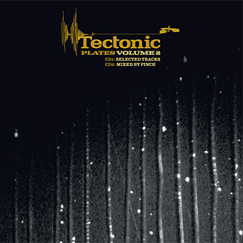
My third CD design for the Tectonic label is another piece of relative minimalism which once again features photos by Liz Eve. All the backgrounds on this occasion are microscope close-ups of vinyl records, very fitting for a double-CD collection of recent 12″ releases.

The Tectonic logo (which predates my involvement with the label) is based on the Technics logo and for this release I tidied the label logo slightly, a process which led to the discovery that the Technics design used a variant of the Clarendon typeface for its letter shapes (it’s not an exact match). This in turn led me to use Clarendon in various weights across the packaging, something which made a change from the usual sans serif or monospace font. The great Saul Bass frequently used Clarendon for his title sequences; if it’s good enough for Saul, it’s certainly good enough for me.

Tectonic main man Rob Ellis talked to Fact magazine about the new release earlier this week.

Previously on { feuilleton }
Aerial by 2562
New things for November

Gandharva by Beaver & Krause

gandharva.jpg

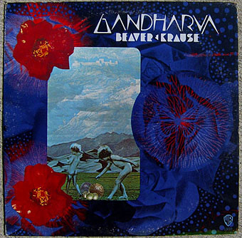
I mentioned Wilfried Sätty’s collage work last week and this album sports one of his few cover designs. A cult object for several reasons, not least Sätty’s involvement. The title lettering was by fellow psychedelic artist David Singer who I had the good fortune to meet in California in 2005 whilst researching Sätty’s career. That chunky Seventies lettering style now looks distinctly contemporary having come back into fashion over the past couple of years.

Beaver & Krause were among the pioneers of Moog-based electronic music in the 1960s and notably provided the throbs and drones which Jack Nitzsche mixed into the soundtrack for Donald Cammell & Nicolas Roeg’s Performance. Gandharva was released in 1971 and one of the few all-electronic pieces on the album, Nine Moons in Alaska, is an outtake from those sessions. The first side is very uneven, with a blues jam and a gospel piece that don’t sit well with each other, never mind with the Moog tracks. Side two, however, is a far more successful suite of improvisations with organ, electronics, guitar, harp and saxophone (played by Gerry Mulligan) recorded live in Grace Cathedral, San Francisco.

Cover photo from the Psychedelic Music Flickr pool which features many fine examples of cover design from the late Sixties on.

Elsewhere on { feuilleton }
The illustrators archive

Elsewhere on { feuilleton }
The album covers archive

Previously on { feuilleton }
Ginsberg’s Howl and the view from the street
Further back and faster
Quite a performance
Borges in Performance

Das Haus zur letzten Latern

sands.jpg

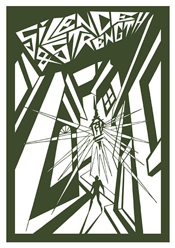
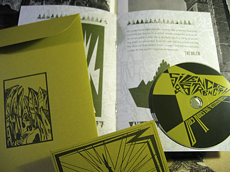
From HP Lovecraft to another writer of weird fiction, Gustav Meyrink. Das Haus zur letzten Latern is a tribute to Meyrink by Silence & Strength and the package I designed late last year for Horus CyclicDaemon has just been released. I’ve mentioned before that Horus make a particular effort with all their CD productions, choosing their materials carefully, and this release is no exception. An envelope of green textured card has two of my designs embossed on either side. Inside this there’s another envelope containing the disc and an 8-page A5 booklet of dark green ink on heavy paper with a grainy texture. The music is suitably dark and atmospheric and would work very well as a soundtrack to Paul Wegener’s Der Golem, wie er in die Welt kam (1920). Seeing as Wegener’s film is the most famous Meyrink adaptation I borrowed the shapes of Prague buildings from one of the original film posters. The rest of the graphics are done in a very spare, quasi-Expressionist drawing style which was a pleasure to do since it’s quite different to my usual work. The background of the booklet pages show an old map of Meyrink’s city, Prague.

sands2.jpg

When people have asked me recently what I think about the proliferation of music downloads I tell them that the best way for record labels (and book publishers for that matter) to continue to attract purchasers is to make beautiful objects which people feel compelled to own. The content is always endlessly reproducible, the packaging isn’t. As far as this argument goes, Horus CyclicDaemon has been ahead of the game for some time.

Previously on { feuilleton }
New things for November II
Hugo Steiner-Prag’s Golem
Nosferatu
Barta’s Golem

Versum – Fluor by Tarik Barri

barri.jpg

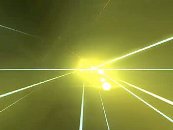
Regular readers will know I’ve enthused before over the electronica of Robert Henke, aka Monolake. The Monolake site recently resumed its monthly free downloads and the offering for this month is a 9-minute piece of abstract video by Dutch artist Tarik Barri. Fascinatingly immersive, this is like a 360º view of the Star Gate from 2001: A Space Odyssey accompanied by ambient drones and rumbles. Henke and Barri are planning on touring this audiovisual experience with a couple of dates already announced on Barri’s website.

Previously on { feuilleton }
Moonlight in Glory