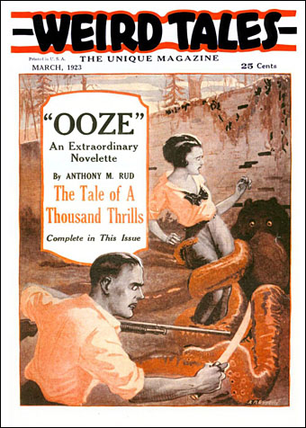
Weird Tales celebrates its centenary this month (although the first issue was on the shelves in February, 1923). Thirty years later, one of the last issues from the initial run had Slime by Joseph Payne Brennan as the story featured on its cover. The magazine maintained a viscous consistency if nothing else. Tentacular art by RR Epperly.
• A big surprise in yesterday’s Bandcamp Friday was the announcement of Singularity, a new album by synth ensemble Node. Or new-ish since the previously unreleased recording is almost 30 years old:
Singularity is the legendary “lost” Node album. Recorded at the same time as their original sessions in 1994 this has DiN stalwart Dave Bessell join Buller & Flood alongside original member Gary Stout who was later replaced by Mel Wesson for the two DiN releases. Presented here for the first time, mastered to modern standards but otherwise untouched and in its original form and recorded to two track with no overdubs.
Node have never been very prolific—two decades separate their first album from their second—so this was very welcome. The new release includes a bonus addition of the 16-minute version of Terminus, one of their best pieces which has only been available previously on a scarce CD-single.
• Steven Watson at Print Mag on skeuomorphic magazine design that turns print into play. Now I want to design a book that fits inside a cassette box.
• RIP jazz giant Wayne Shorter, and David Lindley, co-founder of one of my favourite psychedelic groups, the incredible Kaleidoscope.
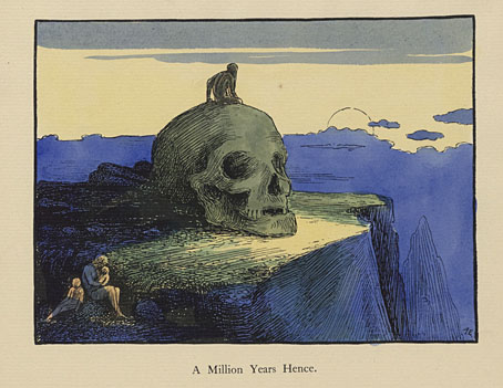
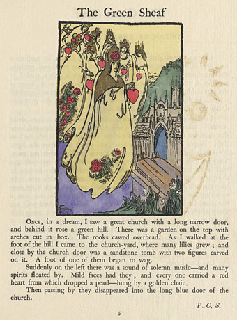
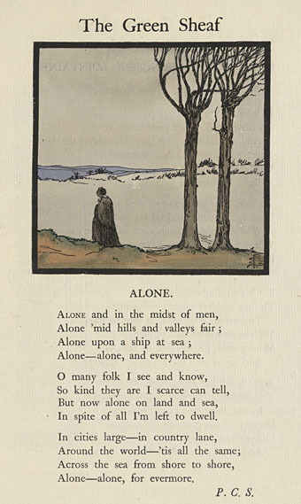
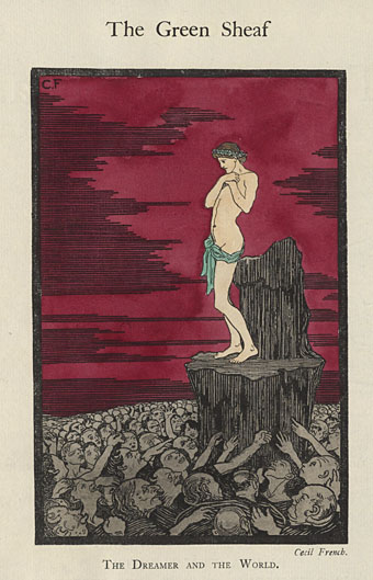
• S. Elizabeth at Unquiet Things on The Sensitive Plant, a poem by Percy Shelley illustrated by Charles Robinson.
• Christopher Parker at Smithsonian Magazine asks “Did Salvador Dalí paint this enigmatic artwork?” Yes, he did.
• Tangerine Dream in 1973 playing Atem live (with pre-recorded drums) on Spotlight, an Austrian TV show.
• New music: Mohanam by Shakti, and Area Code 601 by William Tyler & The Impossible Truth.
• At Spoon & Tamago: Bento boxes inspired by notable Japanese architecture.
• At Tentaclii: Ian Miller cover art for metal albums.
• Northern lights seen across the UK.
• New Blue Ooze (1970) by Kaleidoscope | Ooze Out And Away, Onehow (1986) by Harold Budd/Simon Raymonde/Robin Guthrie/Elizabeth Fraser | Ooze (1986) by 23 Skidoo