Led Zeppelin IV: Jimmy Page versus Little Bo-Peep

lz4.jpg

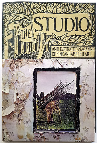
Background graphics by Aubrey Beardsley, 1893.

You’d think by now that everything would be known about an album with a Godzilla-sized cultural footprint like Led Zeppelin IV. I certainly thought so until last week when I turned up the source of something that the more obsessive Zepp-heads have been pondering for years. If this puts a bustle in your hedgerow then read on.

symbols.jpg

Led Zeppelin’s fourth album has been around now for half a century which means there really is a lot known about every detail of its production. Mysteries that used to confound friends of mine when we were teenagers have long been solved, questions such as what the hell the four symbols assigned to each member of the group actually signified; not only do we know the origin and meaning of those symbols, the enigmatic “Zoso” sigil chosen by Jimmy Page has an entire website dedicated to its various manifestations. We know where the photo on the cover was taken (Birmingham), and why the sleeve is devoid of identification (Page was annoyed with the press reaction to the previous album); we know that the hermit painting inside the gatefold is based on the Tarot card by Pamela Colman Smith, and we also know a great deal about the writing and recording of Stairway To Heaven. Erik Davis logged much of this in his 33 1/3 study of the album, and while he examines the band symbols in some detail he doesn’t say much about the rest of the hand-written inner sleeve beyond this comment:

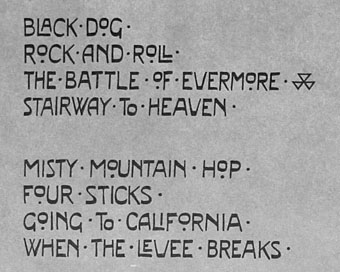
Is there a meaning to the nifty Arts and Crafts typeface that Page lifted for the Stairway To Heaven lyrics on the other side of the sleeve? Or just a vibe?

The source, if not the meaning, of this script has been intriguing Zeppelin fans for many years, but I wasn’t aware of this until I happened to be reading the Wikipedia entry about the album and found myself equally intrigued. The game was afoot, Watson.
soh1.jpg

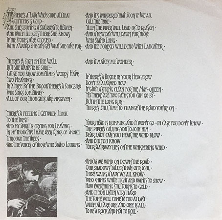
It makes them wonder: the hand-lettered lyrics.

A persistent question you see in fan circles is “What font was used to create X?” People will ask this question even when the design is a one-off, like Syd Mead’s logo for Tron, or something that’s obviously been lettered by hand. Led Zeppelin IV is an album guaranteed to raise the “What font?” question because the lyrics of the group’s most famous song, Stairway To Heaven, cover an entire side of the inner sleeve. On one of the fan forums I was reading someone was eager to identify “the font” because they wanted to apply the words to a bedroom wall. Many more people must have copied out those lyrics since 1971; I once had to do this myself for a female friend who was so besotted with Jimmy Page that she wanted the lyrics in a frame on her own bedroom wall.
tracks.jpg

According to the Wikipedia entry, Page revealed the source of the lettering to be an issue of The Studio, the British art and design magazine which helped launch Aubrey Beardsley’s career and did much to develop and promote the Art Nouveau style in the 1890s. I’m very familiar with The Studio, many posts here refer to it, and I happen to have a complete collection of issues downloaded from the journal archive at Heidelberg University. Seeing the magazine mentioned in this context immediately made me want to find the design that Page had adopted, but before I started flicking through thousands of pages I looked around to see if any of the Zepp-heads had tried searching for the magazine themselves. Evidently not; all the discussion I’ve seen about the inner sleeve tends to recycle the Wikipedia entry, nobody seems to have bothered looking for copies of the magazine. Okay then…

Continue reading “Led Zeppelin IV: Jimmy Page versus Little Bo-Peep”
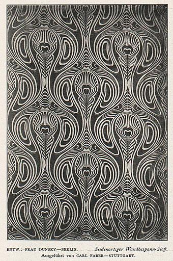
Pavonine pattern play

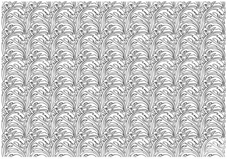
pattern1.jpg

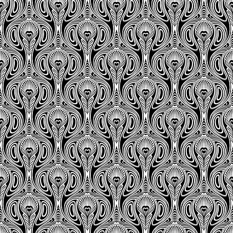
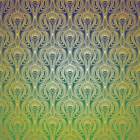
One of the projects I’ve been working on recently contains a large quantity of Art Nouveau design. I can’t discuss this any further for the usual embargo reasons, but I can show off this pattern which has been generated as a by-product of the main work. This is one of those fin-de-siècle designs that looks like it might have originated in the 1960s, a decade which saw a revival of interest in Art Nouveau graphics. Those sinuous lines would work well on a psychedelic poster, and there’s even a touch of Op art in the melting ovals that separate the peacock feathers.

pattern7.jpg

But this isn’t a design from 1970, it actually dates from 1900, the source being a small wallpaper sample that I spotted some years ago in issue 7 of Deutsche Kunst und Dekoration. “Frau Dunsky, Berlin” is named as the designer although there’s no further information about her design in the text. After seeing this I thought I’d have a go at copying the pattern in order to create a digital version but I soon gave up when it became apparent that too much work was required to convert the indistinct image into a sharp outline. I didn’t have a graphics tablet at the time, and my printer had broken down, so the only way to draw an outline was the hard way, using a mouse pointer.

pattern2.jpg

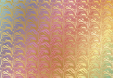
Vectorised and coloured.

A few days ago I pulled out the copy I’d been working on and, since I now have a graphics tablet, decided to try again. Even though creating the outline was easier this time I still wasn’t sure whether a repeatable pattern would be possible. The magazine sample is slightly warped, and the repeated elements don’t match exactly when overlaid, but I was able to compensate for the flaws with some stretching and redrawing in Photoshop. It’s very satisfying getting something like this to work, even more so when it’s a 120-year-old design that you’ve managed to resurrect. I also feel a little familial continuity with this kind of pattern making. My mother worked as a textile designer for a few years in the 1950s, although she never worked on anything like this, the designs produced by her studio were generally chintz-like floral patterns.

pattern3.jpg

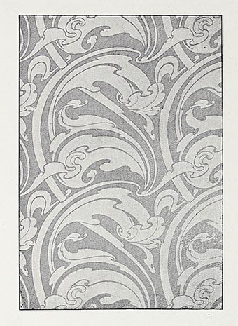
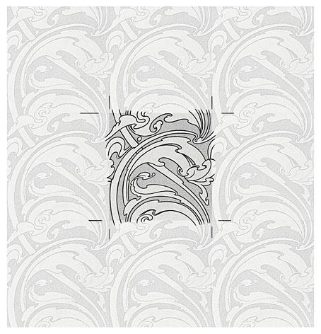
Prior to redrawing the peacock design I’d resurrected another wallpaper design from the same period. This is one of several examples by a French designer, André Morisset, that appeared in issue 15 of L’Art Decoratif. Monsieur Morisset’s design was easier to work into a digital version, being a better reproduction, while the design itself is a square that tiles vertically and horizontally so it’s easier to build into a pattern.

pattern4.jpg

Drawing the outline.

pattern5.jpg

A tessellated tiff.

pattern6.jpg

A coloured vector version.

I’ll be doing a few more things like this when I get the chance. I’m not sure yet whether they’ll find a place in the things I’m working on, but once you have a satisfactory vector outline you can file the art away until you need it later.

Previously on { feuilleton }
Louis Rhead’s peacocks
Peacocks
Rene Beauclair
Whistler’s Peacock Room
Beardsley’s Salomé

Virgil Finlay’s magazine illustrations

finlay1.jpg

The Time Machine by HG Wells; Famous Fantastic Mysteries, August 1950.

This one will be popular, I’m sure. One of the recent uploads at the Internet Archive is a massive collection of Virgil Finlay’s interior illustrations from the magazines that published most of his work—Weird Tales, Famous Fantastic Mysteries, Amazing Stories, etc, etc—together with the astrological illustrations he created later in his career, plus other material, including a few pieces that never appeared in print. Pencil drawings, lithographs and hundreds of meticulous renderings in ink on paper or scratchboard; 1888 illustrations in all. Whoever put the haul together has been much more thorough than I’d have expected. Rather than a stash of random drawings you get 10 separate folders (best appreciated in the cbz format; see the note below) with each illustration tagged with the name of the story it was illustrating, and the date of publication. The contents are a mix of reproductions from later reprints, together with cropped pages from magazine scans. Taken together, this must comprise almost all of Finlay’s published work excluding his magazine covers and other paintings.

finlay3.jpg

Earth’s Last Citadel by Henry Kuttner and CL Moore; Fantastic Novels Magazine, July 1950.

Virgil Finlay (1914–1971) can be a frustrating artist for anyone who admires his work. He was massively prolific, and maintained a high level of quality for almost 40 years; but his interior illustrations were often printed on pulp stock, the kind of paper that offers the worst kind of print reproduction, and which darkens and eventually crumbles into dust unless it’s carefully stored. Descriptions of his illustrations often note that his drawing style evolved to compensate for the deficiencies of the printing but much of his artwork was very finely rendered, and I’m not sure his minute stipple effects would have printed any better (or worse) than the traditional cross-hatching which he used from time to time. His drawings have at least been well-served by reprint collections, where the white art paper makes his striking compositions leap off the page. Inevitably, the best of these—Gerry de la Ree’s seven-volume collection from the 1970s, and a four-volume set from the 1990s—are all out of print. The sheer quantity of illustrations also presents a problem for any reprint collection: what to include…or leave out? All of which is a roundabout way of saying that this accumulation of his interior art may be unauthorised, and even frowned upon by some, but it benefits Finlay by keeping his work in circulation and showing the full range of his career.

finlay5.jpg

The Faceless God by Robert Bloch; Weird Tales, May 1936.

With 1888 illustrations to choose from, picking out a representative selection is a hopeless task, so what you see here are a few favourites. I said that Finlay maintained a high level of quality but there are unsuccessful Finlays, especially in the early years when his style was still evolving. (It should be noted that he was in his early twenties when he was creating pieces such as these. His errors are a lot less grievous than mine were at the same age.) One of the hallmarks of the Finlay style is a frequent use of photo-reference, especially for faces, and it’s the disjunction between faces and bodies which occasionally jars. Disparities between the size or angle of a head and a body are common in photo-collage but you don’t expect to see them in a drawing. Occasionally the disparities worked for him, as in his illustration for The Faceless God by Robert Bloch, a drawing that so impressed HP Lovecraft that he responded with a short poem praising both picture and artist. The reference images used for his later work are much more seamlessly integrated, and in the 1940s and 50s he seemed to be using posed models as frequently as the illustrators for the big American magazines.

finlay4.jpg

The Man Who Mastered Time by Ray Cummings; Fantastic Novels Magazine, March 1950. Remove the fungi from this illustration and you’d have an almost abstract image.

Regarding cbz or cbr files: these are simply folders filled with jpegs or pngs which have been zipped then given a new suffix. They can be browsed using a suitable comics-reader application; I use Simple Comic for the iMac and ComiCat for the tablet. The files can also be opened with any unzipping software to give you access to the images inside. I find these files so much easier to use than pdfs, especially for image-heavy publications, that I’ve taken to exporting pdf pages as jpegs then zipping a folder of the images into a cbr. One of the advantages of the cbr format is that the readers allow you to extract an image without unzipping the whole file. The only drawback with the Finlay files is that ComiCat doesn’t let you see the file name the way that Simple Comic does.

finlay6.jpg

Full Moon by Talbot Mundy; Famous Fantastic Mysteries, February 1953.

Elsewhere on { feuilleton }
The illustrators archive
The Lovecraft archive

Previously on { feuilleton }
Virgil Finlay’s Tarzan
Virgil Finlay’s Salomé
The monstrous tome

Weekend links 616

finlay.jpg

Illustration by Virgil Finlay for The Face in the Abyss by A. Merritt; Famous Fantastic Mysteries, October 1940.

• “The pier was completely outside of the gallery system, which David loved of course. People were just working on the walls, nothing was for sale, nothing could really be bought, although people were coming in and trying to chip things off the walls.” Cynthia Carr on the love letters and legacy of David Wojnarowicz.

• “In pursuit of Pure Form, the Polish artist known as “Witkacy” would consume peyote, cocaine, and other intoxicants before creating pastel portraits.” Juliette Bretan on the artful intoxications of Stanislaw Ignacy Witkiewicz.

• Kino Kyiv: Christopher Silvester compiles a list of notable Ukrainian films. I’ve not seen all of these but Shadows of Our Forgotten Ancestors is a great favourite.

Onscreen for nearly the entire runtime, [Laura Dern] pulls off the remarkable feat of being in total control of a scenario organized by undermining her identity, obliterating her characterization, and so scrambling the distinction between Nikki and Susan that one eventually comes to view Inland Empire not as a maze to exit, a puzzle to solve, an ouroboros to gawk at, but rather as both a generalized treatise on the enigma of acting and a very specific, exquisitely perverse mash note to one of Lynch’s most formidable collaborators.

Nathan Lee on Laura Dern, David Lynch and Inland Empire. I’ve always thought Dern’s exceptional performance might have been recognised more widely if Lynch hadn’t filmed most of it on low-grade video.

• New music: Golden Air by Sun’s Signature, a new project from Elizabeth Fraser and Damon Reece.

• Miranda Remington explores The Strange World of…Stomu Yamash’ta.

• Steven Heller’s font of the month is Boucan.

• At Dennis Cooper’s: Labyrinthine.

Labyrinth (2010) by Chrome Hoof | Labyrinths (2018) by Jonathan Fitoussi / Clemens Hourrière | The Seventh Labyrinth (2019) by Pye Corner Audio

Michel Henricot, 1936–2022

henricot1.jpg

Deux Personnages (1974).

Jan of JKK Fine Arts was in touch this week to inform me that the French artist Michel Henricot died in February, a month before the opening of an exhibition of his work organised by JKK Fine Arts for the International Cultural Centre in Cracow, Poland.

henricot2.jpg

Le Voyageur IV (1996).

I first encountered Henricot’s work in the pages of OMNI magazine where he was one of several featured artists who can be grouped together as “fantastic realists”—Ernst Fuchs, Mati Klarwein, HR Giger, Robert Venosa, Rudolf Hausner, De Es Schwertberger—although the label wouldn’t have necessarily been agreed to by any of them apart from Fuchs and Hausner, both of whom were members of the Vienna School of Fantastic Realism in the 1960s. Henricot’s sombre and obsessive figure studies were a good fit for the magazine, with the science fiction context lending his paintings suggestions of the futuristic or alien that might otherwise be absent in the empty space of an art gallery.

henricot3.jpg

The artist photographed by Jan K. Kapera.

Despite such a high-profile showcase Henricot’s work has never been as visible as his more famous contemporaries so I’m grateful to Jan for supplying additional information, including the artist’s actual birth date, 8th July, 1936, rather than the erroneous dates found all over the internet. Henricot was friends with Leonor Fini, an artist whose work was also preoccupied with the human figure, often just as stylised and set against featureless monochrome backgrounds. Like Henricot, Fini’s art gets tagged as Surrealist even though her own obsessive paintings evolved away from any particular school. Henricot’s Les Promeneuses (1954) was definitely reaching for a Dalínean/Delvaux-like quality, but if his mature work belongs anywhere it’s with that small collection of French artists who don’t comprise any defined movement but who share a taste for the fantastic, the strange and the inexplicable: Sibylle Ruppert, Jean-Marie Poumeyrol, Jean-Pierre Ugarte, Gérard Trignac, Erik Desmazières, Jean-Paul Faccon, Pierre Clayette, Raymond Bertrand, Roland Cat, Gilles Rimbault, Jean-Michel Mathieux-Marie, and others. If I was given the opportunity to put together an art show for a French gallery (or even the Pompidou Centre…), these are some of the artists I’d choose.

henricot4.jpg

Le Silence (1979).

Henricot will be running at the International Cultural Centre, Cracow, until the end of April.

Elsewhere on { feuilleton }
The fantastic art archive

Previously on { feuilleton }
Saint Sebastian in NYC
The art of Michel Henricot