Weekend links 600

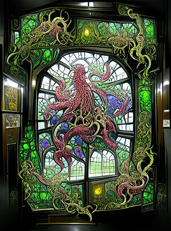
window.jpg

My kind of window. From a collection of machine-learning images by Unlimited Dream Co. Via Bruce Sterling.

• “I will never call myself a queer. That word is one of the things that I detest that has happened, and it’s almost being forced now. For me, you cannot separate that word from the hatred and violence that once accompanied it. When I read it being used in The New York Times, I think, ‘It’s their word and they can fucking have it all they want.’ I will never use ‘queer.’ It’s an ugly word.” John Rechy, still active at the age of 90, talking to Jeff Weiss about hustling, social opprobrium, and his pioneering books.

• “At a time when we are being constantly told that humanity is destroying the planet, it is somehow comforting to see nature not merely outlasting, but triumphing over humanity’s constructions—as nature does in many of Piranesi’s Views of Rome.” Alasdair Palmer on Piranesi’s peerless renderings of Roman ruins.

• “The magical aspect of Get Back is its total refusal to adhere to the standard tropes of music documentaries. There are no talking heads commenting on the Beatles’ greatness, no continual barrage of quick edits and highlights.” Geeta Dayal on Peter Jackson’s resurrection of the Fab Four.

But men are not traditionally meant to be objects of art. “Men look at women,” John Berger wrote. “Women watch themselves being looked at.” When men look at men, however, they break rules. “I didn’t set out to be radical,” says Miller. “But I was at a fair and I had a huge nude on a stand by Michael Leonard. I’d only been open ten minutes and a woman started having a go and saying it’s filth. What I found fascinating is she’d walked past a whole span of female nudes. I think society is just immune to female nudity. People don’t see it. If you take this to the straight world of an art fair, it provokes reactions other dealers don’t get. There isn’t anyone else like me.”

Tony Wilkes talks to Henry Miller, owner of an art gallery devoted to the male form

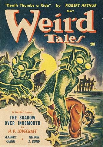
• “I imagine men with starched collars, horrified by an animal with no hard edges to grab onto, no solidity to venerate. Something low, lateral, creeping.” Fiona Glen on “Devil Fish”, Cthulhu and cephalomania.

• I like glowing things so Brian Eno’s glowing record turntable has an immediate appeal. A shame it’s a very limited production which is almost certainly sold out by now.

• The next release on the Ghost Box label will be A Letter from TreeTops by Pneumatic Tubes.

• At Dangerous Minds: A Sight for Sore Eyes Vol. 1, a visual history of The Residents.

• At Wormwoodiana: Mark Valentine on the supernatural thrillers of Archie Roy.

• Mix of the week: A reflection on 2021 at A Strangely Isolated Place.

Swan River Press looks back over a year of book production.

• New music: Spherical Harmonics by Joseph Hyde.

Octopus’s Garden (1969) by The Beatles | The Kraken (2006) by Hans Zimmer | Kraken (2017) by Dave Clarkson

Das Letzte Ritual

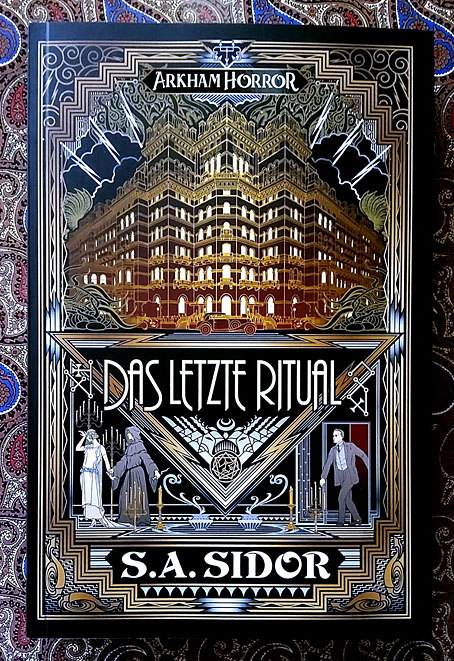
letzte.jpg

Arriving in the post this week, the German edition of The Last Ritual by SA Sidor, a novel with one of the Art Deco-styled cover designs that I’ve been producing recently for Aconyte Books. This isn’t the first example of my artwork being published in Germany—the Magic: The Gathering cards I was painting in the 1990s were sold in many different countries with translated captions and credits—but I think it’s my first German book cover. If that statement sounds unnecessarily vague it’s because things can sometimes be published or reprinted in other countries without anyone telling you about them, especially if a large company is behind the production.

Anyway, my congratulations to Mr Sidor on having his book translated by Cross Cult. There’s also an audio version of this one available. Meanwhile, I’ve just finished another cover for the Arkham Horror series but I can’t show it yet until the title has been announced. More on that later.

Previously on { feuilleton }
The Devourer Below
Litany of Dreams
The Last Ritual

Prints update

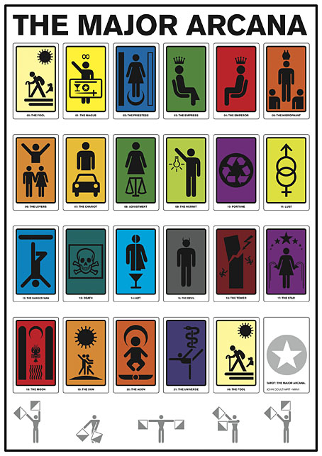
tarot.jpg

The Major Arcana (2006): a C-type print on Fuji gloss paper. A1 or A2 sizes.

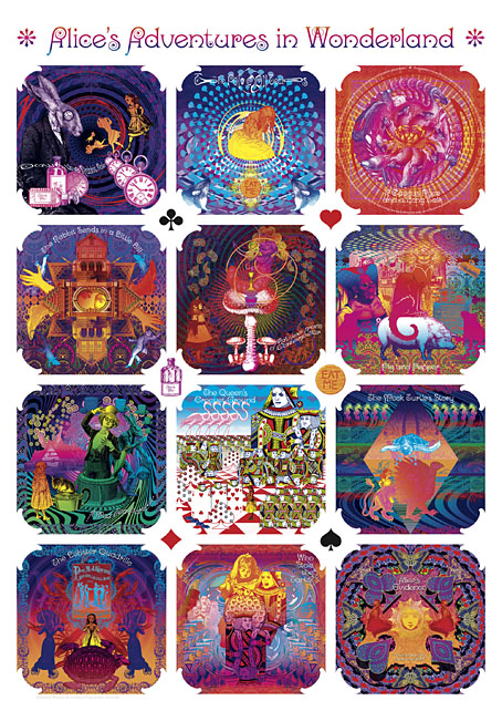
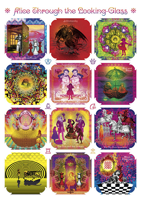
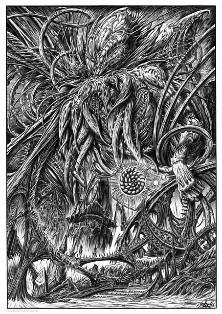
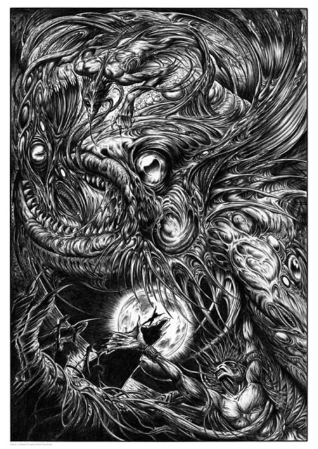
I’m continuing to add artwork to Etsy which will be available as prints in a variety of sizes and papers. I would have done more of this by now but I’m still very busy working through the commissions of the past few months so progress has been slow. The system does actually work as intended, however, with orders being routed automatically to the printer then printed and shipped within 24 hours. The initial setup may take longer than places like CafePress but the benefits are multiple, not only a faster turnaround (and cheaper worldwide postage) but now I can create prints of any size I want, and with a variety of papers and finishes. Most of the items there at the moment are the things I consider “greatest hits” so the latest additions include new poster versions of my psychedelic Alice in Wonderland artwork, together with the International Symbols Tarot poster and yet more Lovecraftiana. Requests are, of course, still welcome.

wonderland.jpg

Psychedelic Wonderland (2009): a C-type print on Fuji gloss paper. A1 or A2 sizes.

looking-glass.jpg

Psychedelic Looking-Glass (2010): a C-type print on Fuji gloss paper. A1 or A2 sizes.

cthulhu.jpg

Cthulhu (1998): a giclée print on Canson Aquarelle rag paper. A3 size.

dagon.jpg

Dagon (1999): a giclée print on Canson Aquarelle rag paper. A3 size.

Previously on { feuilleton }
Prints at Etsy

Resurrecting R’lyeh

rlyeh-2021.jpg

Then, driven ahead by curiosity in their captured yacht under Johansen’s command, the men sight a great stone pillar sticking out of the sea, and in S. Latitude 47°9′, W. Longitude 126°43′, come upon a coastline of mingled mud, ooze, and weedy Cyclopean masonry which can be nothing less than the tangible substance of earth’s supreme terror—the nightmare corpse-city of R’lyeh, that was built in measureless aeons behind history by the vast, loathsome shapes that seeped down from the dark stars. There lay great Cthulhu and his hordes, hidden in green slimy vaults and sending out at last, after cycles incalculable, the thoughts that spread fear to the dreams of the sensitive and called imperiously to the faithful to come on a pilgrimage of liberation and restoration.

HP Lovecraft, The Call of Cthulhu (1928)

Behold the fruits of a more benevolent pilgrimage of liberation and restoration. It was just over a year ago that I decided to draw an exact replica of the R’lyeh triple-spread from my comic-strip adaptation of The Call of Cthulhu, the intention being to make the picture available as a poster-sized print once I had a print-ordering system in place. The picture may now be purchased here as a giclée print on Hahnemüle Pearl art paper. This is a big picture (870.46 x 401.15 mm or 34.27 x 15.793 ins), and unlike my other Etsy prints I’m afraid there won’t be a half-size version which means the price will remain relatively high. I’m also keeping it as a black-and-white piece despite the temptation to create a tinted version.

And so to the obvious question: why did I want to redraw a large and very detailed piece of art in the first place? Pull up a weed-festooned Cyclopean bollard and I’ll explain…

starrywisdom.jpg

Creation Books, 1994. Cover art by Peter Smith.

I spent 17 months drawing The Call of Cthulhu, from January 1987 to May 1988, using my preferred media of the time, a 0.2 mm Rotring Variant pen on A3 sheets of Daler cartridge paper. The story took its time getting into print but it was eventually published in 1994 by Creation Books as part of The Starry Wisdom, a collection of Lovecraftian fiction edited by DM Mitchell. I was very pleased to be represented in the book but the pleasure turned to dismay when it transpired that all the artwork had vanished after the printing was done. Or almost all the artwork… To this day I don’t know whether the drawings by other artists suffered the same fate, but my Cthulhu pages disappeared along with the anatomical cross-section and the Yuggoth collage that I created specially for the collection. I still don’t know what really happened either, whether the drawings were stolen (possible), thrown away deliberately (unlikely), or thrown away accidentally (also possible). The lack of resolution to the whole business is partly my fault. Losing all that art was a painful thing to consider, and I couldn’t accuse the printer of anything when nobody could say what had happened (I was in the Creation office during one of the phone conversations between publisher and printer). The printer was also located in the middle of a rural county somewhere so journeying there would have been difficult for this non-driver, as well as being pointless if they could only tell me what I knew already. Time passed and I did my best to put the whole episode behind me.

pens.jpg

Drawing technology then and now: the Variant pen I used throughout the 1980s and the Wacom stylus I use today. That Variant nib is so fine that I have a faint ink dot tattooed on one of my knuckles from where I accidentally stabbed it into my hand. The Wacom pen looks stubby in comparison but is capable of drawing equally fine lines and much more besides.

On the plus side (there was one), the printer had done a good job of half-toning the artwork, so even though the Starry Wisdom pages are rather small the detail in the drawings is still evident. And I also had a complete set of photocopies of the A3-sized originals. I’d been working for Savoy Books since 1989 during which time making photocopies of new drawings had become second nature. Since 1994 this set of copies has become the original art for the Call of Cthulhu strip, rather like the surviving prints of Murnau’s Nosferatu which are all that anyone can see of his film today. The analogy is an apt one since it also extends to picture quality. Just as silent films always look their best when they’ve been restored from the camera negative, my Rotring drawings really need to be reproduced from the originals. The 0.2 mm pen that I insisted on using throughout the 1980s was too fine for the photocopy machines of the time, especially when my shading was so densely rendered that I might as well have been using a pencil. This isn’t so much of a problem if the pages are being reduced in size but it became one last year when I had the idea of making a print of the R’lyeh panorama that would be the same size as the original drawings. Giclée printing is an ink-jet process that reproduces fine detail with great accuracy, so while I could make full-size prints of the Cthulhu pages they’d never look better than what they were, photocopies that hadn’t fully captured the fine lines of the drawings. This wasn’t the only problem.

Continue reading “Resurrecting R’lyeh”

Byam Shaw’s illustrated Poe

shaw01.jpg

There’s always more Poe. Selected Tales of Mystery was published in 1909, and is one of several illustrated editions produced by British artist Byam Shaw (1872–1919), a painter like Frederick Simpson Coburn who was better suited to the one-off canvas than the illustrated text. There ought to be a term for this kind of illustration—”The Easel School”, perhaps—in which all the techniques and staging of the academic artist are applied to stories or novels, techniques which too often lead to a succession of well-painted figures gesticulating to each other in well-painted rooms. The canvas painter in the first years of the 20th century was also subject to the limitations of print technology which at the time could only reproduce a narrow range of colours.

shaw02.jpg

William Wilson

The question of how best to illustrate a story using realism rather than stylistisation has been a recurrent one recently with regard to a commission of my own. I’ll be discussing this later but something that occurred to me while considering the issue was that illustrators today have access to a visual vocabulary derived from cinema that didn’t really exist until the 1920s. An artist like Byam Shaw would never think to depict a scene from a very high or very low angle, even though high- and low-angle views of dramatic scenes had been familiar to theatre audiences for many centuries. (He does use a high angle for A Descent into the Maelström but so do most artists who illustrate that particular story.) Virgil Finlay’s 1952 illustration for The Tell-Tale Heart is a cinematic view with its combination of flattened perspective and deep focus. In the same issue of Fantastic there’s an illustration by Gaylord Welker that could be a still from any film noir of the 1940s.

shaw03.jpg

The Gold Bug

Reservations aside, Shaw’s Poe is worth a look if only to see which moments he chooses to highlight from each of the stories…or those he doesn’t. One of the problems with illustrating a popular writer like Edgar Allan Poe is that you have the choice of attempting to compete with other artists by illustrating the same scene as everybody else or you avoid the obvious moments in favour of something new. Shaw had an advantage in working without the burden of precedent but his climax for The Masque of the Red Death is overwhelmed today by our acquaintance with Harry Clarke’s definitive illustration. The most original thing about the Shaw edition is its cover, with a trail of human and animal footprints spiralling into a maelström towards…what? A webbed foot? This curious design suggests a set of illustrations that the contents don’t deliver.

shaw04.jpg

The Fall of the House of Usher

shaw05.jpg

The Assignation

Continue reading “Byam Shaw’s illustrated Poe”