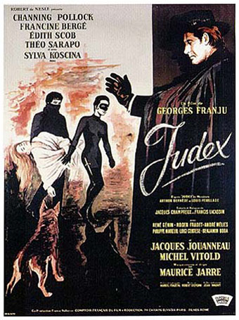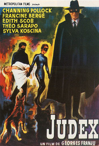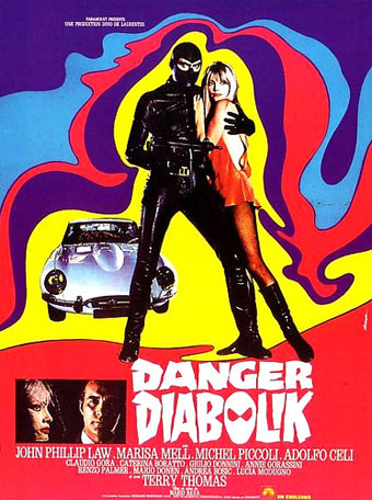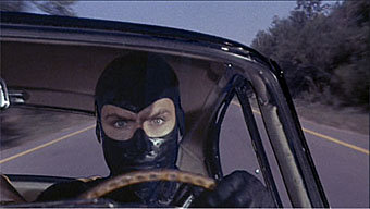
Monsieur Wiley in yesterday’s comments reminded me of George Franju’s seldom seen Judex, a 1963 film based on the Feuillade serials of the same name. Louis Feuillade (1873–1925), as you really ought to know by now, was the director of the original Fantômas serials (1913–14) and also Les Vampires (1915–16), obvious forerunners of Diabolik with all their black-clad nocturnal prowling. Feuillade’s criminals were clebrated by the Surrealists, Blaise Cendrars, Jean Cocteau and others but the director received stern reviews from less liberal critics for apparently promoting immorality:
“That a man of talent, an artist, as the director of most of the great films which have been the success and glory of Gaumont, starts again to deal with this unhealthy genre (the crime film), obsolete and condemned by all people of taste, remains for me a real problem.”
Hence the arrival in 1917 of Judex (The Judge), possibly the first costumed avenger in cinema, with his broad-brimmed hat and cloak, secret lair and network of helpful circus performers. Fictional immorality is less of a concern these days which perhaps explains why Fantômas and Les Vampires were resurrected on DVD first while Judex only appeared recently. I must admit that it’s Feuillade’s criminals which have always interested me for the most part, even if (as with many silent films) the romance of the concept is often more attractive than the actual work. (There are exceptions, of course; the Lon Cheney Phantom of the Opera is far better than the book.) Feuillade and his writer, Arthur Bernède, produced a series of spin-off novels while the films were being made (you thought novelizations were a recent thing?) and this page has some nice reproductions of the covers.

Judex turned up again in 1934, in a film directed by Maurice Champreux before Franju gave his own twist to the character. Franju is most famous for his exceptional horror film, Les Yeux sans Visage (1960) which still packs a punch today; I saw it at a cinema several years ago and one notorious scene drew gasps from an unprepared audience. Nearly everything else of his, Judex included, appears to be out of circulation. Franju began his career as a maker of documentary shorts whose approach to the medium was inspired by the juxtapositions of the Surrealists. In the celebrated Le Sang des bêtes (1949), he contrasted scenes of day-to-day life in Paris with film of animals being killed in the city’s slaughterhouses. This attitude was carried over into his dramas—Les Yeux manages to be lyrical as well as horrifying—and was impressive enough for Jean Cocteau to declare he’d happily entrust his work to Franju. This perhaps explains why Franju’s work has been so overlooked since his death in 1987, both he and Cocteau were mavericks who don’t easily fit the usual narrative of French cinema history.

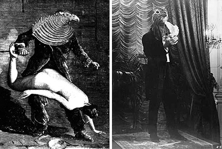
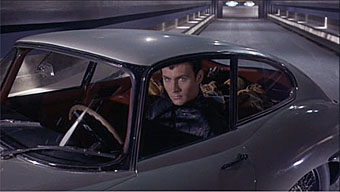
left: Une Semaine de Bonté (1934) by Max Ernst; right Channing Pollock as Judex.
Franju’s Judex was portrayed by an American stage magician, Channing Pollock, whose act with doves was put to use in the film. There’s a great scene of a masked ball (the only part of the film I’ve yet seen) with all the characters wearing bird masks that looks like a page from Max Ernst’s collage novel, Une Semaine de Bonté, brought to life. Senses of Cinema compares the remake with the original:
Franju sought in particular to recapture Feuillade’s sense of documentary and his playfulness. He reproduced with as much exactitude as possible the costumes and settings which Feuillade filmed in scrupulous detail. Feuillade’s street-scapes are now an invaluable documentary record, but Franju also paid particular attention to reproducing the elaborate interior designs and furnishings of the day, resulting in settings of quite extraordinary detail and clutter. Franju also sought, despite the playfulness, to avoid any camp satire of these elements by over-emphasis or any special attention being paid to them.
In the title role, Franju pulled off his most brilliant coup by casting the master prestidigitator of his day, near godlike in his handsomeness, Channing Pollock. Pollock’s skills as a magician were employed to produce a dazzling array of apparent magical occurrences involving, most particularly, disappearing doves, a plot device that Feuillade uses to enable the regular rescue of the heroine and others by Judex. Franju’s Judex is a far livelier, less sombre, more inventive and more mysterious character than that of Feuillade.

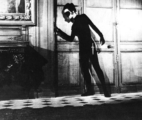
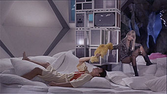
Francine Bergé as the villainous Diana Monti in Franju’s Judex (1963).
Edith Scob (the faceless girl in Les Yeux) played Jacqueline, the imperilled heroine, while Francine Bergé incarnates yet another cat-suited Feuilladesque villain. The cat-suits returned, along with the masks, in a further Feuillade homage, Nuits Rouges (1974), a feature film cobbled together from a French TV series. This page has stills from all of these and this site concerning French pulp characters (from which much of the information above was swiped) goes into more detail about the creation of Judex. There you can also read about other fascinating personages such as Belphegor, Phantom of the Louvre (another creation of Arthur Bernède), Ferocias and the Mysterious Doctor Cornelius.
And so to the inevitable question: how long do we have to wait for a Judex DVD?
See also:
• Fantastic, Mysterious, and Adventurous Victoriana by Jess Nevins
• Les Vampires at the Internet Archive
Previously on { feuilleton }
• Danger Diabolik
• Boys Own Books
• Alla Nazimova’s Salomé
• Meshes of the Afternoon by Maya Deren
• Fantômas
• La Villa Santo Sospir by Jean Cocteau
