Wanted: actor with naked ambition
| John Patterson asks for more dick.
Category: {film}
Film
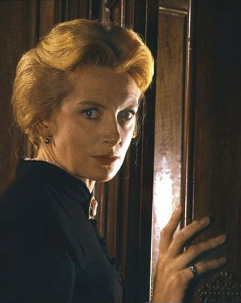
Deborah Kerr, 1921–2007
The Innocents.
A great British actress died this week. She was also something of a movie star in the Fifties, rolling in the surf with Burt Lancaster in From Here to Eternity (1953) and standing up to Yul Brynner in The King and I (1956). Prior to that she starred in two films for Michael Powell and Emeric Pressburger, The Life and Death of Colonel Blimp (1943) (where she played three roles) and Black Narcissus (1947). But for me she’ll always be the (literally) haunted Miss Giddens in The Innocents (1961), Jack Clayton’s superb adaptation of The Turn of the Screw. Still one of the most effective screen ghost stories; try and see it this Halloween.
Previously on { feuilleton }
• Freddie Francis, 1917–2007
Karel Zeman
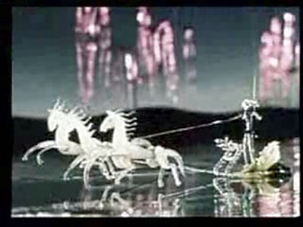
Inspiration (1949).
Karel Zemen (1910–1989) is a filmmaker I’m often telling people about but whose work isn’t easy to see, so it’s good to find that YouTube has gained some clips of his animations and examples of the partly-animated adventure films he made in the Fifties and Sixties. Zeman was yet another great Czech animator, and the YouTube collection includes his most celebrated short, Inspiration, which gives life to glass figurines, an unyielding medium that he moves as expressively as if it were clay or plasticine.
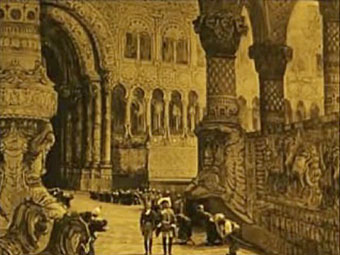
The Fabulous Baron Munchausen (1961).
The adventure films are predominantly based on Jules Verne and place live actors into animated settings, many of which are taken directly from (or intended to imitate) the engraved illustrations of the original novels. The animation enabled Zeman to fill his films with dirigibles, submarines and various steam contraptions which would be too expensive to create otherwise. Zeman’s The Fabulous Baron Munchausen took the Gustave Doré illustrations for its visual style which is something this particular Doré enthusiast appreciates, and the film is closer to the spirit of the Raspe novel than the Nazi adaptation of 1943 or Terry Gilliam’s later version. The results are a lot more artificial than the seamless blend of animation and live action attempted by Ray Harryhausen in his own Jules Verne film, Mysterious Island, but the artificiality gives the films a distinctive charm.
• A Deadly Invention aka The Fabulous World of Jules Verne (1958)
• The Fabulous World of Jules Verne trailer (1958)
• Excerpts from Baron Munchausen (1961)
• The Special Effects of Karel Zeman pt. I | pt. II
Previously on { feuilleton }
• Zeppelin vs. Pterodactyls
• Jan Svankmajer: The Complete Short Films
• Taxandria, or Raoul Servais meets Paul Delvaux
• Barta’s Golem
• The Hetzel editions of Jules Verne
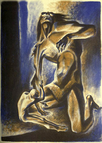
Cain’s son: the incarnations of Grendel
Beowulf wrestles with Grendel, Lynd Ward (1939).
There’s nothing new in pointing out Hollywood’s crimes against literature, the film business has been screwing up book adaptation since the earliest days of silent cinema. But sometimes the wound is so grievous you can’t help but speak out, in this case against Roger Avary’s Beowulf which is released next month. This is another CGI-heavy confection along the lines Polar Express, with the actors being given digital bodies via motion-capture, and it’s something I’d probably have ignored until I saw this picture of Grendel, the story’s principal monster. Beowulf is one of the earliest surviving Anglo-Saxon poems and Grendel, the bloodthirsty creature which Beowulf battles, is one of the ur-fiends of English literature, along with his equally monstrous, lake-dwelling mother and the dragon which fatally wounds the hero. The trio give us a peek back into the dark imagination from a time before recorded history and Grendel especially has always had something raw and primal about its character. So when you see a beast with such a history portrayed as little more than a diseased muppet you wonder what’s going on. Are the creators inept? Ignorant? Were studio restrictions at work? How does an industry with the talent to give splendid life to the trolls and Balrog of Lord of the Rings, or Davy Jones and crew in Pirates of the Caribbean, screw up so badly?
New things for October
“Mirage in time—image of long-vanish’d pre-human city.”
A couple pieces of news to catch up with here, both Lovecraft-related which is very apt for the month of Halloween. The first is the work I gave a teaser view of in August, a commission for Maison d’Ailleurs, the Museum of Science Fiction, Utopia and Extraordinary Journeys in Yverdon-Les-Bains, Switzerland. The brief for An Exhibition of Unspeakable Things: Lovecraft’s Commonplace Book was to choose an entry from HP Lovecraft’s Commonplace Book, his source of story ideas. The entry I chose implies some of the alien architecture which is a feature of At the Mountains of Madness although I’ll admit that the final result is debatable as architecture.

