Malcolm in the middle
| John Patterson talks to Malcolm McDowell.
Category: {film}
Film
Battle of the bloodsuckers
Battle of the bloodsuckers
| Jeremy Dyson looking for the greatest screen Dracula.
The night that panicked America

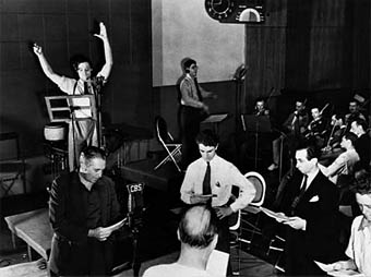
The Mercury Theatre on the air.
Being a long-time fan of both HG Wells and Orson Welles, the latter’s radio production of War of the Worlds with the Mercury Theatre group has always held a special fascination. This was staged sixty-nine years ago today, October 30th, 1938, and famously caused panic among listeners who missed the opening and believed they were hearing genuine news reports of an alien invasion. I’ve often listened to the rather crude recording of the play around this time of year, having owned that recording on vinyl, cassette tape and CD. These days you don’t have to buy it, you can head over to the Internet Archive or this Mercury Theatre page and grab an mp3 to discover what all the fuss was about. The recording may be crude but the presentation still strikes me as decades ahead of its time, with a very astute sense of how ordinary people behave when faced with the news media. I’ve always loved the attention to detail, such as the moment when the man who’s been interviewed at the crash site wants to carry on talking and the interviewer has to shut him up. That same verisimilitude was carried over to the newsreel footage in Citizen Kane (which was pretty much a Mercury production for cinema) and it was those moments in the radio play which helped encourage people to think that what they were hearing was real, not drama.
Screenwriter Howard Koch, who later polished the rudimentary draft script that became Casablanca, is credited as writer of the play but the adaptation was a group effort according to Koch in his book The Panic Broadcast (1970). The idea of presenting Wells’s story as a series of news bulletins came from Orson Welles and producer John Houseman, with Koch scripting the scenes and dialogue. Most of the other Mercury adaptations took a more traditional approach and if you want some spooky listening for Halloween I’d suggest you try their version of Dracula, also from 1938. The story is severely truncated, of course, but Agnes Moorehead is very impressive as Mina, there’s some remarkable music from Bernard Herrmann and Welles plays both Arthur Seward and the sinister Count.
Previously on { feuilleton }
• Alexandre Alexeieff and Claire Parker
• The Door in the Wall
• Voodoo Macbeth
• War of the Worlds book covers
Harlan Ellison: Dreams with Sharp Teeth
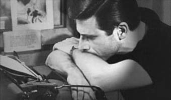
Harlan Ellison.
“You have somebody who is one of the greatest writers of the twentieth century.”
Neil Gaiman on Harlan Ellison, and so say all of us. The quote comes from a trailer for Dreams with Sharp Teeth, a new documentary about Ellison’s life and work which, as far as I can tell, has yet to acquire any distribution. Given Ellison’s reputation you have to wonder why it’s taken this long for someone to make a substantial film about such a great artist and natural performer.
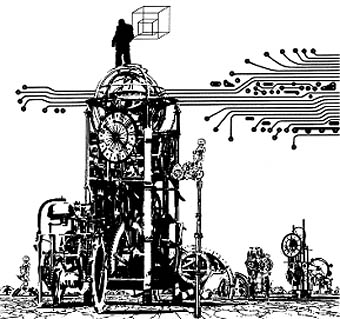
“Repent, Harlequin!” Said the Ticktockman, from a 1978 portfolio by Jim Steranko.
But it doesn’t arrive a moment too soon given the quantity of recent web discussion which seems to have forgotten his huge body of work and sees him solely as a person who gets into arguments all the time. He’s always been argumentative, of course, splendidly so, and his take-no-prisoners attitude did much to shake up the conservative world of American science fiction in the late Sixties and early Seventies. As a political commentator he’s always been at the Hunter S Thompson level with a great line in witty vituperation. The filmmakers seem to have caught both sides of Ellison, the writer who doesn’t so much read as perform his texts from memory, and the tightly-wound ball of fury who won’t take shit from anyone. The film site has nearly an hour of clips to watch, including a tremendous speed-reading of Prince Myshkin, and Hold the Relish.
And while we’re on the subject, I’ll give another plug to the landmark collection of HP Lovecraft-derived art due to appear soon from Centipede Press. This features a number of my Lovecraftian works and an introduction from Mr Ellison himself.
Previously on { feuilleton }
• The Bradbury Building: Looking Backward from the Future
• Revenant volumes: Bob Haberfield, New Worlds and others
Cormac and the Coens
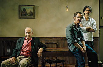
CM, JC & EC photographed by Eric Ogden.
First an Oprah interview, now a feature in TIME; the famously reclusive Cormac McCarthy is almost becoming gregarious. The TIME piece is only a short sit-down between CM and the Coen Brothers which serves to promote the forthcoming film of No Country for Old Men but it’s still something this Cormac fan is happy to see. A shame it isn’t longer, I’d love to hear a tape of the full meeting. Thanks to Steve MacEacheran for the tip!
Previously on { feuilleton }
• Still No Country for Old Men
• Cormac and Oprah
• No Country for Old Men


