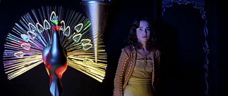
Suspiria: Jessica Harper and a bird with crystal plumage.
For this year’s Halloween playlist I’ve let Mark Pilkington from Strange Attractor make the selection. The following is from a CD-R collection of Italian horror soundtracks that Mark sent me some time ago. Not everything here is easy to find but the superbly nerve-jangling racket created by Goblin to accompany Dario Argento’s equally superb Suspiria (1977) is widely available and ideal Halloween listening.
If one hasn’t been written already, there’s probably a thesis to be found in the influence of progressive rock on Italian cinema. Many of these pieces represent a curious blending of the kind of Italian prog-rock exemplified by bands such as PFM together with the scores of (inevitably) Ennio Morricone. William Friedkin’s use of the opening of Mike Oldfield’s Tubular Bells in The Exorcist inspired legions of imitative themes in subsequent horror films, not least Suspiria. Dario Argento later brought in ELP’s Keith Emerson for the sequel, Inferno (1980), whose main theme—a kind of disco version of Jerry Goldsmith’s Latin chants from The Omen—I’ve always been rather partial to. The best of this music manages to be groovy and scary at the same time, Goblin being the masters in that department, and is often better than the films it was written for. The perfect thing for zombies in satin flares.
Cannibal Holocaust (Main theme) by Riz Ortolani
Death Dies (Profondo Rosso) by Goblin
Zombie Flesh Eaters (theme) by Fabio Frizzi
Sighs (Suspiria) by Goblin
Suoni Dissonanti (City of the Living Dead) by Fabio Frizzi
Flashing (Tenebrae) by Goblin
Adulteress’ Punishment (Cannibal Holocaust) by Riz Ortolani
Suspiria by Goblin
Voci Dal Nulla (The Beyond) by Fabio Frizzi
Deep Shadows (Profondo Rosso) by Giorgio Gaslini & Goblin
L’alba Dei Morti Viventi (Dawn of the Dead) by Goblin
Suono Aperto (The Beyond) by Fabio Frizzi
Markos (Suspiria) by Goblin
The Dead On Main St/Voodoo Rising (Zombie Flesh Eaters) by Fabio Frizzi
Escape From The Flesh Eaters (Zombie Flesh Eaters) by Fabio Frizzi
Roller (Non-soundtrack album) by Goblin
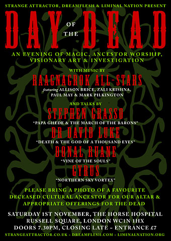
And while we’re on the subject of music and Halloween, Mark Pilkington is playing as part of the Raagnagrok All-Stars on November 1st at the Horse Hospital, London, as part of a Day of the Dead event. More about that here.
Happy Halloween!
Previously on { feuilleton }
• Another playlist for Halloween
• White Noise: Electric Storms, Radiophonics and the Delian Mode
• The Séance at Hobs Lane
• A playlist for Halloween
• Ghost Box

