More vapour trails

jeter.jpg

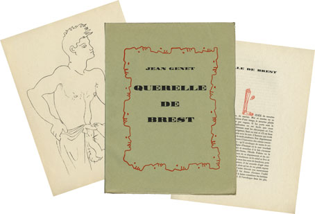
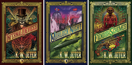
Those covers everyone likes. My designs for KW Jeter’s steampunk novels from Angry Robot and Tor Books.

When I wrote a brief history of steampunk for Eye magazine last year I ended by somewhat provocatively declaring that until something better appeared this was the defining aesthetic of the moment. A year later, the movement (if we can use that term) continues to evolve despite the steady drip of complaints that it’s all reactionary, historically illiterate, and so on. Much of the ire remains nonsensical, and often seems to boil down to a common disdain for people enjoying themselves in some unorthodox manner.

manual.jpg

Design by Galen Smith after the Hetzel editions of Jules Verne’s novels.

If I hadn’t got involved on the art side I would have found it difficult to avoid being attracted by steampunk in one form or another since so much of it originates in areas I was already interested in, not least HG Wells and Victorian science fiction. The rapid evolution of the past few years means we’re currently seeing an aesthetic leaving behind its origins to become an international subculture. What’s striking about this activity—and this is something that doesn’t seem to have been discussed very much—is the way the whole thing has been birthed by genre fiction rather than by pop music, as was the case for the second half of the 20th century. This piece is meant to be a news post, however, not another cultural critique, but if I happen to write any more on the subject there’s something there that’s worth exploring.

manual2.jpg

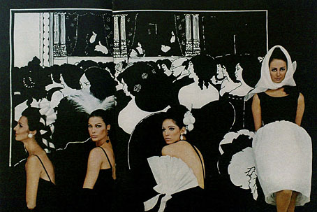
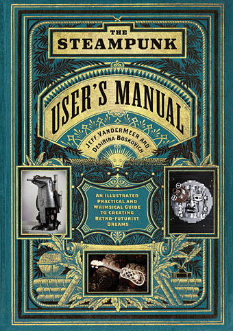
As to the news: this month finds my steampunk artwork manifesting in three very different locations in one of those odd coincidences of timing that occur now and then. First up there’s the Steampunk User’s Manual edited by Jeff VanderMeer & Desirina Boskovich, a follow-up to 2011’s Steampunk Bible. For the new volume I designed spreads for three entries by Jess Nevins from The Encyclopedia of Fantastic Victoriana: Alternative History Edition.

Continue reading “More vapour trails”

Querelle de Brest

querelle01.jpg

Querelle de Brest (1947) by Jean Genet. Cover design by Jean Cocteau.

This weekend’s viewing was Fassbinder’s Querelle (1982) which is marvellous in its new Blu-ray transfer, and a great improvement on the muddy picture of the earlier DVD release. The film is still only the briefest sketch of Genet’s novel (although Genet biographer Edmund White enjoyed it) but I like the overheated atmosphere, the phallic set designs, Franco Nero (hey, it’s Django Gay!), and the film as a whole is a fitting memorial to Brad Davis, everyone’s favourite sweating matelot. So in honour of all that, here’s a small collection of Querellerie past and present.

querelle02.jpg

Querelle de Brest was published in a limited edition of 525 copies illustrated throughout by Jean Cocteau who didn’t avoid the pornographic details. Even though copies were seized by the authorities, and the author fined, Cocteau’s involvement did little to harm his public reputation, something that’s impossible to imagine happening elsewhere. A few of the illustrations follow below, many more of the series can be found scattered across various websites.

cocteau1.jpg

cocteau2.jpg

cocteau3.jpg

Continue reading “Querelle de Brest”

No tears for the creatures of the night

notears1.jpg

No Tears (1978): A song and 12″ EP by Tuxedomoon. Sleeve design by Winston Tong.


munro.jpg

• An artwork from 2005 by Will Munro.


notears5.jpg

• A make-up portfolio from 2012 by Belinda Betz. Photographer : Erwin Tirta. Model : Jesy Love. Make-Up Artist (Special Effects) : Belinda Betz.


notears3.jpg

• A badge design at Zazzle.


notears2.jpg

A Pinterest page. Tags: dracula, isabelle adjani, vampires, werewolves, witchcraft, francisco goya, edward gorey, joanna lumley.


notears4.jpg

• A club night in St Gallen, Switzerland.

Previously on { feuilleton }
Blaine L. Reininger: An American Friend
Tuxedomoon: some queer connections
Made To Measure
Subterranean Modern: The Residents, Chrome, MX-80 Sound and Tuxedomoon
Tuxedomoon on La Edad de Oro, 1983
Tuxedomoon designs by Patrick Roques
Pink Narcissus: James Bidgood and Tuxedomoon

Antony Little’s echoes of Aubrey

little1.jpg

The Dancer (1967) by Antony Little.

My thanks to Sweet Jane this time for alerting me to her post about a series of Beardsley-inspired illustrations from 1967 by Biba designer Antony Little. The Wandering Jew and Other Stories was the first translation in English of Apollinaire’s 1910 collection L’Hérèsiarque et Cie. I’ve known about this book for a while but few of the illustrations have been on view anywhere until this post. There are eight in all, each of them very adeptly capturing different phases of Beardsley’s drawing style, from the spare black-and-whites to the more detailed renderings seen in his later work. The drawing below is another in the series from a post of Callum’s which also includes a favourite of mine by Beresford Egan.

Little’s designs, and the prominence of the Biba stores, did much to make Art Nouveau in general, and Beardsley in particular, a crucial component of London fashion in the late 1960s. For more on that subject see this Sweet Jane post featuring yet more Beardsley borrowings and monochrome design, plus Osborne & Little’s fantastic Chinese Dragon wallpaper which made a memorable appearance last year in Only God Forgives.

little2.jpg

Elsewhere on { feuilleton }
The Aubrey Beardsley archive
The illustrators archive

Aubrey in LIFE

life.jpg

Turned out for a big night at the opera like Beardsley’s Wagnerites, girls wear bare-backed blacks by Trigère. Coiffed heads are by Hugh Harrison and Halston of Bergdorf Goodman’s; Halston also made the pouf-skirted dress. (Photo session by Milton Green & Joe Eula.)

Being determined to catalogue every last piece of Beardsley trivia from the 1960s, I’m compelled to note this post which I’d missed at Sweet Jane’s Pop Boutique a couple of years ago. An earlier post here showed one of the photos from a LIFE fashion feature using Aubrey’s drawings but the Sweet Jane post has scans of all the photos, plus accompanying text. This was published in February 1967, a few months after the summer exhibition at the V&A in London which introduced Beardsley’s work to a new generation, an exhibition which set in motion a wave of popular interest in his work.

I’m intrigued by the way the colour of the women’s bodies emerges from the drawings given the date when the magazine appeared. I’ve long seen 1966 as a very black-and-white year in graphic and aesthetic terms, whereas 1967 is obviously full-colour; the difference between the sleeves of the Beatles’ (Beardsley-derived) Revolver and Sgt Pepper albums are only two of the more prominent examples. These fashion photos could be regarded as being caught mid-way between the shift from one state to another. There are more shots of the Wagnerites above on this page. Thanks to Ian for drawing my attention to the Sweet Jane post.

Elsewhere on { feuilleton }
The Aubrey Beardsley archive