Weekend links 567

dean-osibisa.jpg

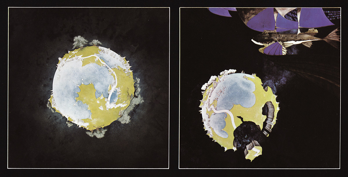
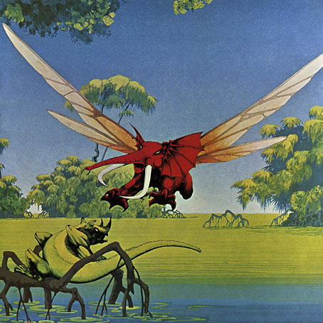
Cover art by Roger Dean for Woyaya (1971), the second album by Osibisa. Dean’s flying elephants made their first appearance on the group’s debut album, and have been an Osibisa emblem ever since.

• Many of Roger Dean’s early album covers are better creations than the music on the albums they decorate. This isn’t the case with Osibisa, however, a Ghanaian group based in London whose discography includes (uniquely, I think) two covers by Dean together with one by Mati Klarwein. The group’s first two albums, Osibisa and Woyaya, are exceptional blends of Ghanaian music with rock, funk and jazz whose omission from the generally reliable Kozmigroov list is a serious error. Garth Cartwright talked to Teddy Osei and Lord Eric Sugumugu about Osibisa past and present.

• “The antiheroes of Angry Young Men cinema railed against the limited life opportunities available to them. Wired and frustrated, they especially chafed against girlfriends, wives, domesticity. Yet they never questioned heterosexuality itself. Not, at least, until The Leather Boys (1964), a relatively little-known film directed by Canadian expatriate Sidney J. Furie.” Sukhdev Sandhu on a film about gay life in pre-decriminalisation Britain that offered a slightly more positive view of its subject than the justifiably angst-ridden Victim (1961).

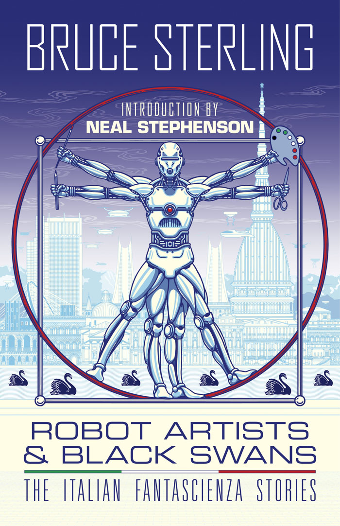
• “Brian Aldiss once confided to me that the big problem with American science fiction writers was that they loved to write about Mars but knew nothing about Indonesia.” Bruce Sterling on the attractions of being an expatriate writer who adopts a foreign persona, as he did for the stories collected in Robot Artists and Black Swans.

• New music: Fire Tower by The Grid / Fripp. Dave Ball, Richard Norris and Robert Fripp have been collaborating on and off since The Grid’s 456 album in 1992. Fire Tower is a preview of Leviathan, a new album out in June on CD/DVD and double vinyl.

• RIP Michael Collins, the astronaut who orbited the Moon alone, listening to Symphonie Fantastique by Berlioz in the Command Module of Apollo 11 while Neil Armstrong and Buzz Aldrin were walking on the satellite’s surface.

• “‘Walking with a thesis’ could easily function as the subtitle for a significant number of Iain Sinclair’s books.” Tobias Carroll on Iain Sinclair and the radical act of walking through a city.

• “‘Plain speaking, like plain food, is a puritan virtue and thus no virtue at all,’ Meades pronounces.” Steven Poole reviews Pedro and Ricky Come Again by Jonathan Meades.

• Building a panorama: Clive Hicks-Jenkins‘ latest progress report on his Cocteau-inspired illustrated edition of Beauty and the Beast.

• At Unquiet Things: Groovy Goddesses From Dimension X: Gene Szafrans’ Kaleidoscopic Book Covers.

• From leather boys to leather men: Miss Rosen on the little-known photography of Tom of Finland.

Alexis Petridis attempts the impossible again, with a list of Grace Jones’ best songs.

• At Dennis Cooper‘s: Cars.

I’m A Leather Boy (1967) by The Leather Boy | Warm Leatherette (1980) by Grace Jones | Leather Bound (2017) by Patrick Cowley

Weekend links 564

kolbe.jpg

Fantastical Tree (c. 1830) by Carl Wilhelm Kolbe.

• “It’s just a square and a semi-circle at the end of the day.” Pete Adlington navigates the rapids of high-profile cover design for the UK edition of Kazuo Ishiguro’s Klara and The Sun. I’m not always keen on the minimal approach but the Faber edition is a better design than the equally minimal US cover whose circle in a hand makes it look like a reprint of Logan’s Run. Faber also produced a limited edition with the sun circle wrapped onto sprayed page edges.

• “‘With a mysterious smile on her lips,’ writes the Chilean film director Alejandro Jodorowsky, ‘the painter whispered to me, “What you just dictated to me is the secret. As each Arcana is a mirror and not a truth in itself, become what you see in it. That tarot is a chameleon.”‘” The painter referred to is the now-ubiquitous Leonora Carrington whose own Tarot deck is investigated by Rhian Sasseen.

• “‘Horror is an emotion,’ Douglas E. Winter tells us. I would respectfully like to amend that assertion. Horror is a range of emotions. And each of these moods, if they are to be successful, must be cultivated differently.” Brian J. Showers offers his thoughts on horror fiction.

• “You move from awareness of—and preoccupation with—how sounds affect our bodies, into how that might create a web of connection with the external world—with the natural world.” Annea Lockwood talking to Jennifer Lucy Allan about her career as a composer and sound artist.

• Gay cruising and its geography in cinema and documentary, a list of films by Mike Kennedy. Related: Shiv Kotecha on O Fantasma (2000), a film by João Pedro Rodrigues.

• Coming from Strange Attractor in June: Coil: Camera Light Oblivion, a photographic record by Ruth Beyer of the first live performances by Coil from 2000–2002.

• At Wormwoodiana: Mark Valentine on The Star Called Wormwood (1941), a strange novel by Morchard Bishop.

• At Unquiet Things: Ephemeral and Irresistible: The Spectacular Still-life Botanical Drama of Gatya Kelly.

• “Fevers of Curiosity”: Charles Baudelaire and the convalescent flâneur by Matthew Beaumont.

• 1066 and all that: Explore the Bayeux Tapestry online.

• Mix of the week: Secret Thirteen Mix 311 by Arigto.

• New music: Terrain by Portico Quartet.

Fever (1956) by Little Willie John | Fever (1972) by Junior Byles | Fever (1980) The Cramps

More Swans and Robots

robotartists01.jpg

Real Italian fantascienza is an authentic expression of Italian culture, which is brainy, nerdy, gutsy and pulp, it’s far-out but down-home, and raw but civilized. I would not proclaim that it’s the best fantasy writing ever created in the world, but it encourages and motivates me.

Bruce Sterling talking to Paul Semel about his collection of fantascienza stories, Robot Artists and Black Swans. My cover design was posted here last September; the book itself is published this week by Tachyon so I can at finally reveal the interior illustrations. Sterling’s collection presents seven stories written by his Italian alter-ego, Bruno Argento, with several of them appearing in English for the first time. The Italian theme informs the design as well as the content, although the associations aren’t always as obvious as they are in my illustrations for Sterling’s earlier fantascienza book for Tachyon, Pirate Utopia, the art and design for which adapted graphics by the Italian Futurists.

robotartists08.jpg

As I mentioned in the earlier post, while searching for more recent Italian graphics I came across the work of Franco Grignani (1908–1999), a designer whose most famous work was the Woolmark logo, one of those international symbols that most people will have seen even if few know who was responsible for its creation. The Woolmark’s black-and-white stripes are typical of Grignani’s designs, many of which work variations on the eye-jangling Op Art style pioneered by Bridget Riley. Grignani’s work seemed at first as though it might offer a suitable model for the cover design but it quickly became apparent that his style wasn’t suitable for this title so I went in another direction. Grignani’s influence is present inside the book, however, in the more abstracted illustrations, and in the parallel lines that provide a connecting thread between the stories and their illustrations. The Eurostile fonts used throughout the book also have an Italian flavour. They’re a little clichéd for science fiction but I liked the way they combined SF associations with more Italian design, being the work of Alessandro Butti and Aldo Novarese.

robotartists15.jpg

The other design influence, and a more identifiable source, is MC Escher, a choice prompted by the black swans in the title. Escher’s tessellated patterns feature a variety of animals, swans included, so I adapted two of the artist’s swan patterns to prevent the illustration from being robot-heavy. Escher also has an Italian side, as it happens; he enjoyed holidaying in Italy, and the vernacular architecture of the country’s small coastal towns may be found in many of his lithographs. The Escher swans led in turn to a self-indulgent illustration that fills two pages at the front of the book, something that came about after I was playing with Penrose triangles in Illustrator. I’d made a group of these impossible shapes into a construction which a little tweaking turned into a piece of equally impossible architecture, rather like those in the Escher-influenced mobile game, Monument Valley. All that was required to flesh things out was to cover the walls in a brick pattern then add a few swans and robots.

Continue reading “More Swans and Robots”

Solid Space: Jon Anderson’s cosmic voyage

olias1.jpg

Jon Anderson’s solo debut, Olias Of Sunhillow, is reissued this week in a double-disc set comprising a remastered CD plus an audio DVD. I’d been hoping for some time that this album might be given a proper reissue, it’s one I like a great deal but my old CD has never sounded as good as it ought to. The album may command cult status round here but you don’t see it mentioned anywhere outside Yes forums or partisan enclaves like the Prog Archives. This post may be taken as a small corrective to the neglect.

olias2.jpg

Olias Of Sunhillow was released in 1976, and was the most unusual of all the solo albums recorded by the individual members of Yes in the mid-70s, being a spin-off from some of the group’s early albums, or at least their cover art. Roger Dean’s first cover work for the group was on Fragile in 1971, for which he painted a miniature world rather like one of MC Escher’s planetoids. This was Dean’s idea, the band had suggested a broken piece of porcelain as the cover image. The back cover of the album showed the same planet in a state of fragmentation with a fish-like spaceship floating above it (see below). Another drawing of the fish-ship was added to the front cover before the album’s release, and it’s this ship, and the narrative it suggests, that leads eventually to Anderson’s solo album. Two years after Fragile, the planetary disintegration had turned into an exodus on the group’s triple-live album, Yessongs, the back cover of which shows pieces of planet being towed through space by a similar fish-ship. The other panels of the cover depict the arrival of these fragments on a newer, larger world. Anderson’s album takes this sequence of events then filters them through Vera Stanley Alder’s mysticism to craft a musical odyssey which Discogs describes as:

…the story of an alien race and their journey to a new world due to catastrophe. Olias, the title character, is the chosen architect of the glider Moorglade, which will be used to fly his people to their new home. Ranyart is the navigator for the glider, and Qoquaq is the leader who unites the four tribes of Sunhillow to partake in the exodus.

olias3.jpg

For many years in British music circles it would have been a grave error to even acknowledge this album’s existence, never mind admit to actually liking it. This was partly the old animus against progressive rock, an unexamined prejudice that lasted well into the 1990s, but Anderson’s album had so many strikes against it that it might have stood as the winner of a disapproval lottery for the more ideologically rigid writers and readers of the NME. It’s Jon Anderson (strike 1), the lead singer of progressive rock (2) group Yes (3), whose album is a science fiction (4)/ fantasy (5) concept (6), littered with Tolkien-like invented names and words (7), and with a multi-page sleeve embellished with detailed fantasy illustrations (8) by David Fairbrother-Roe. The design was art directed by Hipgnosis, who subsequently designed the next two Yes albums. Anderson originally wanted Roger Dean to create the packaging, which would have provided a further strike of disapproval against the album, but Dean’s career had gone into overdrive following the publication of Views so he either didn’t have the time or didn’t want to be involved. In Views Dean mentions “another project” based on the fish-ship’s journey which may be a reference to Anderson’s forthcoming album, the credits of which thank Dean for “planting the seed”.

views1.jpg

Roger Dean’s original artwork for Fragile (1971). Another fish-ship was added to the final cover art.

Continue reading “Solid Space: Jon Anderson’s cosmic voyage”

The Stormbringer Sessions by James Cawthorn

stormbringer15.jpg

One of the books I was designing last year is published next month. The Stormbringer Sessons is a resurrection by John Davey of a sketchbook created by James Cawthorn in the mid-1980s for an Elric graphic novel that Cawthorn was commissioned to adapt and illustrate for Savoy Books. This is a limited edition that’s unlikely to be reprinted so anyone interested is advised to pre-order. (See below.)

stormbringer16.jpg

Slipcase decoration.

The original Stormbringer by Michael Moorcock isn’t a novel as such but a collection of the second series of linked novellas about Elric of Melniboné that Moorcock wrote for Science Fantasy from 1961 to 1964. Over the course of ten stories Moorcock introduced a character and a world that acted as a riposte to the Tolkienite school of heroic fantasy, where the divisions between Good and Evil are clear and fixed. Elric is like one of Sergio Leone’s characters: the difference between Clint Eastwood’s “Good” in The Good, the Bad and the Ugly and Lee Van Cleef’s “Bad” is merely a matter of degree; both men are killers chasing the same hoard of gold coins. (By coincidence, Leone was preparing to the upset the Western genre with A Fistful of Dollars just as Moorcock was finishing the first Elric stories.)

stormbringer03.jpg

James Cawthorn was one of Moorcock’s oldest friends, and a frequent collaborator. He not only illustrated the first Elric stories but also co-wrote the fourth one, Kings in Darkness. Despite having created many Elric illustrations Cawthorn always seemed to want to draw comics based on other characters, notably Moorcock’s Dorian Hawkmoon whose adventures have recently been reprinted in three volumes by Titan Books. The Stormbringer commission was a result of the late David Britton’s obsession with Elric in general and the Stormbringer book in particular. Stormbringer begins with Elric having retired from adventuring; his soul-stealing sword is locked away and he’s settled down to married life. The opening scenes parallel (and prefigure) many Hollywood plots: Elric’s wife is abducted for unknown reasons so Elric has to take up his sword and go after her. What follows is a pursuit into a world growing increasingly dark and chaotic, and with it the realisation that the events taking place are a part of a long-foretold apocalypse that will (and does) destroy that world. The progression from a regular sword & sorcery tale to doom-laden widescreen baroque, with a dragon army flying over a churning Boschian hellscape, is one of the enduring attractions of the book.

stormbringer04.jpg

Britton had first persuaded Cawthorn to adapt Stormbringer into comic form in 1976 but the work on that occasion was compromised by lack of time. The sketches in The Stormbringer Sessions are Cawthorn’s roughs which were drawn in preparation for the second attempt, with the entire story worked out in panel form over 250 pages, complete with dialogue and captions. Some of the opening pages are rough indeed, but the drawings for the apocalyptic finale, presented in many double-page spreads, are almost finished pieces. The sketches may lack the finesse of Cawthorn’s other comics work but the power of his drawing and his imagination shines through. Nobody seems to know why he abandoned this project despite having a publisher waiting for it, but he was also adapting the third Hawkmoon book at the time, and had already spent the past decade working on the Hawkmoon trilogy.

stormbringer05.jpg

My design for this one is fairly straightforward, mostly a matter of framing and typesetting the opening and closing pages, as well as creating graphics for the cover and the slipcase. As with the Elric-themed Hawkwind album, The Chronicle of the Black Sword, I opted for Celtic-style knotwork for the decoration. Elric’s world isn’t our world but knotwork designs are universal (maybe even multiversal) while being satisfyingly antique and abstract. The publication is a co-production between Jayde Design and Savoy Books, with the book being limited to 100 numbered hardbacks in a decorated slipcase. Each copy also contains a colour print of the cover painting. The book may be ordered here. More page samples follow.

stormbringer06.jpg

Continue reading “The Stormbringer Sessions by James Cawthorn”