Category: {design}
Design
Designers take a stand
Some of the honourees of America’s National Design Awards tell the President’s wife why they won’t be attending a special gala breakfast at the White House.
Dear Mrs. Bush:
As American designers, we strongly believe our government should support the design profession and applaud the White House sponsorship of the Cooper Hewitt National Design Museum. And as finalists and recipients of the National Design Award in Communication Design we are deeply honored to be selected for this recognition. However, we find ourselves compelled to respectfully decline your invitation to visit the White House on July 10th.
Graphic designers are intimately engaged in the construction of language, both visual and verbal. And while our work often dissects, rearranges, rethinks, questions and plays with language, it is our fundamental belief, and a central tenet of “good” design, that words and images must be used responsibly, especially when the matters articulated are of vital importance to the life of our nation.
We understand that politics often involves high rhetoric and the shading of language for political ends. However it is our belief that the current administration of George W. Bush has used the mass communication of words and images in ways that have seriously harmed the political discourse in America. We therefore feel it would be inconsistent with those values previously stated to accept an award celebrating language and communication, from a representative of an administration that has engaged in a prolonged assault on meaning.
While we have diverse political beliefs, we are united in our rejection of these policies. Through the wide-scale distortion of words (from “Healthy Forests” to “Mission Accomplished”) and both the manipulation of media (the photo op) and its suppression (the hidden war casualties), the Bush administration has demonstrated disdain for the responsible use of mass media, language and the intelligence of the American people.
While it may be an insignificant gesture, we stand against these distortions and for the restoration of a civil political dialogue.
Michael Rock, Susan Sellers, Georgie Stout, Paula Scher and Stefan Sagmeister.
This story is causing some heated debate over at Design Observer, both for and against. For my part I’m glad to see it and would support their decision; the more people taking a principled stand against these despicable wretches, the better. Too often—as Jonathan Barnbrook never tires of pointing out—designers seem happy to take the money (and awards) and run, ignoring any broader context with regard to their work. Maximum respect.
Czech book covers
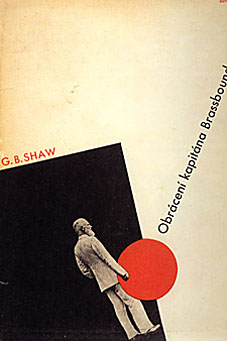
Some nice jacket designs from the Twenties and Thirties at the Smithsonian. I’ve been looking at a lot of Constructivist and Suprematist design recently and some of these come out of those styles. The Shaw jacket above was part of a series. Some of the companion designs can be seen in the excellent A2Z and More Signs by Julian Rothenstein and Mel Gooding.
Via Design Observer.
Elsewhere on { feuilleton }
• The book covers archive
Flowers of Love
Flavor Lab in New Orleans make some incredible
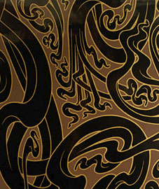
wallpaper designs. This Art Nouveau-inspired
‘Flower of Love‘ design almost demands that any
room it decorates be used solely for drinking
absinthe and smoking opium.
Flavor Lab
4213 Chartres Street
New Orleans LA 70117
Vintage magazine art II
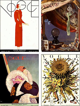
In the days before colour photography most magazine covers were created by illustrators (as the New Yorker still is), a situation that’s left behind a rich legacy of wonderful artwork often far more stimulating than any of the magazine contents. This site has a great collection of early Vogue covers that show an amazing amount of variety and originality at play. Some of these early issues even break with the understandable stricture for a fashion magazine of having a female figure as the focus.
Looking over this selection, it’s impossible not to compare the rich designs of the 1920s with today’s bland uniformity. Vogue now looks like any other magazine for women, with an overly made-up (often celebrity) face filling the cover and the whole picture crowded with sub-headings and a general clutter of typography. UK Vogue‘s own cover archive pages show the gradual degeneration of a stylish flagship to a condition of cultural muzak over the passage of ninety years.
Previously on { feuilleton }
• Vintage magazine art I
• View: The Modern Magazine


