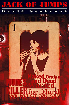
 David Seabrook’s fascinating true crime investigation was published in May by Granta sporting a cover design by yours truly. The Guardian finally managed to review the book this weekend.
Tart visions
Chris Petit shadows David Seabrook as he trails a serial killer through the streets of sixties London in Jack of Jumps
Chris Petit
Saturday August 26, 2006
The Guardian
Jack of Jumps
by David Seabrook
370pp, Granta, £18.99
Between 1959 and 1965 eight prostitutes were murdered in London by a killer who became known as Jack the Stripper because of his habit of dumping the victims’ bodies naked. The murderer was never found. David Seabrook picks up the story in a manic, exhaustive trawl, via old police files, through a fragmented underworld defined by drink, soliciting, unwanted children and bad dentistry. He sifts his evidence with the zeal of a demented anthropologist, taking us back into a pre-decimal world where he notes a weekly disability pension of £2 8s 8d, against a cost of thirty bob for full sexual intercourse (three quid down in Curzon Street). It was a world caught on the cusp between postwar recession, stasis and a dying moral code, and the colour, mobility and licence of the 60s.
The case remains unsolved, despite Seabrook’s best efforts, but that hardly matters when his real subject is metropolitan jetsam and the kind of desperate lives that usually go unnoticed for want of a chronicler. While his category is true crime, his implicit references are to fiction and film, to an imaginative landscape variously represented by the drinking culture of Patrick Hamilton’s lowlife novels and the Notting Hill of the film Performance. Seabrook transforms the stale material of hundreds of “as-told-to” accounts into an act of epic retrieval, full of arcane cross-referencing. Implicit in his argument is a city haunted as much by a lost popular culture as by its missing souls.
Seabrook’s previous book, All the Devils Are Here, contained a memorable cameo of Freddie Mills, who resurfaces in Jack of Jumps. The former boxer ran a Chinese restaurant in Soho and in the early days of television was a popular light entertainer, distinguished by a dopey grin, amiable mugging and a dubious line in knitwear. In 1965 he apparently shot himself in his car in an alley off the Charing Cross Road. Seabrook fails to find anything to support the most scandalous rumour surrounding Mills’s death, that he was the murderer of those prostitutes and had topped himself in a fit of remorse, upon which the murders stopped.
Other theories remain equally elusive: that the victims, all of short stature, were choked during fellatio; that a copper was the killer because the locations where the bodies were dumped suggested someone who knew police divisional boundaries; that the killer had attended the Earl’s Court Motor Show. With greater car ownership, private vehicles played an increasing role in soliciting. Seabrook taps away at the darker recesses of the metropolitan mind, relishing the fact that his subject is so heroically unglamorous. Jack of Jumps is contemporaneous with the Profumo affair, but there are no good-time girls in this account, just lives of hard grind. At its most optimistic, it is a story of coming affluence: as the manhunt intensifies, the police earn a fortune in overtime, something that would have been inconceivable only a few years before.
Seabrook is a tart observer and knows that his obsession borders on the pointless: gumshoe as mug, retreading a worn-down past, chasing ghosts through a litany of pubs and their vanished clienteles, searching for the forgotten, luminous detail (“On this occasion she bought a bottle of Lovibond’s Vat 30 whisky”). Seabrook’s crazed A-Z of the city turns him into a low-life Borges, charting the impenetrable riddles of human behaviour, in a London that feels as foreign and surreal and as remote as Buenos Aires.
Previously on { feuilleton }
• New work out this month
• Borges in Performance

