


An environment by Verner Panton, creator of many classic furniture designs.
Commissioned in 1970 by Bayer AG.
A journal by artist and designer John Coulthart.

Design
An environment by Verner Panton, creator of many classic furniture designs.
Commissioned in 1970 by Bayer AG.
In which your humble narrator enters a contest…
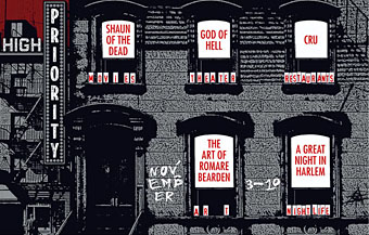
Speak Up, in collaboration with New York magazine, is proud to announce the first-ever open contest to design the visually acclaimed, graphically exhilarating, by-invitation-only “High Priority” feature illustration in the magazine’s year-end, December 18, 2006 double issue.
High Priority highlights five activities, suggested by New York writers, that are not to be missed. Every week designers and illustrators from around the world are invited to create an interpretive typographic illustration to open “The Week” – the listings section of New York Magazine. New York readers place great weight on these five recommendations, and this page is a regular destination for many.
For examples of past editions of High Priority please visit:
New York‘s High Priority archive
Design Observer’s Variations on a Theme: New York‘s High Priorities
I knew about this listings feature from having read the Design Observer piece (I’ve never seen a copy of New York), and liked the idea for what amounts to the design equivalent of a “standard” in jazz, with different designers having to present a riff on the same brief in each issue. The restrictive nature of the problem is part of its appeal; only two colours are allowed (red and black), the box must be the shape it always is, and the design has to incorporate five categories—Movies, Theater (sic), Art, Nightlife and Restaurants—with the date, the words “High Priority” visible somewhere, and the accompanying critics’ recommendation for each category. Aside from that, anything goes.
My attempt can be seen above. I was going to do a couple of different designs then pick the best one but in the end I ran out of time. The initial idea was to do something along the lines of the cover for Physical Graffiti by Led Zeppelin (below) but—as is often the case with first ideas—making it work wasn’t so easy.
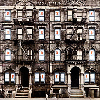
Led Zeppelin’s building is a great photograph of a New York brownstone (the original vinyl sleeve had slots cut in the windows through which the lettering and various pictures on the inner sleeves could be seen); mine had to be pieced together from separate pictures of New York in the 1930s. It doesn’t quite work because there’s not much justification for having the category lettering arranged like rows of birthday cards on the window sills. But maybe I’m being too hasty in pulling it apart when the winner won’t be announced until December 4th. Until then you can browse the 186 other entries. I have to say that the quality of these is really exceptional, if I were one of the judges I’d have a hard time choosing only one. Most of the time I wouldn’t give a second glance to an online contest but this one was fun and the high standard of the other entries has made it worthwhile.
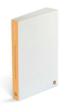
“According to consumer research conducted on what factors matter to people when they decide whether or not to pick up a book in a bookshop, the cover design comes out as most important. So this might be the stupidest thing we’ve ever done.
“…The covers are art-quality paper, and from internal Penguin efforts we know that they hold ink, paint, pencil and glue…. Each one comes shrink-wrapped so the paper doesn’t get dirty, and I hope people might give them as gifts.”
Helen Conford, Senior Commissioning Editor at The Penguin Press.
The latest ploy by Penguin to shift that tricky back catalogue of classics that everyone has heard of but few people read, resorts to what might be called audience interactivity, in other words print a book with a blank cover and the suggestion that the reader draw their own. They’re calling the scheme “My Penguin” which is unfortunate, this has the same treat-me-like-a-child quality as Microsoft’s dreadful “My Computer” and “My Documents”. The new line will be unveiled next week with the following titles: Crime and Punishment by Fyodor Dostoyevsky, Emma by Jane Austen, Magic Tales by the Brothers Grimm, Meditations by Marcus Aurelius, The Picture of Dorian Gray by Oscar Wilde and The Waves by Virginia Woolf.
This is a rather more interesting idea than Headline’s repackaging of Jane Austen as Georgian chick-lit earlier this year, a move guaranteed to disappoint anyone expecting Helen Fielding in period costume. Penguin is asking readers to send in their designs which they’ll then feature in an online gallery. In a way this goes against the traditional function of the paperback which serves as a cheap(ish), easily portable object that’s often treated with considerable disrespect while being used. Anyone who spends a couple of hours crafting their own cover design will quickly find they have a bespoke art object in their home that they want to preserve, not bend out of shape during the morning commute then discard when finished. It’ll be interesting seeing how this project develops. Will many of these unique designs turn up later on the Oxfam shelves along with all the other secondhand volumes, or will people want to keep them? Will we start seeing dedicated collectors of these titles and their artworks? (Some will no doubt be worth a great deal of money in the future if the cover is drawn by a famous owner.) And some are easier to illustrate than others; everyone knows the story of Dorian Gray but what would be suitable for Marcus Aurelius, for instance?
Elsewhere on { feuilleton }
• The book covers archive
Previously on { feuilleton }
• The Picture of Dorian Gray – I

The new masthead designed by Luke Prowse, with a coat of arms
by wood engraver Edwina Ellis.
So, in today’s Neville Brody news (no, I’m not intending on posting about him every day…) it seems the designer has been busy with colleague Luke Prowse making The (London) Times look better. Not before time (so to speak), it was starting to look very out-of-date beside the recent makeovers at The Guardian and Independent. Brody is evidently first choice for these kind of projects at the moment, confirming that he’s still one of our most important print designers.
Among the changes are a new typeface, Times Modern, which has been applied to a new design for the masthead. Considering that this is one of the most famous newspaper mastheads in the world, I hadn’t realised it had changed so much over the years. The Times website has a nice online gallery showing the development from its earliest days as “The Daily Universal Register” through to the present.
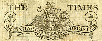
An early edition from 1788.
Brody has said of the new typeface, “Times Modern is a contemporary answer to the needs of compact newspapers. With pinched proportions, it allows more copy in the headline without compromising legibility. It is both authoritative and elegant, while robust at smaller sizes.” Since he’s on record expressing his dislike for Times New Roman, he must have enjoyed being given the opportunity to supplant an ugly and over-familiar font with something more suitable.
Previously on { feuilleton }
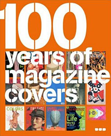
• 100 Years of Magazine Covers
From Black Dog Publishing. Words by Steve Taylor, design by Neville Brody.
If you pick up a copy of this week’s Heat magazine in 30 years time, think how funny it will seem. Our obsession with D list celebrities’ private lives, weight loss and reality TV shows, will become ridiculous in the light of tomorrow’s trends.
Magazines provide us with snapshots of moments in cultural history. Their disposable nature means that they have to sell quickly, and their covers vie for attention on the shelves with images of beauty, sex, shock, humour and celebrity; presenting our fears, desires and aspirations crudely and honestly. When looked at retrospectively, they become fascinating documents that can tell us more about our past self-image than any academic text.
100 Years of Magazine Covers shows the best of these snapshots from throughout the past century. With images from Vogue, Life, Time, The New Yorker, Mayfair, and more subversive publications such as Oz and Sniffing Glue, this book will appeal to anyone and everyone with an interest in popular culture.

Previously on { feuilleton }
• It’s a pulp, pulp, pulp world
• A few thousand science fiction covers
• Vintage magazine art II
• Neville Brody and Fetish Records
• View: The Modern Magazine
• Vintage magazine art
• Oz magazine, 1967–73