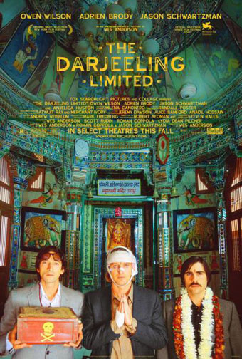
There aren’t many directors whose next films I await with impatience but Wes Anderson is one of them. I still haven’t seen his debut, Bottle Rocket (1996), but Rushmore (1998) was good, The Royal Tenenbaums (2001) was great and The Life Aquatic with Steve Zissou (2004) was a masterpiece. The Darjeeling Limited will be out later this year and stars Owen Wilson (who’s been in all of Anderson’s films apart from Rushmore but he did co-write that one) Adrien Brody, and Jason Schwartzman who made his debut in Rushmore and can be seen in another odd and inventive comedy, I Heart Huckabees. Schwartzman also co-writes this new opus. I have an unproven theory that Anderson is responsible for an annoying trend in recent American independent cinema—the “quirky comedy” which features multiple shots of charmingly flawed characters standing motionless centre-screen while staring at the camera. With groovy music playing on the soundtrack. Anderson does (or did) enough of this but he does a lot more besides. His films are better written and a lot more inventive than those of his imitators.
The most striking thing about the Darjeeling Limited trailers and poster (although it’s not something most people would notice) is the complete absence of Futura. Anderson is possibly unique among filmmakers in having what amounts to an obsession with a single typeface; Futura appears in different weights and styles throughout Rushmore, The Royal Tenenbaums and The Life Aquatic. I’m not quite sure which typeface is used on the poster (and neither are the people at Typophile); Proxima Sans is the closest match I can find but it may be a grotesk variant created specially for the film. I ask you: how many filmmakers are there that can get people talking about their work simply by changing a font?
Previously on { feuilleton }
• Masonic fonts and the designer’s dark materials
• Helvetica: the film

