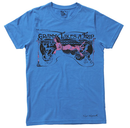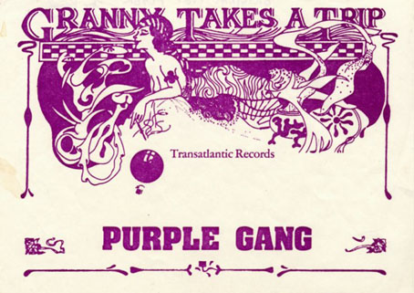
This delightful piece of Art Nouveau-inflected grooviness is one of the new T-shirts designed by Nigel Waymouth for The Look via Topman. Waymouth, as some readers here may know, was part of Hapshash & the Coloured Coat in the late Sixties, London’s leading group of psychedelic poster artists. In addition to design, Waymouth and Sheila Cohen opened the legendary Kings Road boutique Granny Takes A Trip (named after its stock of antique clothes) in 1966. That shop’s fame inspired a one-off single by Stockport group The Purple Gang in 1967 which the BBC banned for alleged drug references, although the trip in question concerns an elderly woman journeying each year to Hollywood. Waymouth’s flyer for the single, of which the shirt design is a variant, can be seen below.
The Look Presents Nigel Waymouth – in-store and online at Topman from Friday August 8
“Sepia tints and flouro tones…darkly psychedelic graphics for the 21st Century…”
Nigel Waymouth is a legend of British rock fashion and design.
Not only did he found the wild 60s Kings Road boutique Granny Takes A Trip (whose ever-changing shop design attracted the likes fo the Rolling Stones, The Beatles, Anita Pallenberg, Brigitte Bardot and Marianne Faithfull), but his graphic design company Hapshash produced eye-popping designs, posters and record sleeves for the The Who and Jimi Hendrix.
Original Hapshash artwork is highly prized in collector circles and Granny’s clothes are seriously sought-after on the vintage market. Now Nigel Waymouth makes his re-entry into fashion via The Look Presents – http://thelookpresents.com – with a contemporary t-shirt range reflecting the original Granny’s aesthetic by delving into decadent psychedelia replete with sepia tints and flouro tones.
The first five t-shirts are available in-store and online at Topman from August 8, with the launch party on August 14 at the George and Dragon in Shoreditch.
The Look Presents Nigel Waymouth is the second collection from the creative hub formed by author Paul Gorman and Soho boutique owner Max Karie. Our first, a collaboration with rock & roll brand Wonder Workshop, proved a great success earlier this summer and this autumn we launch The Look Presents Priceless, a menswear capsule collection with couturier to rock royalty Antony Price.
The shirts are priced £20 each. I rarely wear T-shirts on their own but I’ll probably have to get one of these, for the associations if nothing else.

Previously on { feuilleton }
• The New Love Poetry
• Dutch psychedelia
• Family Dog postcards
• The 14-Hour Technicolor Dream revisited

 Also this week, Yvonne at Nemeton picked { feuilleton } as one of her nominations for the I Love Your Blog award. While I’m going to sidestep the difficult choice of having to pass the award on (which would require nominating a new group of people) I can at least add Nemeton—described as “musings on philosophy, politics, mysticism, geeky stuff, literature, news and ideas”—to the blogroll. Thanks Yvonne!
