Obsolete formats continued

cassette.jpg

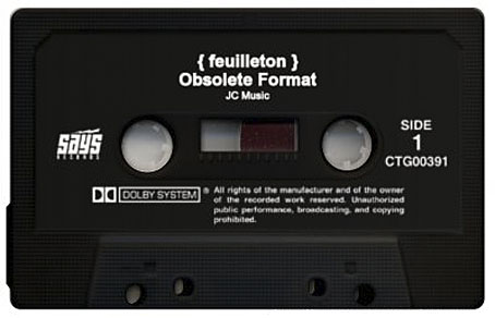
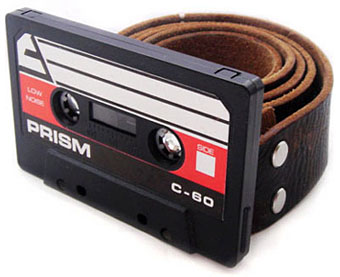
Following yesterday’s post, more cassette culture. Cassette Generator allows you to make your own labelled cassette graphic like the one above. I’m not quite sure this has any compelling purpose but that’s the web for you. For the question of what to do with the world’s stock of unwanted cassettes, Designboom has a few suggestions, including the belt buckle below. If you need more bling, there’s also a gold version. And for real obsessives, there’s Tapedeck.org.

cassette2.jpg

Previously on { feuilleton }
Old music and old technology

Old music and old technology

autobahn1.jpg

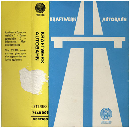
Clearing junk today turned up some obsolete artefacts one of which (the Kraftwerk) has been kept for purely sentimental reasons. It’s been amusing the past few years watching the vinyl disc refuse to crawl onto the scrapheap of history despite its death having been announced many times over by journalists who should know better. Several of the CD releases I’ve designed recently have also been brought out in vinyl editions. Meanwhile the audio cassette really is on the way out: “Sales of music cassettes in the U.S. dropped from 442 million in 1990 to about 700,000 in 2006” says Wikipedia. I certainly won’t mourn its passing; portability aside, I always hated these things. Music sounded shitty unless the tape was chrome or some other high-quality format, and whatever the quality they were all subject to mangling by cheap cassette players.

Continue reading “Old music and old technology”

Alan Aldridge: The Man With Kaleidoscope Eyes

wind_from_nowhere.jpg

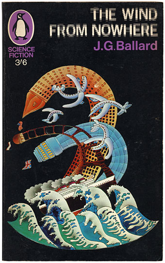
I’ve never been all that keen on Alan Aldridge‘s brand of psychedelic art but it’s worth noting here the (London) Design Museum retrospective which runs from 10 October to 25 January, 2009. Aldridge’s work as a designer and illustrator for Penguin Books in the Sixties impresses me more than his subsequent illustrated Beatles lyrics and The Butterfly Ball and the Grasshopper Feast (1973), a pair of books which seemed ubiquitous in the 1970s. Flickr has a decent selection of his book covers which included a run of sf paperbacks in 1967. Ballard’s The Wind from Nowhere is the very slight debut novel which the author prefers to forget. Where Ballard in Penguin is concerned, David Pelham’s work a few years later was a far more suitable match.

Seeing Aldridge honoured with a big retrospective make me wonder why Roger Dean hasn’t yet been given the same accolade. Dean for me is by far the better artist in terms of distinctive and memorable imagery; he’s also a better draughtsman and far more imaginative designer (not to mention having always been a speculative architect). I suspect Dean’s reputation is still blighted by his associations with Yes and the general antipathy which that band’s name generates in a certain middle-aged sector of Britain’s cultural commentariat. Ballard’s name was equally blighted in literary circles by his science fiction associations and it was Barcelona, not London, which honoured him with a major exhibition recently. There may be some home-grown reappraisals in the offing but I won’t hold my breath.

Elsewhere on { feuilleton }
The book covers archive
The illustrators archive

Previously on { feuilleton }
Ballard in Barcelona
The New Love Poetry
Penguin Labyrinths and the Thief’s Journal
Penguin designer David Pelham talks
Barney Bubbles: artist and designer

Dark horses

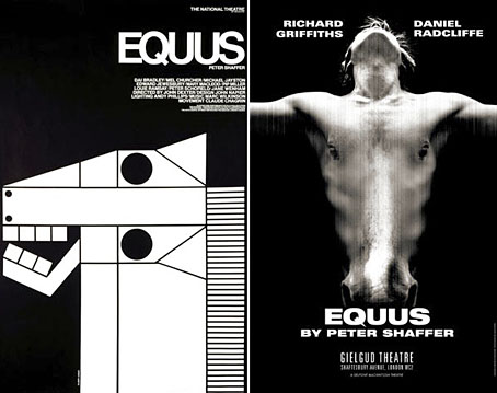
equus1.jpg

A juxtaposition of old and new theatre posters in the New York Times caught my eye this week, part of a feature about the current Broadway run of Peter Shaffer’s play. The news there, of course, has been Daniel Radcliffe’s on-stage nudity; understandable, perhaps, but celebrity trivia has overshadowed appraisal of Shaffer’s work as a piece of art.

What struck me seeing these was the two very different approaches to the same design problem. Given the subject matter, using an image of a horse is somewhat unavoidable as well as being immediately attractive since horses nearly always look good. The freight of historical and cultural association they carry is also one of the themes of the play. I really like the spare treatment of Gilbert Lesser’s 1976 poster for the National Theatre (left) and much prefer it to the new version used for the London and New York shows. The Lesser poster has the quality of a puzzle, matching the psychological piecing together of the story and Alan Strang’s accusation that Dysart the psychiatrist is always “playing games”. It also has a sinister quality lacking in the contemporary version; Shaffer’s Equus is an unforgiving god and the black eyes could refer to the blinded horses. The Photoshop horse looks altogether too mundane and is it my imagination or is the horse head misshapen slightly in order to fit the torso?

Continue reading “Dark horses”

The Mindscape of Alan Moore: US edition

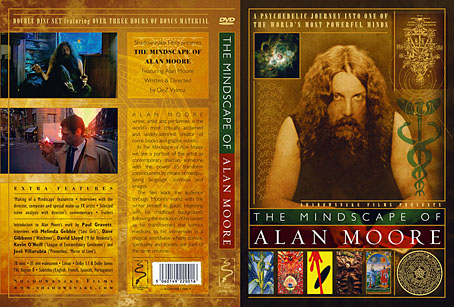
mindscapecover.jpg

Yes, it’s that film again. The feature-length documentary by DeZ Vylenz about the Northampton Magus receives its official US release through Disinformation on September 30th. I designed the packaging (the original EU inlay is shown above) and the DVD menus.

As I’ve said before, this is a great film—shot on film, not video—a revealing insight into Alan’s life and work. The set includes a bonus disc of interviews with Alan’s artist collaborators: his wife, Melinda Gebbie (Lost Girls), Dave Gibbons (Watchmen), David Lloyd (V for Vendetta), Kevin O’Neill (The League of Extraordinary Gentlemen) and José Villarubia (Promethea, The Mirror of Love); also an interview with comics historian Paul Gravett.

Big Shiny Robot interviewed director DeZ this week and there’s a trailer at the Shadowsnake Films site. The Mindscape of Alan Moore should be available from all the usual DVD retail outlets.

Previously on { feuilleton }
The Demon Regent Asmodeus
New things for June
Alan Moore in Arthur magazine
Watchmen
Alan Moore interview, 1988