Three alphabets

mitelli.jpg

E is for Elefante.

Last week I was trying without success to find the origin of a calligraphic alphabet I have in a book about ornamental typography. A failed quest but the search did turn up a couple of those illustrated alphabets that were popular in the 17th and 18th centuries, including this first one which I have as poor reproductions in another book. Alfabeto in Sogno (“Dream Alphabet”), a book of etchings by Giuseppe Maria Mitelli, dates from 1683, and shows the letters of the alphabet constructed by posing human figures, some of which require props to create their letters. A common feature of the abecedary is an attempt to match one or more details in the picture to the letter in question, something which Mitelli does with a small illustration of an animal. Each of his plates also includes a few lines of verse and the less common addition of details intended to help students of drawing.

betti.jpg

E is for Endymion.

A’ dilettanti delle bell’ arti (“To the Amateurs of the Fine Arts”, 1785) by Giovanni Battista Betti opts for an easier method of depicting human-sized letterforms with a series of tableau-style caprices in which the shapes of the letters are formed by baroque curlicues or lengths of fabric arcing around the figures. Not all of these figures are human. Where Mitelli matches animals with each letter, Betti chooses characters from mythology—Bacchus, Endymion, Faunus, Ganymede and so on—or fills the space with the putti that are ubiquitous fixtures of the art of this period. You can take this as a quiz without an immediate solution: I couldn’t decipher the identities of all the non-putti characters but then my knowledge of Classical mythology isn’t very thorough.

basoli1.jpg

B is for Babylon.

The third alphabet is one that’s appeared here before, the Alfabeto Pittorico (1839) of Antonio Basoli, but the copies I linked to ten years ago were hosted on a dubious Russian site which is now defunct. No matter, all the plates may now be seen at Gallica where they should have a more permanent home. Basoli’s abecedary is my favourite of the three, being a collection of very plausible architectural designs that pastiche the building styles of different countries or eras. Once again the viewer is challenged to try and match the letter with the view in which the letter-building is situated. Some of these are very easy (the identity of H with “harem” is revealed by a sign above the door) while others are complicated by Basoli’s loose interpretation of ancient architecture. As for assignation of the ampersand below, that’s anybody’s guess.

basoli2.jpg

Elsewhere on { feuilleton }
The etching and engraving archive

Previously on { feuilleton }
Liber Artificiosus Alphabeti Maioris
Abeceda
The Royal Picture Alphabet
Giovanni Battista Pian’s Pictorial Alphabet
Antonio Basoli’s Pictorial Alphabet
Grand capitals
Paulini’s mythological alphabet
Lettres et Enseignes Art Nouveau

mulier1.jpg

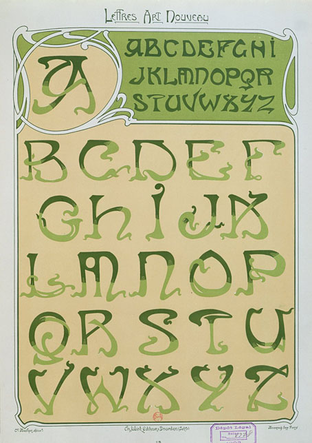
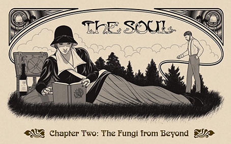
These lettering designs were posted at Wikimedia Commons in the summer but I’ve only just noticed them this week. I’d been searching for Étienne Mulier’s designs while working on the six-part story about Miss Adeline Carr, aka “The Soul”, in the Bumper Book of Magic, the idea being to have each chapter open with the character’s name in a different Art Nouveau lettering style. If you look at enough bookselling sites you can eventually find one or two large photos of Mulier’s pages which is what I used when creating the heading for the second chapter of the story; but I still would have preferred to have had access to the whole collection. As it happens, most of the Wikimedia plates have also come from bookselling sites but they’re a slightly better collection than the ones I found.

soul.jpg

Mulier’s plates were published in 1901, presented not in book form but as a collection of loose lithographs in a card portfolio; the “Enseignes” in the title are suggestions for shop signs. Mulier also throws in a couple of less practical designs showing alphabets created by posing flamingos. The loose-leaf format is a useful one for something intended to be consulted by artists and craftspeople. Books could be awkward things in the days before digital scanning and photography if you wanted to trace something from a page which wouldn’t lie flat. The Mulier design I used for The Soul isn’t a perfect alphabet—the letters K and M could do with improving—but it’s a good example of the French approach to Art Nouveau lettering (and Art Nouveau design in general) which tends to be more loose and plant-like than equivalents from Germany or the Netherlands. The organic appearance of the letterforms suited the chapter I was illustrating which opens with a hunt for magic mushrooms.

mulier2.jpg

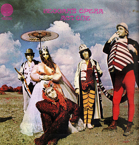
Mulier’s plates don’t appear to have been turned into printable fonts until the 1960s when the revival of interest in Art Nouveau prompted the creation of filmtype adaptations. Fontsinuse shows a rare print example on the cover of an album by Scottish prog band Beggar’s Opera, a version of the typeface which filled in the bi-chromatic letters and slightly altered their forms. “One of the ugliest typefaces ever created,” says Mr Hardwig. I can think of worse. More recently we have the inevitable digitisations, with Art Nouveau Caps being the closest to Mulier’s original. I was tempted to use a digitised version for the story but I find that many amateur (or semi-professional) digitisations of old typefaces are often crude things compared to the originals. I also liked the bi-chromatic effect so I ended up drawing my own copies of the letters I needed.

Previously on { feuilleton }
Bergling’s Art Alphabets
Typefaces of the occult revival

Another view over Yuggoth

yuggoth1.jpg
The original Yuggoth collage, 1994.

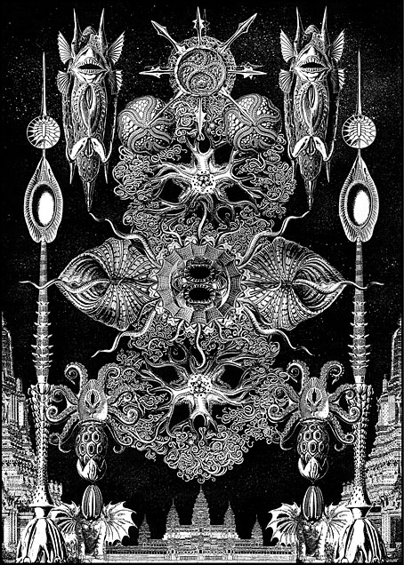
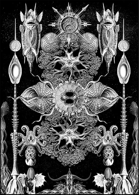
Three years ago I resurrected my panorama of R’lyeh from The Call of Cthulhu, a process that took five months from start to finish as I redrew a large and very detailed picture. Last month I spent a much shorter time doing the same for one of the other pieces of art that went missing after being printed in 1994, the Haeckel collage that I titled Yuggoth. I don’t think I’ve mentioned before that this was originally created as a potential cover for the first edition of the Starry Wisdom collection published by Creation Books. My Cthulhu strip had already been accepted for the book when I was asked to create something for the cover. The painting I eventually submitted was rather mediocre, not terrible but I’d only been painting with acrylics for a year or so and was still getting used to the medium. By the time Creation rejected the cover the print deadline was approaching so I had little time to create anything new. Having recently bought a copy of the Dover edition of Ernst Haeckel’s Art Forms in Nature I decided to try and make a suitably Lovecraftian collage using Haeckel’s prints.

yuggoth4.jpg
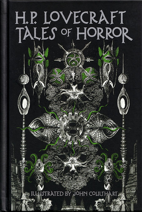
The original collage as it appeared on the cover of HP Lovecraft: Tales of Horror in 2022. Cover design by Jo Obaroswki.

Yuggoth was the result, created in a day or so after I’d rushed to the local copy shop and returned with a large quantity of paper which I chopped up then tried to assemble into a coherent form. I duly posted the result to Creation unaware that they’d already decided to use some of Peter Smith’s Lovecraft art on the cover. I was okay with this, I liked Smith’s drawings and Yuggoth ended up appearing inside the book. Despite the hasty production process I’d taken the precaution of photocopying the collage before it went into the post, something I did with the rest of the artwork, so even though the original Yuggoth was lost (or stolen or whatever actually happened to all that artwork) I’ve still had something which was usable years later. It was this photocopied version that appeared a few years later in my Haunter of the Dark book, as well as on the cover of the Fall River Lovecraft collection, Tales of Horror, in 2022.

yuggoth2.jpg

The reworked Yuggoth collage, 2024.

The photocopied version was usable, then, but not ideal. The original collage had been made with photocopies produced by a machine which didn’t deal very well with the halftones in Haeckel’s plates. This gave the final piece a rough, posterised quality, the roughness being intensified once the whole thing was copied again. The resurrected version has been pieced together from scans of the original Haeckel book with everything in the same size and (almost) the same placement as before, only now all of the hafltones and other fine detail are intact. And while I was going to all this trouble I decided to change the architectural details in the original to something more in keeping with the rest of the picture. The planet Yuggoth (or Pluto as human beings know it) is more alluded to than actually described in Lovecraft’s fiction, but we do know that the place is inhabited by a race of fungoid aliens. I’ve always thought of Yuggoth as being architecturally rich as well as inhabited, rather like the alien worlds that Frank R. Paul used to paint for the back covers of Fantastic Adventures magazine, but in my haste to create the collage I’d resorted to copying Cambodian and Thai temples from a book of architectural engravings. These have now been replaced by structures that are more in keeping with the other elements. Using Haeckel for architectural inspiration has a minor history, as I’ve noted before. The French architect and designer René Binet had been looking at Haeckel’s plates in 1900 when he designed the arched gateway for the Exposition Universelle in Paris. Binet later expanded on this design with Esquisses Décoratives, a book of proposals for more Haeckel-derived architecture produced in collaboration with Gustave Geffroy.

yuggoth3.jpg

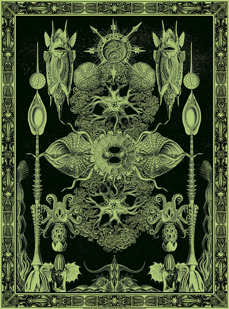
The tinted version you see here is now available as prints and other products at Redbubble. My shop there is still a little understocked but I intend to keep adding to it in the coming months. As before, I’ll mainly be doing prints at Redbubble, all my T-shirt sales are now being handled by Skull Print. The latter emailed their final dates for pre-Xmas orders today: 6th December for overseas and 18th December for the UK. Skull Print will also be taking a break at the beginning of January so they won’t be dealing with any new orders until the 15th of that month. Thanks.

Elsewhere on { feuilleton }
• The Lovecraft archive

Previously on { feuilleton }
• Ghost Box and The Infinity Box

Richard M. Powers album covers

powers10.jpg

Berlioz: Symphonie Fantastique (1958); Charles Munch, Boston Symphony Orchestra.

Continuing an occasional series about artists or designers whose work has appeared on record sleeves. Richard M. Powers is one of those illustrators whose work is remembered today for his many covers for SF books and magazines even though his commissions often took him away from the genre. Powers’ early paintings for record companies use the wiry illustration style that was popular during the 1950s, few of them resemble the X-ray views or amorphous, Tanguy-like forms that populate his cosmic vistas and alien worlds. The cover for Symphonie Fantastique is an exception, justified by the suite’s narrative thread which involves visions seen in an opium dream.

Powers is also unique, I think, in having an entire album of music dedicated to his SF covers, Powers (12 Sound Pieces Inspired By The Art Of Richard M. Powers) by Andy Partridge. This album doesn’t feature any of Powers’ own artwork but the illustrations are done in his style so the cover has been included in this list.

powers01.jpg

Mendelssohn: Symphony No. 3 in A Minor “The Scotch” (1955); Music Appreciation Symphony Orchestra.

powers02.jpg

Tchaikovsky: Symphony No.6 In B Minor, Op.74 – Pathétique (1956); Leonard Bernstein, Music Appreciation Symphony Orchestra, The Stadium Concerts Symphony Orchestra.

powers03.jpg

Verdi: Rigoletto (1956); The Metropolitan Opera Orchestra And Chorus conducted by Fausto Cleva, Robert McFerrin, Sr.

powers04.jpg

Johann Strauss: Die Fledermaus (1956); Tibor Kozma, The Metropolitan Opera Orchestra And Chorus.

powers05.jpg

Mozart: The Marriage Of Figaro (Highlights) (1956); Vienna Philharmonic Orchestra, Erich Leinsdorf, Giorgio Tozzi, Roberta Peters, Lisa Della Casa, George London, Rosalind Elias.

Continue reading “Richard M. Powers album covers”

Weekend links 753

brewer.jpg

Grow (1970) by Linda Brewer.Via.

• The week in work-related reviews: Raymond Tyler reviewed the Bumper Book of Magic at Religious Socialism, while James Palmer did the same at Foreign Policy. Meanwhile, Rob Latham at the Los Angeles Review of Books examined the legacy of the New Wave of science fiction with reviews of New Worlds 224, and The Last Dangerous Visions, Harlan Ellison’s long-delayed story collection.

• “Incline Press is a private fine press publisher in the UK, stubbornly printing with hand set, metal type on a collection of vintage machines, working with poets and artists to make limited edition books and ephemera.”

• New music: Horses In Your Blood, another dose of unhinged weirdness from Moon Wiring Club; The Source by Jon Palmer; and Ekkorääg by Tarotplane.

• At Dennis Cooper’s: Spotlight on…Rikki Ducornet The Fan-Maker’s Inquisition: A Novel of the Marquis de Sade (1999).

• At Smithsonian Magazine: “Rare atlas of astronomy from the Dutch Golden Age goes on display in England“.

• Old music: Jon Savage’s Space, a space-themed compilation on Caroline True Records.

• At The Daily Heller: Berman’s Book Boom is a boon to graphic design’s legacy.

• At Public Domain Review: Christoph Jamnitzer’s Neuw Grotteßken Buch (1610).

• Mix of the week: A Dungeon Synth mix by Flickers From The Fen for The Wire.

• At Heavy Metal Magazine: The HP Lovecraft Art of John Holmes.

• At The Quietus: The Strange World of…Laurie Anderson.

I Can Hear The Grass Grow (1967) by The Move | Grow Fins (1972) by Captain Beefheart | The Growing (2011) by The Haxan Cloak