Weekend links 703

hallbeck.jpg

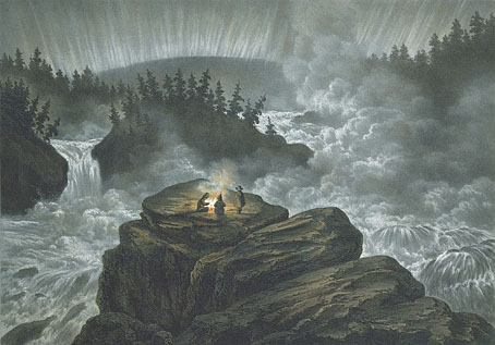
Njommelsaska i Lappland (1856) by Carl Svantje Hallbeck.

101 hidden gems: the greatest films you’ve never seen. Not another clickbait listicle of Hollywood fare that you really have seen, this is 101 films from Sight & Sound‘s annual poll of critics and directors, each of which only received a single vote. Cinema from the silent era to the present day, “from every continent but Antarctica”, all presented on a single page, and with accompanying notes from the voters. I’ve only seen four of these so it’s a list to mine for the future.

• 2024 will see the 100th anniversary of the publication of the first Surrealist manifestos, so the following new books are making their presences known before the celebratory rush. At Colossal: extracts from New Surrealism: The Uncanny in Contemporary Painting by Robert Zeller; at AnotherMag: photos by Coco Capítan of Salvador Dalí’s home at Port Lligat.

• “Cocteau was like one of those magicians who, having announced that they are going to reveal the secret of one trick, immediately perform another.” Pierre Caizergues introducing extracts from The Secrets of Beauty, a small book of aphorisms by Jean Cocteau, newly translated into English by Juliet Powys.

• More Michael Powell: “Scorsese says The Red Shoes is in his DNA”: Thelma Schoonmaker on her life and work with Michael Powell and his friend Marty.

Dennis Cooper’s favourite fiction, poetry, non-fiction, film, art, and internet of 2023. Thanks again for the link here!

• At The Daily Heller: Book covers by Iris Alba (1935–1993), art director, illustrator and graphic designer.

• At Smithsonian Magazine: See the newest underwater sculptures residing on the floor of the Caribbean.

• At Wormwoodiana: Douglas A. Anderson goes looking for the fantasy fiction of Raymond Chandler.

• At Public Domain Review: Paige Hirschey on Anna Atkins’ cyanotypes.

Entries for the Northern Lights Photographer of the Year 2023.

• At Bibliothèque Gay: Der Mann in der Photographie, 1954.

Aurora (1971) by Tonto’s Expanding Head Band | Aurora (2005) by Alva Noto + Ryuichi Sakamoto | Aurora Liminalis (2013) by William Basinski + Richard Chartier

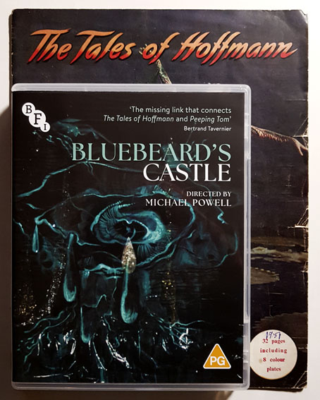
Powell’s Bluebeard on blu-ray

bluebeard1.jpg

My film viewing at the weekend included a return visit to Michael Powell and Emeric Pressburger’s opéra fantastique, The Tales of Hoffmann, followed by the new blu-ray restoration of Powell’s Bluebeard’s Castle. This is the third time I’ve written about Powell’s film of the Bartók opera, the first occasion being a “When will I get to see this?” post, the second a review of a VHS copy which had turned up on YouTube. The new release, which is the film’s debut appearance on disc, is a restoration by the BFI under the supervision of Thelma Schoonmaker and Martin Scorsese.
bluebeard2.jpg

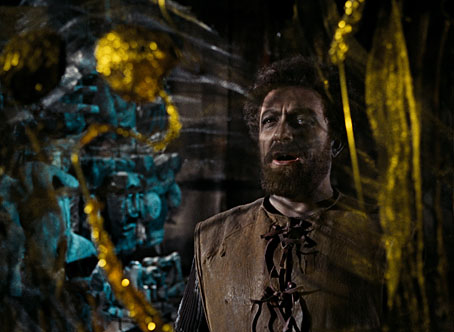
Norman Foster (Bluebeard).

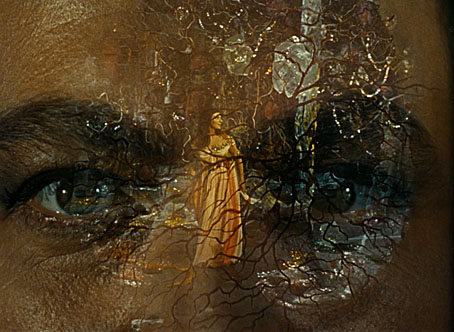
Powell directed the hour-long dramatisation for the German TV channel Süddeutscher Rundfunk in 1963, at a time when his career was in the doldrums following the critical outrage provoked by the release of Peeping Tom. The production was a smaller one than he was used to but it was still shot on 35mm which has now been polished to a breathtaking degree, revealing rich shadows, deep colours and a profusion of glittering detail. (See this clip.) The audio track remains monophonic but the sound is a great improvement on the VHS version. Seeing the latter was gratifying after so long a wait but was also an underwhelming experience. The restoration proves once again how unfair it is to judge filmmakers from a low-grade copy of their work that’s been thrown onto the internet.
bluebeard3.jpg

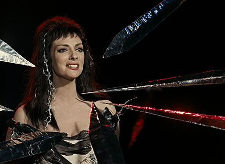
Ana Raquel Satre (Judith).

Bluebeard’s Castle (or Herzog Blaubarts Burg, to use the film’s German title) wasn’t a project that Powell inaugurated. Hein Heckroth, the production designer on many of Powell and Pressburger’s colour features, had been working for German TV since the late 1950s, and suggested to singer/producer Norman Foster that Powell might be interested in directing the film. The presence of Heckroth’s weirdly Expressionist designs give Bluebeard’s Castle a continuity with the extended ballet sequence in The Red Shoes and the “Giulietta” episode of The Tales of Hoffmann; all three stories share a dream-like atmosphere whose grading to nightmare is enhanced by Heckroth’s decors. I’ve often wondered whether the strangeness of some of Heckroth’s set designs, whose aesthetics extend to Dalínean Surrealism, were a factor in the frequent grumblings of distaste expressed by British critics for Powell and Pressburger’s films even before Powell made Peeping Tom. The first film that Powell worked on was The Magician in 1926, Rex Ingram’s adaptation of the Somerset Maugham novel, and a film which is at its best in its moments of visual excess. Powell’s films are valued today for their own visual excess but this quality hasn’t always been encouraged in British cinema, as Ken Russell later discovered. Favourable critics like Ian Christie often point to this as part of the “European” sensibility of Powell and Pressburger’s oeuvre, something which is present even when the subject matter is very English. Pressburger was a Hungarian emigré, while Powell met Ingram when he was living in the south of France; the production designers on all the major P&P films, Alfred Junge and Hein Heckroth, were both German, and the films themselves, especially The Red Shoes and The Tales of Hoffmann, feature a host of different nationalities. Watching Bluebeard’s Castle again I was reminded of Italian horror cinema, especially the films of Mario Bava. When you combine the artificiality of Heckroth’s sets with the Gothic story of a woman imperilled by a powerful aristocrat, plus the resemblance of Ana Raquel Satre to Barbara Steele, the whole thing assumes a very Bavaesque flavour.
bluebeard4.jpg

On a musical level I much prefer Bartók to Offenbach, (although Offenbach’s famous Barcarolle is always worth hearing) so I’m pleased that this minor work has been treated to the same restorative care as The Tales of Hoffmann. The 1988 version of Bartók’s opera directed for the BBC by the late Leslie Megahey remains my favourite filmed Bluebeard even though it lacks Powell’s flamboyance; Megahey’s film has more gravitas, and the direction, performances and musical recording are better. But seeing Powell’s film again revealed nuances I’d missed before, like the sustained shot near the end when Judith seals her fate by asking for the key to the forbidden room. It also makes a change hearing the whole thing sung in German, a language I can understand in parts. Bluebeard’s Castle is a further example of Powell’s idea of a “composed film”, a work that would combine all the dramatic arts. (Or almost all—this one lacks dance.) As I said ten years ago, it may be minor compared to the films that he made with Emeric Pressburger but it offers a more satisfying coda to his career than his final features.

Previously on { feuilleton }
Bluebeard’s Castle, 1981
Powell’s Bluebeard revisited
Joseph Southall’s Bluebeard
Leslie Megahey’s Bluebeard
Powell’s Bluebeard
The Tale of Giulietta

A Wizard with a Pen

wizard.jpg

The wizard is Mr Alan Moore who celebrated his 70th birthday last month. This piece is my contribution to Alan Moore: Portraits of an Extraordinary Gentleman, a birthday book put together by Smoky Man, curator of the Alan Moore World blog:

This 150-page volume contains short essays, memories and portraits by 50+ contributors including Gary Spencer Millidge (cover), Iain Sinclair (foreword), Peter Hogan (afterword), Paul Gravett, Russell Willis, John Coulthart, Koom Kankesan, Gene Ha, Zander Cannon, Hilary Barta, Jacen Burrows, Eduardo Risso, Hunt Emerson, and more…

100% of the net profits proceed from this book are to be donated to the NGO Doctors Without Borders. (more)

The book is a print-on-demand production via Amazon so anyone interested in a copy should click the above link which will direct you to a regional outlet. I’d have preferred the printing to have avoided Bezos’s feudal empire but the decision wasn’t mine to make.

As for the artwork, after spending the past couple of years looking for examples of the style I refer to as “the groovy look” I’d been itching to do something similar myself. Alan happens to enjoy this look as well—see all those Promethea covers, especially the one for issue 16 which nodded to Peter Max. Alan also likes the Beatles’ psychedelic years so my portrait is a riff on the Yellow Submarine art style: small head, big feet, and the same Kabel typeface they used for the film titles. The garment pattern is the Art Nouveau wallpaper design by André Morisset that I resurrected last year, and which I’ve been using in another project that’s yet to see the light of day. More about that later.

Previously on { feuilleton }
32 Short Lucubrations Concerning Alan Moore
Voice of the Fire by Alan Moore
The Blake Video
The Cardinal and the Corpse
Mapping the Boroughs
Art is magic. Magic is art.
Alan Moore: Storyteller
Alan Moore: Tisser l’invisible
Dodgem Logic #4

Weekend links 700

demorgan.jpg

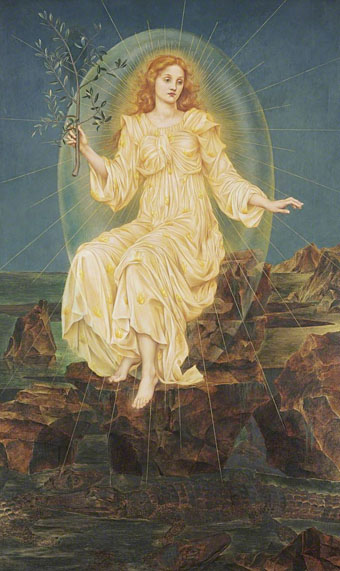
Lux in Tenebris (1895) by Evelyn De Morgan.

• “NASA celebrates the worm logo designer, Richard Danne“. Until I read this story (and this one) I wasn’t aware that the NASA logos were known as The Meatball and The Worm.

The Red Shoes: behind the scenes of the classic Powell and Pressburger film – in pictures. Related: Kings of the movies: Martin Scorsese on Powell & Pressburger.

• The 700th weekend post happens to arrive on Alan Moore’s 70th birthday. Many happy returns to the Northampton Magus.

Fundamentally, we face a choice. Either:

• it’s a coincidence that, of all the possible values that the finely tuned constants of physics may have had, they just happen to have the right values for life;

or:

• the constants have those values because they are right for life.

The former option is wildly improbable; on a conservative estimate, the odds of getting finely tuned constants by chance is less than 1 in 10-136. The latter option amounts to a belief that something at the fundamental level of reality is directed towards the emergence of life. I call this kind of fundamental goal-directedness ‘cosmic purpose’.

As a society, we’re somewhat in denial about fine-tuning, because it doesn’t fit with the picture of science we’ve got used to. It’s a bit like in the 16th century when we started getting evidence that our Earth wasn’t in the centre of the universe, and people struggled to accept it because it didn’t fit with the picture of the universe they’d got used to. Nowadays, we scoff at our ancestors’ inability to follow the evidence where it leads. But every generation absorbs a worldview it can’t see beyond. I believe we’re in a similar situation now with respect to the mounting evidence for cosmic purpose. We’re ignoring what is lying in plain view because it doesn’t fit with the version of reality we’ve got used to. Future generations will mock us for our intransigence.

Philip Goff, professor in philosophy at Durham University, making an argument for cosmic purpose

• At Spoon & Tamago: Exploring Japanese Hell through art from the 12th to 19th century.

• New music: Turning The Prism by Ben Frost, and Sanctuary Of Desire by Steve Roach.

• Mix of the week is DreamScenes – November 2023 at Ambientblog.

• DJ Food looks at Tomi Ungerer’s Electric Circus posters.

• At Dennis Cooper’s: Alain Resnais Day.

Strange Flowers visits the Villa Stuck.

Diet Of Worms (1979) by This Heat | Opera Of Worms (1981) by Van Kaye & Ignit| Wormhole (2002) by Cliff Martinez

Return to Square

ctg.jpg

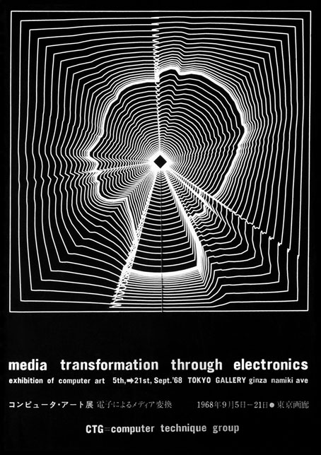
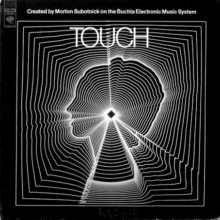
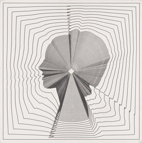
“Media transformation through electronics” might be a description of the internet but the phrase here is the title of an exhibition of Japanese computer art by CTG, the Computer Technique Group, which took place in Tokyo in 1968. The image on the poster is Return to Square, an example of incremental transformation conceived by Masao Komura and programmed by Kunio Yamanaka which is the most well-known work produced by the group. Morton Subotnick used Yamanaka’s print a year later on the cover of his third album, Touch, which is where I first encountered it.

touch.jpg

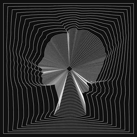
After reading this recent interview with Subotnick I was listening again to some of his albums, Touch included, which in turn prompted me to go looking for more information about the cover art. Following Yamanaka’s history back to the CTG revealed two versions of Return to Square. The image on the exhibition poster and the Subotnick cover is the second version, Return to Square (b) which in both cases is printed in negative, or reversed-out to use the technical term that printers prefer. This version takes 30 incremental steps from the shape of the woman’s head to reach the central square.

yamanaka.jpg

The first version, Return to Square (a), is more densely printed inside the head, taking 50 steps to reach the central square. According to a description in the Cybernetic Serendipity catalogue (see below), the difference between the versions is also a result of the programming: version (a) is programmed with an arithmetic series, while version (b) uses a geometric progression. Return to Square (a) achieved some prominence of its own when it was reproduced in 1967 by Motif Editions, a British publisher of lithographs who made prints from several images derived from experiments with computer graphics. I can’t say where Subotnick first saw Yamanaka’s print but it’s a great choice for the cover of an album of avant-garde electronic music. You’ll only see it today, however, on old vinyl copies (or on 8-track cassettes) since Touch hasn’t been reissued as a standalone album since 1972. The whole composition runs for 30 minutes which means on CD (or audio-DVD, as with one of my discs) you only find it bundled with other Subotnick compositions.

vogue.jpg

Photo by William Klein.

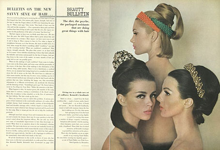
While tracing the history of Yamanaka’s print I didn’t expect to find the source for the outline of the woman’s head but here it is, a spread from a 1964 issue of Vogue magazine. This detail comes from a short post by Zihou Ng which not only gives you the code that Yamanaka used to create Return to Square (a) but also has a small interactive rendering of the image which you can push around and distort: “media transformation through electronics”.

return.jpg

Less successful than Ng’s recreation is this attempt by myself to make a version of Return to Square (b) in Illustrator. I use Adobe’s vector-graphics application almost as much as I use Photoshop but some of the standard Illustrator tools I find to be of limited utility. The shape-blending tool is one of these but it’s what I used to make this recreation. The lack of accuracy is a result of its limited settings: you define the number of steps you want it to take then click on two shapes in succession and the tool fills the space between them with iterative transformations. Rather a blunt instrument but this took me all of 15 minutes to create, a fraction of the time that Yamanaka would have spent programming his original.

• Related reading: Cybernetic Serendipity, PDFs (high- and low-res) of a catalogue for an exhibition of computer art at the ICA, London, in 1968. Includes a profile of the Computer Technique Group with examples of their work. The low-res scan has a few extra pages at the end which include an ad for Motif Editions.

Previously on { feuilleton }
Gioconda of the Mausoleum
Golden apples and silver apples