The case of the fin de siècle fleuron

artnouveau.jpg

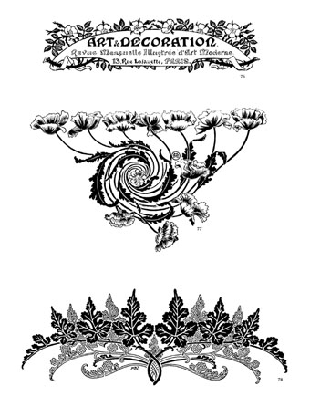
I said yesterday that poppies are a common feature of the fin de siècle magazines for the convenient way they combine long-stemmed flowers—ideal for all those Art Nouveau flourishes—with narcotic connotations that signal Decadence. The spiralling fleuron above is one example that readers of Savoy books may recognise, an occasional company logo which has been in use since the mid-1980s. David Britton chose the design from one of the Dover Pictorial Archive books, Carol Belanger Grafton’s Treasury of Art Nouveau Design and Ornament, and I later made a digital version from this page scan.

heroes.jpg

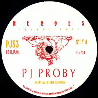
One of the earliest Savoy uses, a label design for Heroes (1986) by PJ Proby.

Having spent a great deal of time in recent years trawling through Art Nouveau magazines I was sure I was going to run into the original printing of the fleuron eventually. Some of the page decorations in Jugend are very similar but it wasn’t there or in Pan, Deutsche Kunst und Dekoration or The Studio. I don’t have a copy of the Grafton book, and Dave says his copy is lost, so I’ve no idea whether there’s a credit for the source of the designs; not all Dover books credit their source material in any detail. Earlier this week I decided to look in Art et Décoration, a magazine that was the French equivalent of The Studio, since the header at the top of the scanned page implied that the other designs might be from the same magazine. Aside from a couple of copies at the Internet Archive this means looking through the poor-quality scans at Gallica; by a fluke—because they don’t seem to have a complete run of the early issues—the January 1898 edition contained the page below showing the Savoy fleuron, an endpiece for an article devoted to another French art magazine, L’Image.

Continue reading “The case of the fin de siècle fleuron”

Cocorico graphics

graphics01.jpg

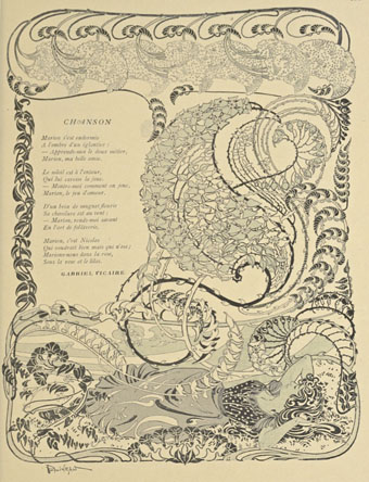
A final visit to Cocorico, the French humour magazine of the fin de siècle. Where graphics are concerned I’ve ignored the cartoons to concentrate on the Art Nouveau decoration which is plentiful in the early issues. The star here is Louis Popineau, an artist I only knew from the excessively florid page above which is reprinted sans poem in one of my design books. Popineau enjoyed foliage running riot in this manner but the magazine also features several of his excellent coloured prints. There’s a lot more of this type of work in the complete run of the magazine which may be found at the Internet Archive.

graphics02.jpg

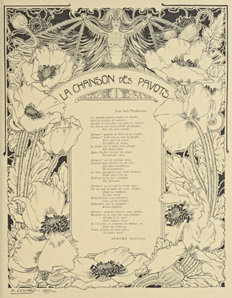
A paean to the poppy by Jérome Doucet illustrated by Adolphe Cossard. Poppies were a very popular plant in the 1890s for obvious naroctic reasons. Cossard made them a feature of his cover for issue 32.

graphics03.jpg

Continue reading “Cocorico graphics”

Cocorico covers

cocorico01.jpg

Alphonse Mucha.

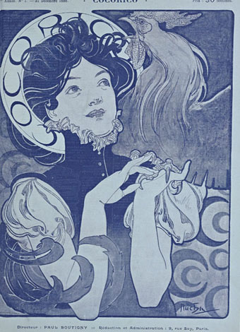
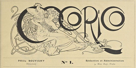
For a while now I’ve been waiting for several French journals of the fin de siècle to turn up online but humour magazine Cocorico has never been among them. I knew that Alphonse Mucha had contributed a handful of covers and some other graphics to Cocorico, notably the frontispiece (below) which ran in every issue. What I didn’t realise was that this title was effectively the French counterpart to Jugend magazine which had been running for two years when the first issue of Cocorico appeared in December 1898. Both magazines share the same mix of humorous articles, cartoons, serious art pieces and poetry, all connected by some very fine Art Nouveau graphics.

cocorico19.jpg

Alphonse Mucha.

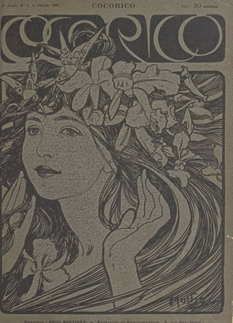
Jugend has the edge when it comes to the graphics, some of which are very strange, but Cocorico looks much more like a humour magazine to contemporary eyes, with many cartoons that resemble those drawn today. Cocorico is also mostly free of the Jugend brand of satire which is often little more than nationalist rabble-rousing. Cocorico ran for 63 issues to 1902 by which time its format had changed and the florid graphics had been abandoned for a more sober layout. What follows is a selection of cover designs, many of which are Mucha’s work, and all of which follow the Jugend template of varying the art style and title design. There’s also one by František Kupka (or François as he was credited here) who also contributed interior illustrations in the later issues. There’ll be more about him tomorrow.

cocorico02.jpg

Alphonse Mucha.

Continue reading “Cocorico covers”

The Dracula Annual

wolff1.jpg

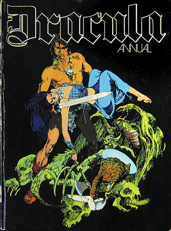
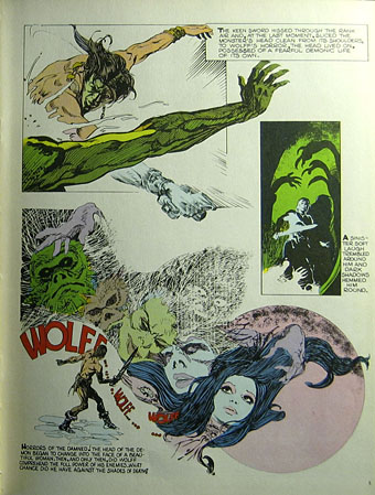
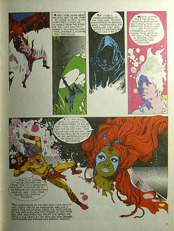
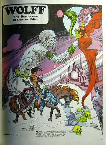
A comment by Modzilla in last month’s post about psychedelic comic book Saga de Xam is responsible for this recent book purchase. Dracula was a full-colour large-format comic book from notorious pulp imprint New English Library (later to be distributors for my colleagues at Savoy Books) that repackaged Spanish horror strips for a British audience. The comic ran for 12 issues in the early 1970s; the pages shown here are from the hardback annual that gathered all the issues into a single volume. I remember this being around in secondhand shops for years but I never paid it any attention at all so the artwork has been a revelation.

NEL’s Dracula isn’t much of a horror comic, despite its title; Dracula himself only appears in one story, and that’s a jokey throwaway piece. The two main episodic strips are Wolff, a Conan clone searching for his lost wife in a world ravaged by witches, werewolves and other supernatural threats; and Agar-Agar, a deliriously psychedelic picaresque concerning a hyper-sexual “sprite” (or a hippyish young woman with blue hair and magic powers) from the planet Xanadu. Everything in the book is redolent of the early 1970s when strains of psychedelia were still percolating through pop culture. Watered-down psychedelia used to bore me because I wanted the authentic stuff but forty years on this kind of work is much more attractive.

wolff2.jpg

Wolff is the work of Esteban Maroto whose splash pages and inventive layouts give Barry Windsor-Smith’s Conan the Barbarian (which was running at this time) some serious competition. Wolff is very much in the Conan mould—he even shouts “Crom!” at crucial moments—a pawn of supernatural forces he often fails to comprehend. The artwork in Smith’s Conan was often praised for its details and decor but the Art Nouveau influence in Maroto’s work is much more overt. Maroto’s flame-haired witches are like Alphonse Mucha sirens—one panel even borrows from Mucha’s Salammbô—and he’s no slouch with the Frazetta-like demons either. The scripting is perfunctory but I don’t mind that when it turns up pages like these. There’s also a brief nod to Lovecraft when “R’Lyeh” is mentioned.

wolff3.jpg

wolff4.jpg

Continue reading “The Dracula Annual”

Album de la décoration

decoration1.jpg

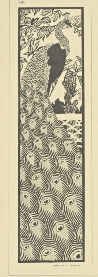
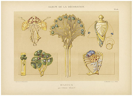
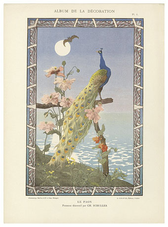
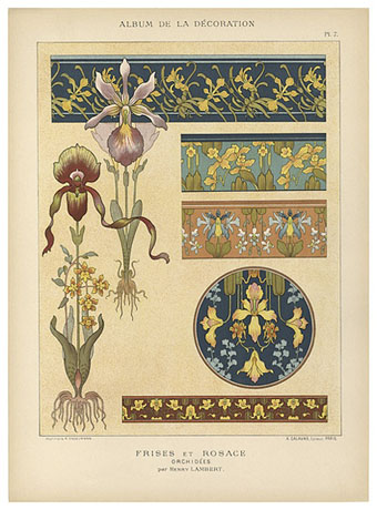
Plates from a selection of art nouveau-styled prints for the use of artists and craftsmen. There’s more in this incomplete Flickr set; a little searching turns up further examples but the Flickr ones are the highest quality. The Four Seasons were featured here several years ago in a post about illustrator Patten Wilson. The bat-obsessed Robert de Montesquiou would no doubt have approved of the unusual conjunction of a chauve-souris with the favourite fowl of the fin de siècle.

decoration2.jpg

decoration3.jpg

Previously on { feuilleton }
The Grammar of Ornament revisited
Dekorative Vorbilder
Combinaisons Ornementales
Charles J Strong’s Book of Designs
Styles of Ornament
The Grammar of Ornament by Owen Jones