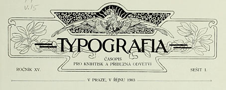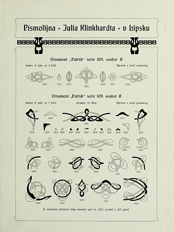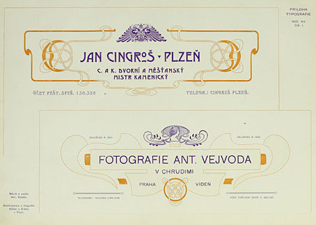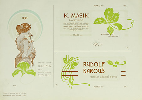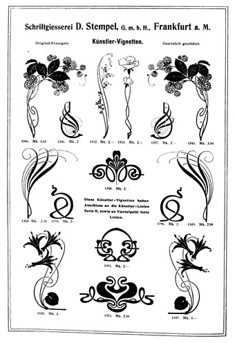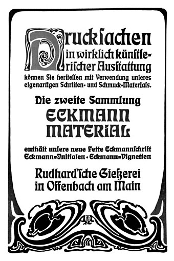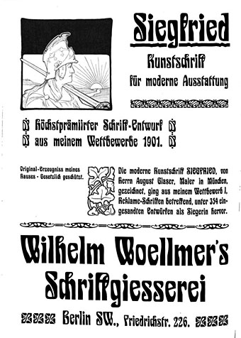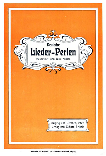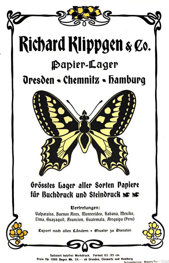
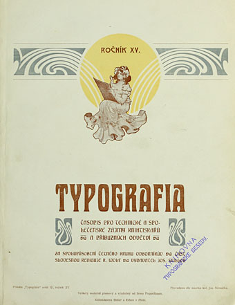
My work this week is more Deco than Nouveau but I enjoy looking at Art Nouveau graphics even when I don’t have any immediate use for them. Typographische Jahrbücher was a German publication for typographers and printers whose pages are filled with samples of the latest type styles and print decorations, together with many adverts that use the same graphics. The examples here are from issues for the year 1902 when Art Nouveau (or Jugendstil as it was in Germany and Austria) had reached its peak as the predominant European style. This is the kind of book I love to see, one with a wide variety of borders, letterforms and motifs for print use alone, not designs for textiles or other crafts. Of note are the pages below promoting a pair of recent typefaces, Eckmann and Siegfried. Both designs soon fell out of fashion but returned to prominence in the 1960s among the typefaces of the occult revival. It’s a shame the quality of this book isn’t better—it’s another poor Google scan—but I’m happy to find it. 750 pages; dig in here.
Category: {art nouveau}
Art Nouveau
A Can pin
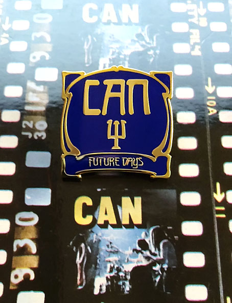
I’ve always liked badges, and I especially like the enamel pin variety even though I tend to buy them then not wear them very much for fear of losing them. This handsome item arrived a couple of days ago from an eBay seller, and is the first Can-related pin I’ve come across. After Kraftwerk, Can were the most popular of the German groups in the Britain of the 1970s but I’ve never seen any Can badges or anything else related to them from that decade aside from the records. The resurgence of interest in German music—Krautrock, if you must—has prompted the badge manufacturers who populate eBay, Etsy and elsewhere to create a number of items based on the record covers of Can, Neu!, Harmonia and others. The quality isn’t always very good but then badges in the 1970s were often crude designs as well. You can’t go wrong with a simple logo but shrinking an album cover down to 25 mm isn’t always a good idea. A couple of years ago I bought three Can badges from another eBay seller; two of them, with logo designs taken from sleeves, were okay but the third, based on the Future Days album cover was poorly printed. This pin equivalent is much better, as well as being one of the few Can sleeves you could transform in this manner. The raised gold lines are a good match for the Art Nouveau-styled design by Ingo Trauer and Richard J. Rudow which was embossed on the original German pressing. The group may have been popular in Britain but UA gave British Can-heads a flat sleeve.
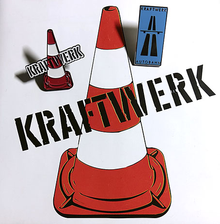
The same eBay seller also makes these Kraftwerk pins which I bought a while ago. I’d still prefer to have the traffic cone without the band name—something that only aficionados would recognise—but it was good to find a pin based on the early years of the group’s career, the period which Kraftwerk themselves have long disowned. The seller recently added a new design with the same traffic cone in green as it is on the Kraftwerk 2 album cover, but the green cone was only a variation on a theme, the orange leitkegel is the ubiquitous and definitive icon of the pre-Autobahn years.
Previously on { feuilleton }
• Holger’s Radio Pictures
• Jaki Liebezeit times ten
• Can esoterics
• Can soundtracks
• The kosmische design of Peter Geitner
• Reworking Kraftwerk (again)
• Leitkegel
• German gear
• Autobahnen
• Ralf and Florian
• Can’s Lost Tapes
• Reworking Kraftwerk
• Autobahn animated
• Sleeve craft
• Who designed Vertigo #6360 620?
• Old music and old technology
• A cluster of Cluster
• Aerodynamik by Kraftwerk
Weekend links 550
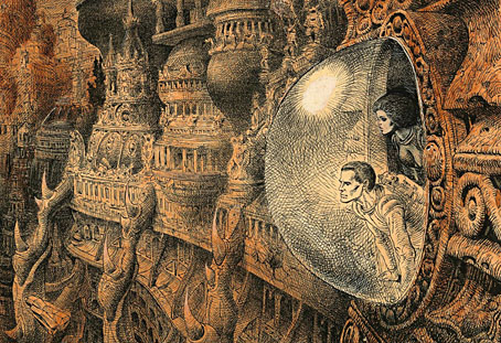
Illustration by Moebius for Les Robinsons du Cosmos (1970) by Francis Carsac.
• Notre Dame des Fleurs is a collection of art based on or inspired by the Jean Genet novel. The book, which includes some new work of mine, will be published in February. Editor Jan van Rijn has a trailer for it here. It’s limited to 150 copies so anyone interested is advised to pre-order.
• Books that made me: William Gibson‘s influential reading. Good to see him mention Suttree by Cormac McCarthy, an outstanding novel that might be better known if it wasn’t for the gravitational pull of McCarthy’s other works.
• Zagava have announced a paperback reprint of The Art of Ilna Ewers-Wunderwald, a collection of neglected Art Nouveau drawings and designs compiled by Sven Brömsel.
• At Dennis Cooper’s: Black_Acrylic presents…He Stood In The Bath And He Stamped On The Floor: A Joe Meek Day.
• More yearly roundups: Our Haunted Year 2020 by Swan River Press, and The Year That Never Was by blissblog.
• New music: Spaceman Mystery Of The Terror Triangle by The Night Monitor.
• Ralph Steadman’s guided tour through six decades of irrepressible art.
• At Greydogtales: Valentine Dyall: Mystery and Mesmerism.
• At Wormwoodiana: The Esoteric in Britain, 1921.
• At Strange Flowers: Marie Menken’s Lights.
• I Want To See The Bright Lights Tonight (1974) by Richard and Linda Thompson | Neon Lights (1978) by Kraftwerk | Lights (1980) by Metabolist
Alphonse Mucha et Son Oeuvre
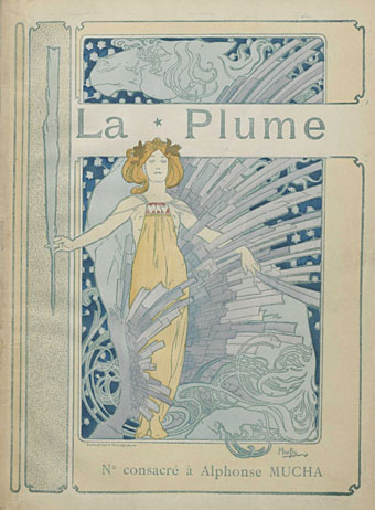
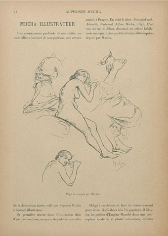
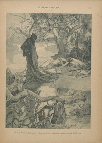
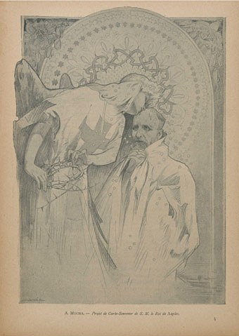
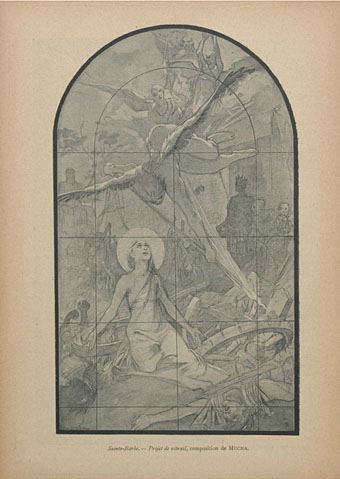
Alphonse Mucha was so wildly prolific, and his work maintained such a consistently high standard, that book collections tend to focus on the popular Art Nouveau prints and posters to the exclusion of everything else. This short study of Mucha’s career was published in 1897 when the Nouveau style was becoming a dominant trend in Continental Europe, thanks in part to the promotion of art journals like La Plume, as well as to Mucha himself. The reproductions are all monochrome halftones but they include many sketches, illustrations and smaller works that are either never seen elsewhere or are marginalised by his advertising graphics and the designs for Sarah Bernhardt. Browse the book here or download it here.
The ceramic art of Eduard Stellmacher
The Art Nouveau style is seldom more grotesque than in these vases and amphorae designed around the turn of the century by Eduard Stellmacher (1868–1945) for his father’s company, Amphora, in the Tur-Teplitz region of Bohemia. Art Nouveau (or Jugendstil as it was in Germany and Austria) emerged in Europe in the 1890s, and though its development ran parallel to the Decadence of the fin de siècle it wasn’t really a Decadent form in the literary sense of a dwelling on the perverse, the morbid or the blasphemous. The sinuous curves of Art Nouveau are too suggestive of vigorous life and energy to appear corrupt; Alphonse Mucha’s femmes are too healthy to be fatale, they’re nothing like the dissolute, hollow-eyed sirens seen in the drawings of Félicien Rops, an artist who wasn’t Nouveau (he died in 1898) but who was thoroughly Decadent.
Stellmacher and co. created their share of delightful ceramic figures with Mucha-like tresses and flowing garments but Eduard’s designs around this time were preoccupied with ferocious creatures: bats, fish, lizards, octopuses, and a profusion of fire-breathing dragons. Even the plant forms have a diseased, unhealthy aspect. The designs may not have been intended as Decadent but they embody the quality more than anything used as vase decoration before or after this period. Art Deco also favoured predatory animals (snakes and leopards especially) but only in forms that were suitably sleek and abstracted.