The Great God Pan

pan_daphnis.jpg

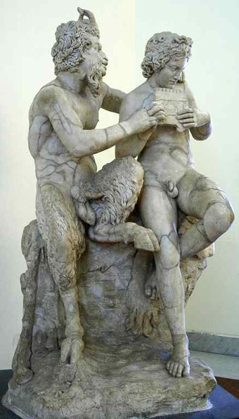
Pan teaching Daphnis to play the panpipes; Roman copy of a Greek original from the 3rd-2nd centuries BCE by Heliodoros.

“The worship of Pan never has died out,” said Mortimer. “Other newer gods have drawn aside his votaries from time to time, but he is the Nature-God to whom all must come back at last. He has been called the Father of all the Gods, but most of his children have been stillborn.”

So says a character in The Music on the Hill, one of the slightly more serious stories from Saki’s The Chronicles of Clovis (1911). Saki’s Pan is a youthful spirit closer to a faun than the goatish creature of legend. But being a gay writer whose tales regularly feature naked young men (surprisingly so, given the time they were written) I’m sure Saki would have appreciated the Roman statue above. There’s nothing chaste about this Pan with his “token erect of thorny thigh” as Aleister Crowley put it in his lascivious 1929 Hymn to Pan, a poem which caused a scandal when read aloud at his funeral some years later. The Roman statue was for a long while an exhibit in the restricted collection of the Naples National Archaeological Museum where all the more scurrilous and priapic artefacts unearthed at Pompeii were kept safely away from women, children and the great unwashed. These are now on public display and include the notorious statue of a goat being penetrated by a satyr.

Continue reading “The Great God Pan”

Louis Rhead’s peacocks

rhead1.jpg

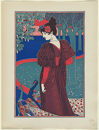
La femme au paon (Woman with peacocks): from L’Estampe Moderne (1897).

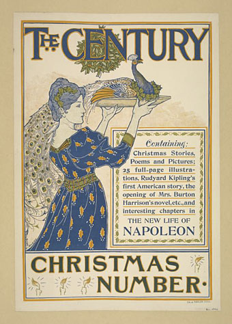
Two works by British Art Nouveau poster artist and illustrator, Louis Rhead (1858–1926). The first of these is very typical and resembles many of his magazine covers of the period. The cover illustration for The Century, meanwhile, must count as the only time I’ve seen a peacock presented as a possible Christmas dish.

rhead2.jpg

The Century Christmas Number (December 1894).

Previously on { feuilleton }
Peacocks
Rene Beauclair
Whistler’s Peacock Room
Beardsley’s Salomé

Taking Woodstock

taking_woodstock.jpg

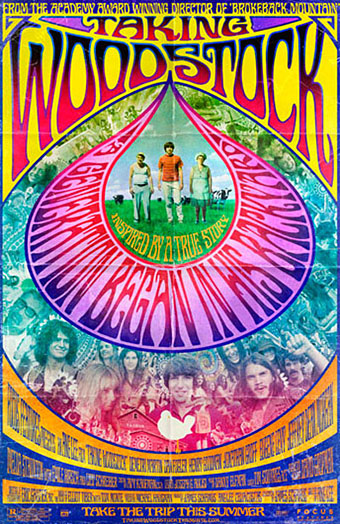
I mentioned Ang Lee’s forthcoming film, Taking Woodstock, last week and this poster by Mojo makes a decent fist of capturing some of the West Coast psychedelic style. I thought at first that the rainbow hues were garish in the wrong way, the San Francisco poster artists used bold colours but limited their palette since many of them were working for screenprinting. But since this film concerns the story of a gay man, Elliot Tiber, and his attempt to provide a home for the Woodstock festival in 1969—and since the rainbow flag is now a gay symbol—it makes sense even if the overall impression is of colour clash. I like the subtle touch of making the poster look worn, something I’ve done myself on a recent book cover design which is also styled as a cinema poster. I’ll be posting that here in due course.

woodstock.jpg

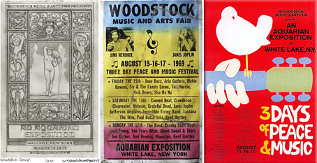
That’s the film promotion; the posters for the original event can be seen at Woodstock posters. The pencil sketch on the left is an elaborate Art Nouveau-styled design intended for the festival before the original choice of venue was refused. The sheet in the centre looks like a hasty promo piece for the new venue while the poster on the right is the final version with the famous dove graphic by Arnold Skolnick. That dove came to symbolise the whole event, hence its appearance on the Taking Woodstock one-sheet.

Taking Woodstock opens in the US on August 15th, 2009, the 40th anniversary of the festival.

Previously on { feuilleton }
Over the rainbow
Dutch psychedelia
Family Dog postcards

Art Nouveau illustration

stolba.jpg

The cover picture of yesterday’s book purchase complements the month, being a woodcut by Leopold Stolba entitled February from a Ver Sacrum calendar for 1903. The book is Art Nouveau: Posters and Designs (1971), a collection edited by Andrew Melvin for the Academy Art Editions series and the book includes some covers for Jugend magazine which coincidentally was the subject of Monday’s post.

letters.jpg

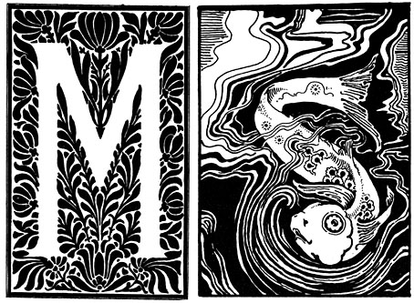
Ornamental letters from The Studio magazine, 1894; no artists credited.

I wrote about another of the books in the Academy series, The Illustrators of Alice, a couple of years ago and while I don’t really need yet another Art Nouveau book, the presence of a few illustrations I hadn’t seen before made the purchase worthwhile. Further examples follow.

Continue reading “Art Nouveau illustration”

Jugend Magazine

jugend.jpg

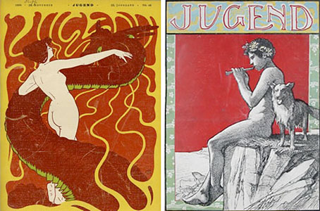
Two of several cover illustrations by Hans Christiansen (1866–1945) for 1898 issues of Jugend magazine. I waited a long time for someone to put together a site devoted to Jugend and good as this one is I can’t help but wish it was as thorough as the Simplicissimus site. Jugend is a regular fixture in histories of Art Nouveau since it was the magazine’s promotion of the new graphic style which gave the movement a name in Germany, Jugendstil. The covers look strikingly advanced today in the way they vary their style and the presentation of the magazine title from one week to the next. The monotonous branding of contemporary magazines seems staid in comparison. Christiansen’s swirling title design shows why these covers had such an influence on the psychedelic poster art of the 1960s. You can see a larger copy of that cover here and a further 299 drawings and paintings by the artist here.

Elsewhere on { feuilleton }
The illustrators archive

Previously on { feuilleton }
Meggendorfer’s Blatter
Simplicissimus