Jessie M King’s Grey City of the North

advocates.jpg

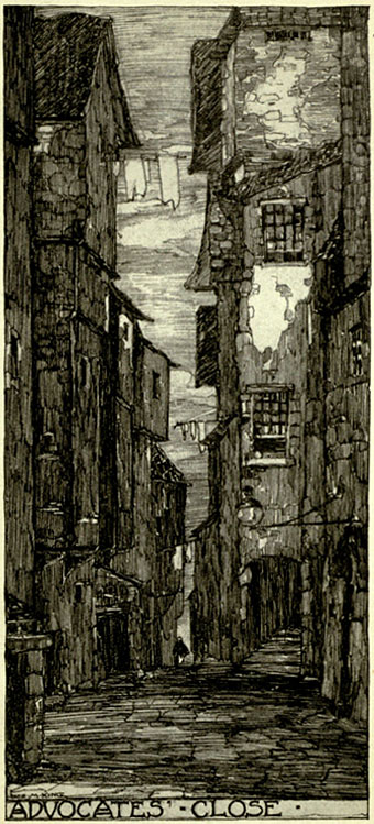
“This dark and steep alley took its name from Sir James Stewart of Goodtrees, Lord Advocate of Scotland, 1692–1713, whose mansion stood at the foot of the close. It was a fashionable quarter in the early 18th century, and here resided Andrew Crosby, the famous lawyer, the original of Scott’s ‘Andrew Pleydell,’ Lord Westhall, John Scougall, the painter of George Heriot, and many well-known people of the time.”

Another book scan from the Internet Archive, this time a title which plays to my fetish for Old Edinburgh. The illustration work of Jessie M King (1875–1949) was featured here in September with a delicate piece from A House of Pomegranates by Oscar Wilde. The Grey City of the North (1910) is quite a departure from her usual style, being a collection of monochrome views of buildings, streets and closes of the Old Town. Very nice lettering on all the plates which perhaps shows some influence from her colleague Charles Rennie Mackintosh.

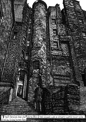
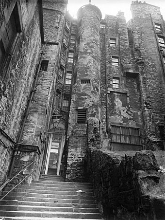
Advocates’ Close has particular significance for me since I copied a view of the alley for my adaptation of HP Lovecraft’s The Haunter of the Dark in 1986. Providence looks nothing at all like Edinburgh, of course, but I couldn’t find adequate reference at the time so used photographs of Scotland by Edwin Smith instead. You can see Smith’s photograph and my rendering of it below. Among the Internet Archive’s other Jessie King books there’s a follow-up to the Edinburgh volume, The City of the West; 24 drawings in photogravure of Old Glasgow.
advocates2.jpg

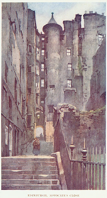
Another view of the close from Edinburgh and The Lothians by Francis Watt; illustration by Walter Dexter (1912).
advocates3.jpg

Advocates’ Close by Edwin Smith from Scotland (1955).

This book of photographs was an early Thames & Hudson title using their typically excellent photogravure reproduction. My copy was rescued from a waste bin near Manchester University and I’ve used it so much for reference over the years I’ve often wondered what I would have done without that chance encounter. You can see from my copy below (drawn with a 0.2mm Variant pen) how much detail I skimped and how much I embellished. I skimped rather more than I remember, as it happens. I think if I’d have drawn this a couple of years later I might have been more faithful to the original.

advocates4.jpg

Elsewhere on { feuilleton }
The illustrators archive

Previously on { feuilleton }
Ephemeral architecture
The Essex Street Water Gate

Design as virus 3: the sincerest form of flattery

mindscape.jpg

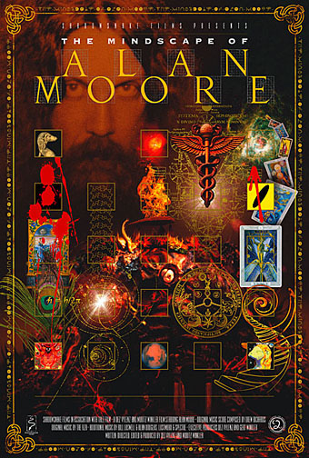
The Mindscape of Alan Moore; film poster by John Coulthart (2003).

moore_poster.jpg

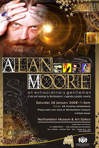
Alan Moore: An Extraordinary Gentleman;
event poster by unknown designer (2008).

Previously on { feuilleton }
Design as virus 2: album covers
Design as virus 1: Victorian borders

James Bond postage stamps

stamps1.jpg

stamps3.jpg

stamps2.jpg

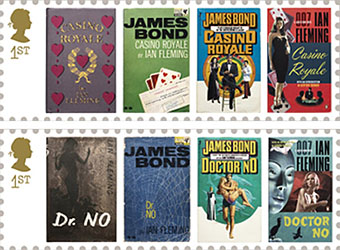
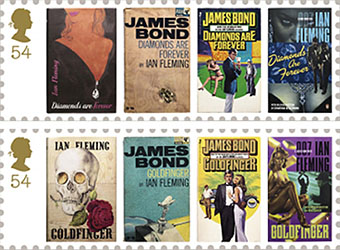
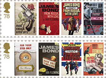
Proving once again the centrality of James Bond to contemporary British identity, the Royal Mail releases these stamps on January 8th, 2008, the 100th anniversary of Ian Fleming’s birth. If a sexist state assassin seems an awkward choice of cultural ambassador, Alan Moore and Kevin O’Neill present a more iconoclastic view of the super spy in the Black Dossier, the latest volume in their unfolding history of the League of Extraordinary Gentlemen.

Good to see that the stamp designs above include the Pan paperback covers from 1963. (The other examples are the first editions from Jonathan Cape, the 2006 Penguin reprints and what appear to be a set of Seventies reissues.) A friend of mine at school had a collection of the Pan books and they remain my favourite Bond book designs, not least because they were some of the first book covers to strike me as being well-designed rather than well-illustrated. What the Flickr link doesn’t show is the die-cut holes in the Thunderball jacket which made the cover seem as though it was pierced by bullets, the kind of expensive production detail you rarely see on anything other than a bestseller.

And while we’re on the subject of Bond design, Daniel Kleinman’s superb Casino Royale title sequence is on YouTube.

Elsewhere on { feuilleton }
The book covers archive

Previously on { feuilleton }
Please Mr. Postman

CQ

cq1.jpg

A belated shout of appreciation for this film whose distribution appears to have been so limited that everyone missed it, me included. That’s a shame as Roman Coppola’s debut (he’s the son of Francis) has a lot to commend it although it helps if you’re familiar with pulpy European spy/science fiction/horror movies of the late Sixties and the po-faced works of auteurs such as Jean-Luc Godard and Michelangelo Antonioni. CQ pays loving homage to both styles of filmmaking which probably explains why the studio didn’t know what to do with it.

Continue reading “CQ”