Continuing an occasional series.
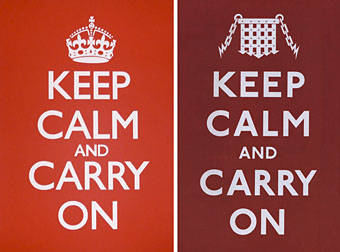
The poster at the top left is the unused Ministry of Information design created to maintain Britain’s resolve after war had been declared in September 1939. This simple slogan struck a chord recently among Britons sick of the climate of fear, security theatre and authoritarian coercion which, deliberately or not, appears to benefit politicians and the agents of the State more than the populace who pay their wages. The BBC asked whether this was the greatest motivational poster ever. The Guardian noted the popularity of the slogan and its inevitable commercial exploitation:
…one day in 2000, Stuart Manley, co-owner with his wife Mary of Barter Books in Alnwick, Northumberland, was sifting through a box of hardbacks he had bought at auction when he saw “A big piece of paper folded up at the bottom. I opened it out, and I thought, wow. That’s quite something. I showed it to Mary, and she agreed. So we framed it and put it up on the bookshop wall. And that’s where it all started.”
The reworked version at the top right is one of the opening pages from The Black Dossier (2007) by Alan Moore and Kevin O’Neill. The crown is replaced by a portcullis and Gill Sans is dropped in favour of Edward Johnston’s sans serif typeface which has been used throughout the London Underground system since the 1930s.

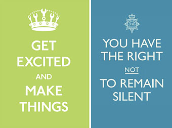
The original poster has been undergoing numerous redesigns, from the jokey to the serious. The green design is one of the better variants by designer Matt Jones.
The blue design is part of an advertising campaign by the British Home Office intended to promote their new “Policing Pledge”, “a set of promises to local residents that not only gives more information about who their local neighbourhood policing team is, but also ensures that communities will have a stronger voice in telling the police what they think is most important and what they are most worried about.”
Laudable as this intention may be, I was very surprised when I saw this poster on a bus shelter earlier in the week. While the Home Office and its advertising people are fully entitled to reclaim a design which originated with the State in the first place, one of the reasons the original poster strikes a chord is because it runs counter to anti-terrorist nonsense like this. It speaks, among other things, to people sick of being lied to by politicians and spied on by police and security services. To see a forgotten design experience a swelling of grassroots popularity then be co-opted by the State itself is as depressing as it would have been had Richard Nixon used psychedelic posters to campaign for his re-election. To see a campaign use slogans which treat the rights of defendants as flippantly as the poster remixers when this present government has spent the past ten years undermining the rights of its citizens is simply a disgrace.
Update: A Flickr pool catalogues the variations.
Previously on { feuilleton }
• Design as virus 7: eyes and triangles
• Design as virus 6: Cassandre
• Design as virus 5: Gideon Glaser
• Design as virus 4: Metamorphoses
• Design as virus 3: the sincerest form of flattery
• Design as virus 2: album covers
• Design as virus 1: Victorian borders

