Elric 1: Le trône de rubis

elric1.jpg

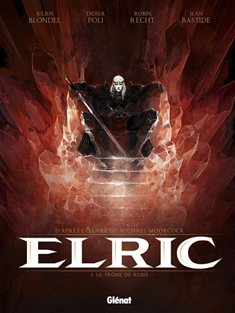
The closest I ever got to illustrating Michael Moorcock’s Elric character was the sleeve for The Chronicle of the Black Sword in 1985, a Hawkwind concept album based on the first couple of Elric books. That design favoured a decorative approach over anything illustrative, however. At the time I felt too intimidated by the renderings of Elric’s first illustrator, James Cawthorn, and subsequent depictions by book cover artists such as Michael Whelan, to attempt my own version of the character. These days I pay little attention to heroic fantasy of any kind but I do look out for new depictions of Moorcock’s anti-hero. Earlier this year the French bande dessinée publisher, Glénat, released the first album in a planned series of five comic-strip adaptations of the Elric books. Many creditable Elric comics have appeared since the 1970s, not least the Cawthorn version of Stormbringer, one of the earliest and best, and Philippe Druillet’s own somewhat eccentric production. Mike Moorcock very generously sent me a copy of the Glénat volume this week, and I’d say this is now the one to beat.

elric2.jpg

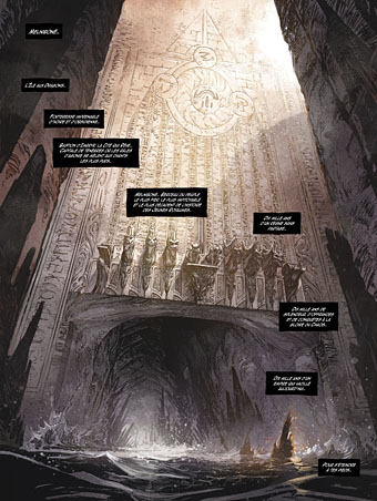
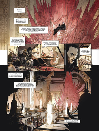
Writer Julien Blondel has adapted the books with the art duties being taken by Didier Poli and Robin Recht. Jean Bastide is the colourist. I’ve always preferred the French and Belgian approach to comic art over the American style so I’m naturally biased towards a book such as this. That said, the art is marvellous, and so many of the details feel just right. Moorcock portrays the Melnibonéans as decadent and cruel, something that Poli and Recht portray with scenes of naked slaves being bled, butchered, and even used as human torches for the blithe amusement of their masters. The general atmosphere in the opening pages is like something from Flaubert’s Salammbô with its combination of antique depravity and the massing of great armies prior to battle. They don’t slouch with the monstrosities, either, there’s a spot of Lovecraftian weirdness when Elric is rescued by Straasha, the Sea King. I look forward to seeing how they deal with Arioch (who puts in an appearance at the end) and the other Chaos Lords. The dialogue is all in French, of course, but if you know the books it’s easy to follow even with French as limited as mine.

elric3.jpg

The Glénat site has a few more page samples. Moorcock has been watching these books being adapated and re-adapted for decades, and he says this is among the very best. For anyone with more than a passing interest in the brooding albino prince it’s well worth seeking out.

Previously on { feuilleton }
Salammbô illustrated
Jim Cawthorn, 1929–2008

Ptooff!

ptoof1.jpg

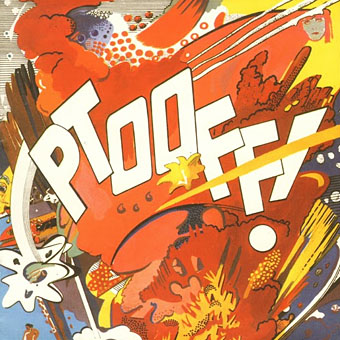
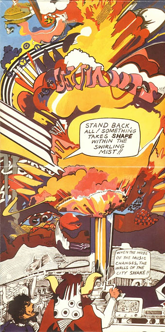
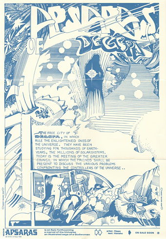
There’s a sub-genre of the psychedelic album cover in which florid, unfocused and vividly polychrome doodles by friends of the band are used as the principal artwork. (The cover of The Parable Of Arable Land [1967] by The Red Crayola is a typical example.) The art which decorates the fold-out sleeve of Ptooff! (1967), the debut album by British group The Deviants, isn’t quite in the doodle league but it treads a narrow divide between drug-addled scribbles and American comic-strip art à la Jack Kirby. Someone named “Kipps” receives the art credit. Viewed today the swirls and explosions on the sleeve’s outer panels also seem to predict the graffiti art which would flourish a decade later.

ptoof2.jpg

The Deviants were the first musical vehicle for writer and singer Mick Farren who died last week. At the time Farren was known as a journalist for International Times which explains the disembodied head of Theda Bara (from the paper’s logo) floating in the top right-hand corner of the front cover. The lysergic wildness continues inside with an incoherent scene and the promise that “APSARAS—is an Epic forthcoming—a marvel of the Universe—an illustrated saga of a Godwoman. On sale soon.” John Peel provided some sleeve notes. See the artwork at larger size here.

ptoof3.jpg

Charles Shaar Murray penned a memorial note for Mick Farren last week. My favourite track from Ptooff! is the opening song I’m Coming Home, a number that demonstrates the group’s ability to combine humour with hard-rock freakout.

Elsewhere on { feuilleton }
The album covers archive

Previously on { feuilleton }
International Times archive

Weekend links 168

bell.jpg

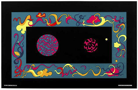
Window to the Universe (1967) by Roberta Bell. From Summer of Love: Psychedelic Posters from SCMA currently showing at the Smith College Museum of Art, Northampton, MA.

Sympathy for the Shoggoth: China Miéville’s Revolution of the Weird Tale, an essay by Christina Scholz which features one of my Cthulhu pictures among its embellishments. Related: “‘New Strange’ stories hold a chilling mirror to life” says Rick Kleffel discussing Robert Aickman and others. And speaking of Aickman (so to speak), Reese Shearsmith has recently recorded Aickman’s Cold Hand in Mine for Audible.

• An erotic alphabet book from the Soviet Union circa 1931, created to promote adult literacy. Who says porn can’t be educational?

Angelystor is a new 39-minute composition by Phil Legard which he describes as “often heavy, Saturnine and melancholic”.

• James Ward’s postcards of the Post Office Tower. Related: film of the revolving restaurant at the top of the Tower in 1967.

•You Might Never Find Your Way Back: Shirley Jackson’s Hangsaman by Nicholas Rombes.

satty.jpg

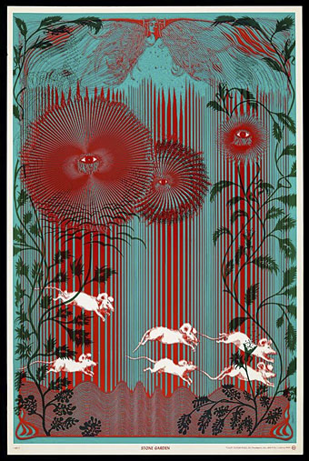
Stone Garden (1967) by Wilfried Sätty.

High Over Blue is “a mind-warping 20-minute freakout” by Moon Duo.

• Queer Visual Splendour: Jon Macy discusses his erotic comics.

The Origin of the Pilcrow, aka the Strange Paragraph Symbol.

• Mix of the week: the Kranky 20th Anniversary Mixtape.

Ten Amazing Cheeses and their Literary Counterparts.

PingMag looks at the past and present of Ginza.

Mind Gardens (1967) by The Byrds | The Garden (1981) by John Foxx | The Toy Garden (2006) by Helios

Weekend links 164

panikanova.jpg

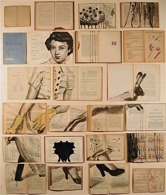
Ekaterina Panikanova paints on books.

Back in 2009 I bought a book of Art Nouveau illustration and design which contained an intriguing drawing by an Austrian artist, Franz Wacik (1883–1938). At the time there was little of Wacik’s other work online so I was delighted by the latest post at 50 Watts which showcases a selection of his illustrations. Wacik was a contemporary of British illustrator Sidney Sime, and both artists share a predilection for the comic and the grotesque.

• “The outlawing of drugs such as cannabis, MDMA and LSD amounts to the ‘the worst case of scientific censorship since the Catholic Church banned the works of Copernicus and Galileo’, the former Government drugs advisor Professor David Nutt has claimed.” Related: “At last, the edifice of drugs prohibition is starting to crumble,” says Amanda Feilding.

Alan Johnston on “A gay island community created by Italy’s Fascists”, and at Another Nickel In The Machine a report on The Gateways Club, one of the few meeting places for London’s lesbians in the 1960s. Alex Park wonders “Why Is Gay Porn So Popular In Pakistan?”

• If it’s June 16th then it must be Bloomsday: The Irish Times has a page of Joyce-related links to mark the anniversary. This year there’s a global reading of Ulysses taking place.

• “Now we can concentrate on album number nine,” says Kraftwerk’s Ralf Hutter. The rest of us will impatiently count the passing seconds.

• After a week in which George Orwell’s Nineteen Eighty-Four has seen an increase in sales, a look at its cover designs old and new.

Aleister Crowley: Wandering the Waste is a 144-page graphic biography of the Great Beast by Martin Hayes and RH Stewart.

Barnbrook Design‘s presentation of Taxidermy, a book by Alexis Turner, is rather splendid.

• FACT Mix 386 is a great collection of dubby grooves compiled by Young Echo.

• From 2001: Michael Wood in the LRB reviewing Apocalypse Now Redux.

• The first recording of Allen Ginsberg reading Howl.

Rejoyce (1967) by Jefferson Airplane | The Sensual World (1989) by Kate Bush | Molly Bloom (2013) by Alan Munde

The horror

Last year I was asked to write something about my favourite horror comics for Nørd Nyt, a Danish comics zine. I’d pretty much forgotten about this until the printed copy arrived, so here’s my piece in English, a choice of three favourite horror stories.
breccia.jpg

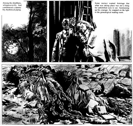
The Dunwich Horror by Breccia (1973)

The October 1979 issue of Heavy Metal magazine came as a revelation. I’d only bought a few issues prior to this, and seeing an entire magazine devoted to HP Lovecraft seemed far too good to be true. Lovecraft art is so common now that it needs to be emphasised how scarce this kind of illustration used to be, the most you saw was paperback art of varying quality. There had been a few comic-strip adaptations but they were mostly in American publications or foreign editions I hadn’t seen. As it turned out, Heavy Metal‘s great JK Potter cover promised more than it actually delivered: at least half the magazine was taken up with continuing strips that had nothing to do with Lovecraft, or strips that did little but borrow a few Lovecraftian motifs for a slight horror tale. The one really outstanding piece was Alberto Breccia’s The Dunwich Horror, one of several Lovecraft adaptations the artist produced in 1973. Breccia’s style was sketchy, shadowy and replete with period details. The faces of his characters looked absolutely right for what I still consider to be one of Lovecraft’s darkest stories (people tend to miss the implication that a backwoods magus very nearly destroys humanity). Until I encountered the artists in Heavy Metal I’d given up on comics as an artistic medium, having no time at all for superheroes or the poor science fiction of 2000AD. Artists like Breccia, Moebius and Druillet showed that there was more than one way of drawing imaginative work, that you could use the refined techniques of illustration to tell a story.
yeux.jpg

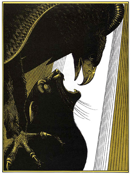
Les Yeux du Chat (The Eyes of the Cat) by Jodorowsky and Moebius (1978)

This story came to my attention when it received its first English translation in the pages of Steve Bissette’s Taboo anthology. It was printed in black on yellow paper, the original French edition having been yellow and black with white highlights. Compared to Jodorowsky’s customary flights of fancy the story is a very simple one, if typically grotesque: a silhouetted figure stands at a tall window overlooking a futuristic (or alien) city, directing with its thoughts the action of an eagle who hunts down a cat in the streets below. The horror comes from the shocking predicament revealed at the end, and the final line of dialogue, although this remains secondary to the formal perfection of the drawing and storytelling. Even by the standards of Moebius’s meticulous draughtsmanship this is a superbly controlled piece of work. Each spread operates as a kind of split-screen, with the left page showing the dialogue and the silhouetted figure, while the full-page illustration opposite shows a simultaneous moment of action somewhere in the city. One thing I immediately liked about this was Moebius’s architecture which even more than usual manages to seem otherworldly yet completely convincing. Everything we see in this brief tale poses questions that remain unanswered. And like many of the best short stories, a few carefully chosen details can imply an entire world.
fromhell.jpg

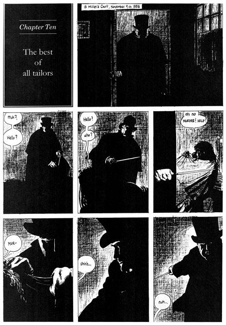
From Hell by Alan Moore and Eddie Campbell (1991–1996)

Horror doesn’t have to be delivered within genre stereotypes, in fact these days it’s often better if it isn’t when so many of those stereotypes—vampires and zombies, for example—have been diminished by over-familiarity. From Hell isn’t a horror story per se—it’s self-described as “a melodrama in sixteen parts”—but it debuted in Steve Bissette’s anthology Taboo where the brief was to offer the reader something dark or challenging that they hadn’t seen before. From Hell certainly fulfilled that brief: Alan Moore’s writing has never shied from the dark—consider the nihilistic Rorschach chapter of Watchmen—but this is as black as he gets. Eddie Campbell has been vocal about his dislike of horror stories but he was the perfect artist here with his long experience drawing ordinary human beings rather than posturing superheroes. Together the pair delivered a story that was novelistic in scope and minute in its attention to detail. Most people would have thought they knew more than enough about Jack the Ripper but no other representation has been this thorough in its exploration of all aspects of the case.

Watchmen had already aimed for a panoramic range of characters—from the president to a newspaper-seller—but From Hell went much further and in greater detail, with a scope that ranges from a group of homeless women to the head of the British Empire and all the classes in between. One of the most impressive aspects of the story was its exposure of the awful gap at the heart of previous dramatisations, namely the reduction of the lives of the murdered women to a cast of frequently nameless unfortunates who we glimpse for a moment sidling up an alley before their blood splashes on a wall. Moore’s script showed us (as much as is possible) the real women behind the roll-call of victims, crushed by poverty yet still distinct individuals. Looking for human detail has always been a feature of Moore’s writing, it’s why his work seemed so fresh in the 1980s compared with lesser writers who were simply recycling clichés as though there was no other way to behave. So too with Campbell’s artwork which has never been subject to the exaggerations of the superhero genre. One of my favourite moments in the entire story was utterly human and utterly trivial: the scene in Chapter 3 when Walter Sickert and Annie Crook meet. Annie says “I need a wee” so she hitches up her shift and squats in the road. It’s the accumulation of numerous human moments such as this—the moments that genre comics invariably avoid—that makes From Hell such a powerful and memorable piece of work. Eddie Campbell’s art shows us the true London dark, a city as black and terrible as it would have been in the days before electric light.

Previously on { feuilleton }
Heavy Metal, October 1979: the Lovecraft special