Weekend links 560

martin.jpg

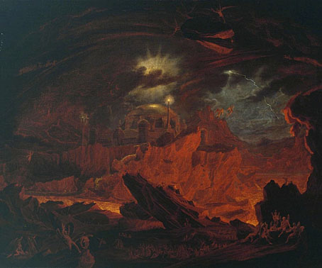
The Fallen Angels Entering Pandemonium, from ‘Paradise Lost’, Book 1 (c.1841) by John Martin.

• “Hergé’s heirs sue artist over his Tintin/Edward Hopper mashups.” The complaint is that the paintings of Xavier Marabout besmirch Tintin’s character by making him seem…human? Silly. I’d sooner complain that Hergé’s ligne claire drawing style is an awkward match for Hopper’s realism. And besides which, isn’t Tintin gay? There’s a lot of wish-fulfilling slash art showing Tintin and Captain Haddock in a closer relationship than Hergé ever would have wanted. This Canadian magazine cover by Normand Bastien dates from 1987.

• “Everyone wanted to make products that looked fast and angry and maybe wanted to lay eggs in your brain.” Alexis Berger tells S. Elizabeth how she avoided years stuck in a design office by becoming a jeweller instead.

• New music: Chiaroscuro by Alessandro Cortini, and Frequencies For Leaving Earth Vol. 4 (One-Hour Loop) by Kevin Richard Martin & Pedro Maia.

The Willows is less a flight of fancy and more an attempt to articulate the ways in which what we dubiously still call “nature” is at once an object of human systems of knowledge and yet also something that undermines those same systems. Thus if The Willows is indeed a classic of “supernatural horror” (as HP Lovecraft would famously note), we might also be justified in calling it “natural horror” as well. In Blackwood’s wonderfully slow, patiently constructed scenes of atmospheric suspense, there is the sense of an impersonal sublime, a lyricism of the unhuman that shores up the limitations of anthropocentric thinking, as well as evoking the attendant smallness of human beings against the backdrop of this deep time perspective.

Eugene Thacker on how Algernon Blackwood turned nature into sublime horror

• Women of Letters: John Boardley talks to Lynne Yun, Deb Pang Davis, Coleen Baik and Duong Nguyen about their typographic designs.

• At Google Arts & Culture: Music, Makers & Machines: A brief history of electronic music.

• At The Public Domain Review: The Universe as Pictured in Milton’s Paradise Lost (1915).

• Beyond the Perseverance drone: Chloe Lula on the sounds of space.

• At Wormwoodiana: Colour magazine (1914–1932).

Wyrd Daze Lvl.4 FOUR STAR is here.

• At Dennis Cooper’s: Hell.

O Willow Waly (1961) by Isla Cameron And The Raymonde Singers | Cool Iron (1972) by The Willows | The Willows (2005) by Belbury Poly

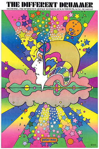
The groovy look

groovy14.jpg

Peter Max, 1968.

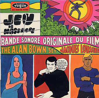
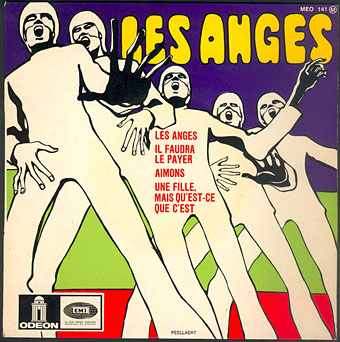
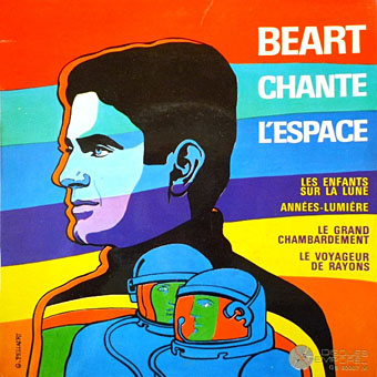
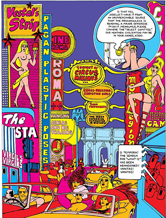
Artists complain justifiably about the constraining effect of labels but sometimes you really do need a label in order to identify a particular idiom. The artwork here is what most people would regard as psychedelic even though the subject matter isn’t always psychedelic at all. I doubt that Citroën intended their new Dyane car to be associated with LSD when they asked Michel Quarez to create a comic book to promote the vehicle, while Quarez’s Mod Love comic is just as hallucinogenically chaste. I tend to think of this style as “groovy”, an unsatisfying term with other associations but “post-psychedelic”, while accurate, feels too cumbersome for such playful graphics. The groovy look is where the purely psychedelic style enters the mundane world, and where the intended audience may be youthful but isn’t always a crowd of experienced lysergic voyagers; a watering down of psych delirium mixed with a dash of Pop Art, all bold shapes, heavy outlines and very bright colours, comic art (or actual comics) with the edges and detail smoothed away and the gain pushed to the maximum. I keep wishing someone would put together a collection of this stuff. There’s a lot more to be found.

Update 1: I knew I’d forgotten somebody. I replaced the book cover by Gray Morrow—an artist who was never really groovy in the manner of these other works—with a contraception poster by Nicole Claveloux, who was very much in the Groove Zone in the 1970s.

Update 2: Added designs by Miguel Calatayud, Mike Hinge, György Kemény, and Tito Topin. Thanks to Vadim for the tips!

• Further browsing: The Peculiar Manicule.

groovy01.jpg

Guy Peellaert, 1967.

groovy02.jpg

Guy Peellaert, 1968.

groovy03.jpg

Guy Peellaert, 1968.

groovy04.jpg

The Adventures of Jodelle by Pierre Barbier and Guy Peellaert, 1966.

Continue reading “The groovy look”

Switched On again

stereolab.jpg

This week I’m electrically possessed by Stereolab, thanks to the arrival of the fourth volume in the Groop’s Switched On series of compilation albums. As with the earlier releases, the new album collects deleted EPs, singles and other scarcities. I already had a third of this one on the First Of The Microbe Hunters EP but it’s good to finally have on disc B.U.A. (aka Burnt Umber Assembly), a previously unreleased piece from the Amorphous Body Study Centre recordings, together with more of the tour singles such as The Underground Is Coming and Free Witch And No-Bra Queen. The latter may well allude in its title and cover art to Pravda, La Survireuse, Guy Peellaert’s freedom-loving biker-hippie whose persona was modelled on Françoise Hardy. (Stereolab’s borrowings are often overt but I’ll give them the benefit of the doubt on this one.) Pravda or not, the animation that Peellaert produced with Gallien Guibert would have made a great video for the song if it was a little longer. Guibert has an updated version of the film here.

Weekend links 556

wilson.jpg

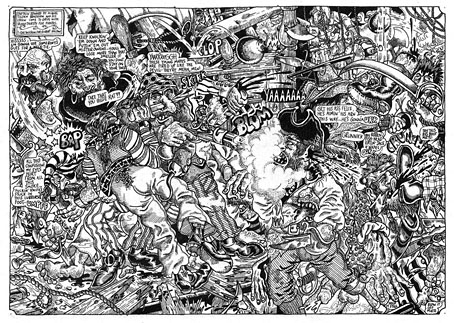
Captain Edward St. Miquel Tilden Bradshaw and his Crew Come to Grips with Bloodthirsty Foe Pirates by S. Clay Wilson, Zap Comix no. 3, 1968.

• RIP S. Clay Wilson, the wild man of American comics. The scene of mayhem above is typical in being barely coherent at a small size; click for a larger view. Patrick Rosenkranz at The Comics Journal describes Wilson as “the most influential artist of his generation…creating an extensive body of work that will defy authority and offend propriety until the end of days”. When Moebius was writing in the 1980s about the founding of Métal Hurlant he had this to say about the American undergrounds: “They were the first in the world to use comics as a means of communication, to express real emotions. Before, comics were used only to do stories, entertainment. They had some great moments but they were all very conventional. The American Underground showed us in Europe how to express true feelings, how to tell something to the reader through the comics. They blew the minds of the few professionals in Europe who saw them.” Also at TCJ, the S. Clay Wilson Interview. Wilson sent me a postcard once. I wish I knew what the hell I’d done with it.

• Michael Hoenig, synthesist for Agitation Free and (briefly) Tangerine Dream, plays one of the pieces from his debut album of electronic music, Departure From The Northern Wasteland, on a radio show in 1977. Hoenig’s album is long overdue a remastering and re-release.

• “My job, which the BBC has tasked me to do, is to provoke people and ask them, ‘Have you thought about looking at the world this way?'” Adam Curtis talks to Michael J. Brooks about his new TV series, Can’t Get You Out Of My Head.

m_chat.jpg

{ feuilleton } celebrates its 15th birthday today. Monsieur Chat, the mascot of this place, is happy about that but then Monsieur Chat is happy about most things.

• At Greydogtales: Opening The Book of Carnacki. A call for contributions to a collection of new stories about William Hope Hodgson’s occult detective. I’d be tempted if I didn’t already have more than enough to keep me occupied.

• “I’m being asked to talk about it a great deal at the moment, with the pandemic.” Roger Corman and Jane Asher on filming The Masque of the Red Death.

• New music: Cygnus Sutra by Mike Shannon, “a soundtrack to a fantasy/sci-fi epic not yet written”.

• A trailer for The Witch of King’s Cross, a documentary about occult artist Rosaleen Norton.

• At Dennis Cooper’s: Spotlight on…Hans Bellmer & Paul Eluard The Games of the Doll (1949).

• RIP also this week to Rowena Morrill, fantasy artist, and to Chick Corea.

• “Computers will never write good novels,” says Angus Fletcher.

• DJ Food on Zodiac posters by Funky Features, 1967.

• Mix of the week: Fact Mix 794 by Lutto Lento.

Annie Nightingale’s favourite music.

Zodiac (1984) by Boogie Boys | From The Zodiacal Light (2014) by Earth | Zodiac Black (2017) by Goldfrapp

The Stormbringer Sessions by James Cawthorn

stormbringer15.jpg

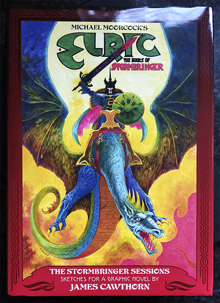
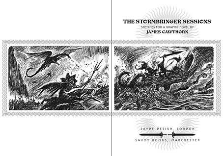
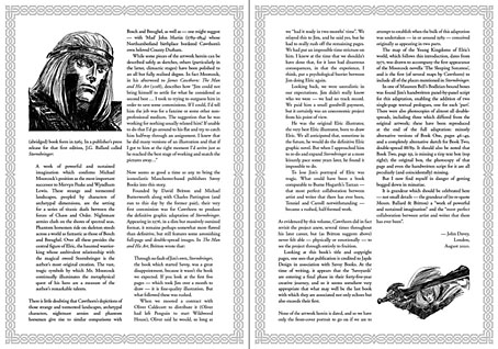
One of the books I was designing last year is published next month. The Stormbringer Sessons is a resurrection by John Davey of a sketchbook created by James Cawthorn in the mid-1980s for an Elric graphic novel that Cawthorn was commissioned to adapt and illustrate for Savoy Books. This is a limited edition that’s unlikely to be reprinted so anyone interested is advised to pre-order. (See below.)

stormbringer16.jpg

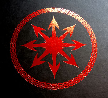
Slipcase decoration.

The original Stormbringer by Michael Moorcock isn’t a novel as such but a collection of the second series of linked novellas about Elric of Melniboné that Moorcock wrote for Science Fantasy from 1961 to 1964. Over the course of ten stories Moorcock introduced a character and a world that acted as a riposte to the Tolkienite school of heroic fantasy, where the divisions between Good and Evil are clear and fixed. Elric is like one of Sergio Leone’s characters: the difference between Clint Eastwood’s “Good” in The Good, the Bad and the Ugly and Lee Van Cleef’s “Bad” is merely a matter of degree; both men are killers chasing the same hoard of gold coins. (By coincidence, Leone was preparing to the upset the Western genre with A Fistful of Dollars just as Moorcock was finishing the first Elric stories.)

stormbringer03.jpg

James Cawthorn was one of Moorcock’s oldest friends, and a frequent collaborator. He not only illustrated the first Elric stories but also co-wrote the fourth one, Kings in Darkness. Despite having created many Elric illustrations Cawthorn always seemed to want to draw comics based on other characters, notably Moorcock’s Dorian Hawkmoon whose adventures have recently been reprinted in three volumes by Titan Books. The Stormbringer commission was a result of the late David Britton’s obsession with Elric in general and the Stormbringer book in particular. Stormbringer begins with Elric having retired from adventuring; his soul-stealing sword is locked away and he’s settled down to married life. The opening scenes parallel (and prefigure) many Hollywood plots: Elric’s wife is abducted for unknown reasons so Elric has to take up his sword and go after her. What follows is a pursuit into a world growing increasingly dark and chaotic, and with it the realisation that the events taking place are a part of a long-foretold apocalypse that will (and does) destroy that world. The progression from a regular sword & sorcery tale to doom-laden widescreen baroque, with a dragon army flying over a churning Boschian hellscape, is one of the enduring attractions of the book.

stormbringer04.jpg

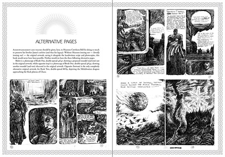
Britton had first persuaded Cawthorn to adapt Stormbringer into comic form in 1976 but the work on that occasion was compromised by lack of time. The sketches in The Stormbringer Sessions are Cawthorn’s roughs which were drawn in preparation for the second attempt, with the entire story worked out in panel form over 250 pages, complete with dialogue and captions. Some of the opening pages are rough indeed, but the drawings for the apocalyptic finale, presented in many double-page spreads, are almost finished pieces. The sketches may lack the finesse of Cawthorn’s other comics work but the power of his drawing and his imagination shines through. Nobody seems to know why he abandoned this project despite having a publisher waiting for it, but he was also adapting the third Hawkmoon book at the time, and had already spent the past decade working on the Hawkmoon trilogy.

stormbringer05.jpg

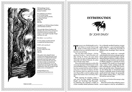
My design for this one is fairly straightforward, mostly a matter of framing and typesetting the opening and closing pages, as well as creating graphics for the cover and the slipcase. As with the Elric-themed Hawkwind album, The Chronicle of the Black Sword, I opted for Celtic-style knotwork for the decoration. Elric’s world isn’t our world but knotwork designs are universal (maybe even multiversal) while being satisfyingly antique and abstract. The publication is a co-production between Jayde Design and Savoy Books, with the book being limited to 100 numbered hardbacks in a decorated slipcase. Each copy also contains a colour print of the cover painting. The book may be ordered here. More page samples follow.

stormbringer06.jpg

Continue reading “The Stormbringer Sessions by James Cawthorn”