Weekend links 133

woods1.jpg

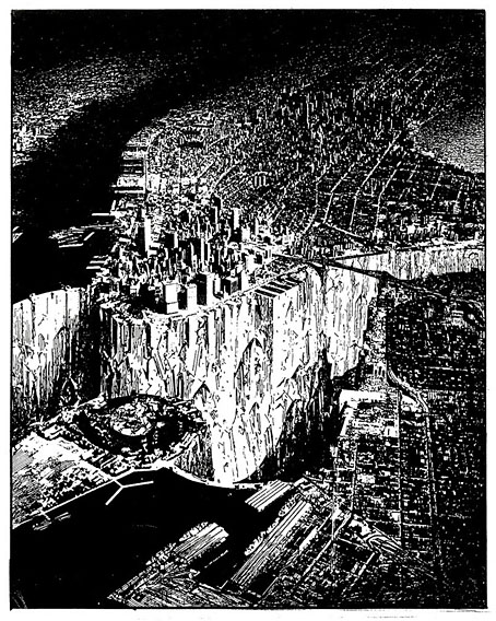
Lower Manhattan (1999) by Lebbeus Woods.

RIP Lebbeus Woods, an architect and illustrator frequently compared to Piranesi not only for his imagination and the quality of his renderings but also for the way both men built very little from a lifetime of designs. Lots of appreciations have appeared over the past few days including this lengthy piece by Geoff Manaugh at BLDGBLOG. (Geoff interviewed Woods in 2007.) Elsewhere: A slideshow at the NYT, Steven Holl remembers Lebbeus Woods and Lebbeus Woods, visionary architect of imaginary worlds. See also: Lebbeus Woods: Early Drawings and this post about Woods’ illustrations for an Arthur C Clarke story collection. Woods was at his most Piranesian with Gothic designs for an artificial planet that would have been the principal location in Vincent Ward’s unmade Alien 3.

Arkhonia draws to the end of a year of blogging about and around the Beach Boys’ errant masterwork, Smile (1967). Witty, discursive and frequently scabrous accounts of how Brian Wilson’s magnum opus was derailed and marginalised until it became convenient for commercial interests to exploit its reputation. Anyone following those posts won’t have been surprised by Wilson’s sacking from his own group by Mike Love in September.

• “We’ve been underground for 27 hours now. Everyone is caked in mud, with grit in their hair.” Will Hunt explores the catacombs and sewers of Paris.

I think the only remotely interesting drug was acid. I had a slightly peculiar attitude towards it I think. Just about everything about hippydom I hated. I liked the 60s up to about ’65 or ’66. I liked the mod clothes, I liked the look. I wasn’t a keen taker of speed because I didn’t like the comedown from it. Then everything changed and became looser, I didn’t like the clothes at all. I felt rather out of step with it. The acid thing was interesting though. I come from Salisbury and from the age of 12 I had a friend who was 30 years older than I was who I saw regularly up until when he died a couple of years ago, whose obituary I wrote in The Times. This man was called Ken James and he was deputy head at the chemical warfare unit at Porton Down [the MOD’s Defence Science and Technology Laboratory]. He then became head of the scientific civil service; he was the man who introduced computing into the civil service and he had taken acid as early as 1950. This was long before Aldous Huxley.

Sharp Suits And Sparkle: Jonathan Meades On Acid, Space And Place by John Doran. Marvellous stuff. Meades’ new book is Museum Without Walls.

• In New York later this month: A Cathode Ray Séance – The Haunted Worlds of Nigel Kneale.

• More acid: Kerri Smith talks to Oliver Sacks about his drug experiences.

• “It starts with an itch”: Alan Bennett (again) on his new play, People.

nymag.jpg

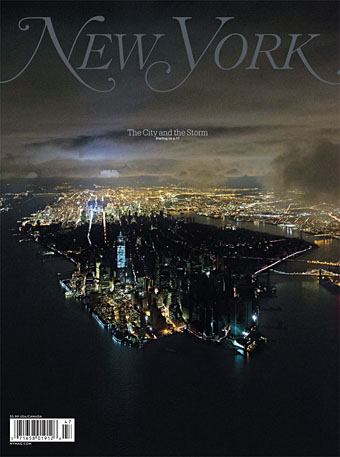
Lower Manhattan last Wednesday. Photo by Iwan Baan.

• Back issues of OMNI magazine can now be found at the Internet Archive.

• Alan Moore & Mitch Jenkins present their new film, Jimmy’s End.

• At BibliOdyssey: Atlas title pages part one & part two.

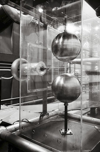
• Raw Functionality: An interview with Emptyset.

Athanasius, Underground

Vintage Caza

Stormy Weather (1979) by Elisabeth Welch.

Views of Old Manchester

manchester01.jpg

I’ve always been curious about the history of the places I live in so for a while I was reading a lot about the history of Manchester, mostly via small booklets published by the City Council. The drawings in this Internet Archive discovery are familiar from some of those publications which tended to recycle the same few views. Manchester’s history dates back to the Roman occupation of Britain but the city never received the kind of detailed artistic attention that London inspired.

manchester02.jpg

Views of Old Manchester is dated 1885 but its antiquarian publishers use the old-fashioned (and somewhat anachronistic) medial “s” in their text. The drawings are from Jackson’s Views of Manchester Streets (1822) and James’s Views (1825), and show a variety of Dickensian buildings many of which had been demolished by the time this small book was published. The only recognisable structure to contemporary eyes is the tower of the Cathedral. For an idea of how Market Street looks today, Flickr has plenty of recent views while mcrarchives has photos dating back to the 19th century.

manchester03.jpg

Map of Manchester, 1650.

manchester04.jpg

Top of Market Street (Built about 1550).

Continue reading “Views of Old Manchester”

Rue St. Augustin, then and now

augustin1.jpg

Boutique art nouveau, 45 rue st. Augustin (2e arr, 1904–05).

Despite being reasonably familiar with Eugène Atget’s celebrated photos of Paris, this picture of a very elaborate Art Nouveau façade is something I’d not seen until now. The photo is part of the George Eastman House collection of Atget prints, and is unusual for showing a very contemporary shopfront. Atget generally preferred premises redolent of an older, pre-Haussmann Paris, like the window full of barometers at Au Griffon, 39 Quai de l’Horloge. The Rue St. Augustin façade is an especially baroque example of Art Nouveau excess with a flying fish, a large butterfly (or moth) supporting the window, and the ubiquitous fin de siècle female floating above it. Naturally I had to know if the decor had survived but a quick look at Google Maps revealed the mundane scene below. The apartment entrance next door is pretty much unchanged but the wine shop that’s there now shows no traces of its delirious past.

augustin2.jpg

Previously on { feuilleton }
Hector Guimard elevations
Infernal entrances
Hector Guimard sketches
Temples for Future Religions by François Garas
Elizabetes Iela 10b, Riga
Atelier Elvira
Louis Bonnier’s exposition dreams
The Maison Lavirotte
The House with Chimaeras

Weekend links 122

jackson.jpg

Transmitter Crowbar Discharge Unit, Bates Linear Accelerator. Photo by Daniel Jackson from his Dark Machines series.

The language we use for writing about art is oddly pornographic: We know it when we see it. No one would deny its distinctiveness. Yet efforts to define it inevitably produce squeamishness, as if describing the object too precisely might reveal one’s particular, perhaps peculiar, investments in it. Let us now break that unspoken rule and describe the linguistic features of IAE in some detail.

IAE has a distinctive lexicon: aporia, radically, space, proposition, biopolitical, tension, transversal, autonomy. An artist’s work inevitably interrogates, questions, encodes, transforms, subverts, imbricates, displaces—though often it doesn’t do these things so much as it serves to, functions to, or seems to (or might seem to) do these things. IAE rebukes English for its lack of nouns: Visual becomes visuality, global becomes globality, potential becomes potentiality, experience becomes…experiencability. […] Whatever the content, the aim is to sound to the art world like someone worth listening to, by adopting an approximation of its elite language.

International Art English by Alix Rule & David Levine

For years I’ve been calling it Artspeak: the frequently disingenuous, misleading or merely confused jargon that passes for descriptive writing in the art world. Alix Rule and David Levine apply the more neutral label of International Art English. In a lengthy essay at Triplecanopy they reveal the origins of IAE’s terminology and show why the stuff has spread like semantic kudzu.

• “What a bizarre focal point Anish Kapoor’s spiral callipers are: a Laocoönian observation platform strangled in red steel at a cost of many millions, while electricity pylons, with their austere elegance, once hymned by the poets of the 1930s, have been removed, at enormous cost, from the same site to be buried in the radioactive tilth of landfill dumps and industrial detritus.” Iain Sinclair reports on the Olympics.

Alfred Kubin in…Nottingham! The Other Side, an exhibition of “haunting drawings of death, trauma and fantastical creatures inhabiting imaginary worlds”, running to the end of September.

Francis Ford Coppola and Stewart Copeland discuss the making of Rumble Fish (1982). Over at The Rumpus there’s Coppola talking about his career and his latest film, TWIXT.

Eraserhead: The Making of a Cult Classic. In the 1980s Kenneth George Godwin interviewed everyone responsible for making David Lynch’s film. Fascinating reading.

Skin Job, the debut poetry collection by Evan J. Peterson, is twenty-one poems about monsters, horror, and science fiction. Evan made a trailer.

• Wood, brass and “the latest advances in nanotechnology”: Teka, an OLED lamp by Aldo Cibic and Tommaso Corà.

Tonite Let’s All Make Love in London (1967): Peter Whitehead’s film of the capital at its swinging height.

“Beam Us Up, Mr. Scott!”: Why Misquotations Catch On by Maria Konnikova.

Hari Kunzru‘s ten favourite books about underground London.

The Periodic Table of Heavy Metals.

Alan Garner: A life in books.

Fuck yeah, manuscripts!

• (HR) Giger Counter.

• This week was all about Vangelis in the 1970s: Creation du Monde (1973) | Spiral (1977) | Himalaya / Summit (1979).

Recovering Viriconium

viriconium01.jpg

Detail from Assassination in the Night (c. 1600?) by Monsù Desiderio.

Yesterday’s post looked at some of the past cover designs for M. John Harrison’s Viriconium books. This post makes a few suggestions for how they might be presented in the future. Since these are mostly covers that I’d like to see they’re not necessarily ideal for the audience a publisher might be aiming at, cover design is usually a three-way process involving designer, author and publisher. In the end I’ve resisted the temptation to draft a range of original cover proposals—writing these posts has taken long enough—so almost everything here uses pre-existing art. If I was designing covers for all four Viriconium books, however, and the brief was to orient them towards a fantasy readership, the first thing I’d try would be a series of four imaginary Tarot designs. A peculiar pack of Tarot cards is a recurrent feature of the books so I’d create four emblematic cards that featured significant elements and characters from each. The characters wouldn’t be too well defined, they’d be stylised, maybe even silhouettes. Each card would feature a dominant presence: offhand these would be one of the geteit chemosit for The Pastel City, a locust for A Storm of Wings, the Barley Brothers for In Viriconium and a Mari Lwyd horse skull for Viriconium Nights. These presences together with the human characters would loom over a silhouette city at the foot of each card whose outlines would change appearance from book to book, evolving gradually from a fantastic outline of domes and towers to something that resembles a contemporary city. The colours and treatments would show a similar evolution from the bright and bold styles of the Pamela Colman Smith Tarot deck to something more photographic, collaged from elements closer to our world. Maybe.

That’s an idea for the four individual books. All the examples here use the convenience of the omnibus edition so a single image (or pair of images) has to somehow represent the entire series. To save time and effort I’ve taken the liberty of hijacking a couple of Penguin Books layouts. I hope Penguin doesn’t mind, and I should also apologise to Harrison’s UK publishers, Gollancz, for making one of their authors jump ship. The Viriconium omnibus is certainly good enough to be considered a modern classic. Penguin’s recent template for its Modern Classics series happens to be very easy to apply to a wide range of artwork.

viriconium04.jpg

The Anti-Pope (1942) by Max Ernst.

Penguin has a long tradition of using pre-existing art on its covers, especially on those in its Penguin Classics series. You can almost make this into a parlour game: match your favourite novel with the best choice of painting. The tradition was extended to its science fiction titles in the early 1960s when the art of Max Ernst was featured several times along with the work of other Surrealists. Max Ernst is a favourite artist of mine so this is one I can’t resist. Many of Ernst’s decalcomania paintings of the 1940s would suit Viriconium but The Anti-Pope with its horse heads seems especially suitable.

Also on the Penguin sf covers was a picture by the mysterious “Monsù Desiderio” one of whose works can be seen at the top of this post. Desiderio was a 17th-century painter with a vague enough presence—works have been attributed to both François de Nomé and Didier Barra—and a line in gloomy architectural fantasias to make him an ideal Viriconium artist.

Continue reading “Recovering Viriconium”