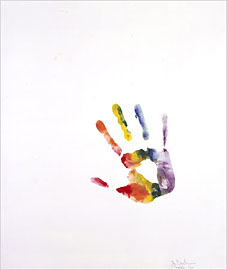
Left: Handprint (1964).
Bull’s-Eyes and Body Parts:
It’s Theater, From Jasper Johns
By HOLLAND COTTER
New York Times, February 2, 2007
WASHINGTON — Art and crass are all but inseparable. So it’s no surprise to find an exhibition that brings together a record number of Jasper Johns’s famous target paintings being bankrolled by Target. You pass the corporate bull’s-eye logo, small but vivid, on a wall on your way into “Jasper Johns: An Allegory of Painting, 1955-1965” here at the National Gallery of Art.
Mr. Johns’s targets, endlessly reproduced in the half century since he painted the earliest of them, have themselves become a form of advertising, a logo for American postwar art. Through sheer omnipresence they’ve become nearly invisible. What could change that now?
The answer: Seeing them live. The 15 “Target” paintings installed in the show’s first gallery look every bit as radical and mysterious as they surely did in New York in the 1950s, when, simply by existing, they closed the door on one kind of art, Abstract Expressionism, and opened a door on many, many others.
The National Gallery show, organized by the museum’s curator of modern and contemporary art, Jeffrey Weiss, has mysteries of its own. It isn’t a survey of the decade 1955-65, but a selection of 90 Johns works from that time organized by visual theme: targets, “devices,” words and the human body. Other motifs at least as important to that phase of his career, like flags, numbers and maps, are nowhere in evidence. Nor can the connective “allegory” proposed by the exhibition title be readily discerned. No matter.
Walk in the door, and you’re hooked. Try to move through the show in a hurry, and you can’t. The work is too strong, too unusual. It keeps stopping you, here, then here, then here. Mr. Johns, you suddenly remember, doesn’t just create visual objects, he creates situations, events. Each painting is a mini-theater, with farce and tragedy silently acted out and the audience invited to participate.
Initially Mr. Johns wanted the participation to be physical. “Target With Plaster Casts” (1955) is a painting surmounted by a row of wooden niches holding casts of body parts: a hand, a foot, a penis, a breast. And each niche has a little flip-up door, designed to be opened and closed by viewers, to give them a different, more intimate art experience than usual. Of course, if you reach for them now, in a museum, you risk arrest. So the real message, which Mr. Johns must have anticipated, is: Touch, but don’t touch.
His art is built on such ambiguities. Most of his very early paintings, done in a thick encaustic medium that makes them look molded instead of brushed, feel like sculptures. Many of those done a bit later in oils have three-dimensional objects attached to their surfaces so that, like furniture, they carve out sculptural space.
Dada, cerebral and vacant, was a big influence on Mr. Johns. His group of paintings made up of the stenciled names of colors — red, yellow, blue — was inspired in part by Marcel Duchamp’s use of language as art. Duchampian too are the so-called “devices” paintings, which have rotatable wooden discs, with squeegeelike arms for smoothing arcs of paint, affixed to their surfaces.
One assumes that Mr. Johns was declaring his complete dissociation from gestural abstraction, with its fetishized brushstroke, its existentialist soul, its emotional acting out. But then you arrive at a word-painting like “False Start” (1959), which explodes with hysterical brushwork. Or “Device Circle” (1959), on which the attached wheel looks gloomily derelict, like a one-handed clock. Or “Painting Bitten by a Man” (1961), which has a mouthful of wax encaustic gnawed out of its center, leaving a mark like a frozen scream or guffaw.
What’s the story? Is he mocking expressive painting or declaring it compatible with Dada’s cerebral conceits? Is he exposing a reserve of hidden passion beneath Duchamp’s dandyish, bone-dry wit?
In 1962 Mr. Johns made a group of prints by pressing his face and hands, covered with baby oil, onto large sheets of paper. The resulting images suggest a person swimming up from beneath an opaque surface that he is unable to push through. Over the next two years he finished two paintings and a drawing that referred to Hart Crane, the American poet who jumped off a ship in midsea and drowned.
The larger of the paintings, “Diver,” is very large and holds a compendium of motifs from earlier work: stenciled words, turbulent brushwork and a rainbow-colored target. At the center, two long wooden arms, ending in palms-open hands, reach upward.
If the painting theatrically approximates the psychic splintering that drove Crane to suicide, the related charcoal drawing, also called “Diver,” suggests the aftermath of his leap. Here the arms have hands at both ends. They point both downward and upward, with the descending hands meeting to form the shape of a skull in a subaqueous twilight.
It is in these theme-gathering works that a narrative, or “allegory,” comes together, though how to interpret it is hard to say. Countless glosses have been applied to Mr. Johns’s art, which is always assumed to be thick with coded meanings. Critics and scholars have scrutinized the art he has looked at, the writers he has read, the thinkers he has thought about.
Others have parsed his life. The artist Robert Morris, in a powerful catalog essay, links the themes of targets, flags and maps to Mr. Johns’s stint in the Army from 1951 to 1953. The art historians Kenneth E. Silver and Jonathan Katz have noted the dark, personal turn in his art after he and his lover, Robert Rauschenberg, split up in 1961. Their relationship seems to have shaped the careers of both men. It lives on in an art-world game that pits them against each other in a who’s-greater competition, though they are very different kinds of artists.
And what kind of artist is Mr. Johns? Various labels have been advanced: post-Dada, proto-Pop. I would call him a metaphysical artist, in the way that the 17th-century English poet John Donne is a metaphysical poet. Like Donne’s poetry, Mr. Johns’s art is equally about body and mind, sensuality and reflection. It is unmystical, unromantic, unnostalgic but obsessed with transcendence and the reality of loss.
Despite the difference in medium, the languages of Donne and Mr. Johns share many features: deliberate awkwardness, ungraceful beauty, a virtuosity so extreme that it turns weird. Their work can be startlingly, even embarrassingly candid, but is more often self-protectively opaque. Metaphor, rather than statement or confession, is their method. Some people find Donne manipulatively difficult and withholding. They might feel the same about Mr. Johns.
Finally, both metaphysicians appeared when a culture was on the cusp of change. And they were prepared to engage with that change, boldly, anxiously, in long careers that were electrifying early but are of profound interest all the way through. Mr. Johns’s career is of course still very much in progress, and I look forward to each future phase. I know of no major postwar American male artist whose work more completely approaches the condition of poetry, that reads as richly as it looks. To me it always feels new.
“Jasper Johns: An Allegory of Painting, 1955-1965” continues through April 29 at the National Gallery of Art, East Building, Constitution Avenue between Third and Ninth Streets, Washington; (202) 737-4215, nga.gov.
Previously on { feuilleton }
• Michael Petry’s flag
• Dada at MOMA