Born to be Posthumous: The Eccentric Life and Mysterious Genius of Edward Gorey

dery.jpg

Cover design by Jim Tierney; photo by Richard Corman.

When so many current biographies are recounting the lives of those about whom we’ve already heard a great deal (see the new biography of Oscar Wilde by Matthew Sturgis), a book exploring the career of a previously undocumented yet worthwhile figure is especially welcome. Such is the case with Born to Be Posthumous, Mark Dery’s life of the elusive Edward Gorey: artist, writer, illustrator, book designer, book creator, bibliophile, theatre designer, cat lover and balletomane.

gorey5.jpg

The Gashlycrumb Tinies (1963).

Gorey’s small books have long been one of the more curious fixtures of American culture: many of them look like children’s books but aren’t (unless the child is Wednesday Addams); others look like comic books but they aren’t comics either. The books are sometimes (but not always) Surrealist fables; or brief accounts of irreducible mystery; or sombre inexplicabilities; or camp ripostes to the pieties of Victorian morality; infrequently spiced with black humour and with lurches into outright horror. Gorey delivered his miniature tales in an idiosyncratic drawing style that combines a cartoon-like stylisation with the density of shading found in old wood engravings, a blend that would prove influential as his popularity grew. As Dery notes in his book’s introduction, without Edward Gorey’s work there would be no Lemony Snicket, while Tim Burton would be a skeletal shadow of his present self. (Given the latter’s current output, this might do him some good. But I digress.)

gorey4.jpg

The Doubtful Guest (1957).

In Britain, however, Gorey remains a cult rather than cultural figure, still overshadowed by better-known contemporaries such as Maurice Sendak and Charles Addams. Until the publication of the Amphigorey story collections Gorey’s books were produced in small editions with such a limited availability you were more likely to encounter his art on the cover of another author’s book than within the pages of his own. I became aware of Gorey’s work by gradual osmosis. The first substantial piece I read about him was his entry in Philip Core’s Camp: The Lie that Tells the Truth (1984), in which Core’s mention of an art style “recollecting Victorian engravings” marked Gorey as an artist to be investigated. Two years later he received a longer entry in The Penguin Encyclopedia of Horror and the Supernatural edited by Jack Sullivan. (Camp and horror: how many other artists sit so easily in both worlds?) But Gorey is absent from many books about 20th-century illustrators, and despite the sequential nature of his work you won’t find him in histories of comic art.

gorey6.jpg

Edward Gorey’s Dracula: A Toy Theatre (1979).

In a way it’s fitting that the work of a man who was adamant in his determination to avoid being pinned down should be so difficult to find. But it’s also a shame that the work of an ardent Anglophile should be hard to find in the country that fuelled his imagination. Among Gorey’s literary favourites Dery lists Jane Austen and Agatha Christie together with Ronald Firbank, Saki, and EF Benson’s Mapp and Lucia novels. (The latter trio are all present in Core’s book on camp, which no doubt makes Gorey camp to the core. Whether he would have approved of being labelled as such is another matter.) I wasn’t surprised by the mention of Saki when so many of Saki’s story titles (The Secret Sin of Septimus Brope) sound like Gorey books, while many of the stories themselves are like Gorey scenarios in prose. Not all Gorey’s work is camp or comic, however; the 32 drawings that comprise the wordless masterpiece of The West Wing (1963) are closer to David Lynch or the “strange stories” of Robert Aickman, the latter an author that Gorey illustrated on several occasions. Dery emphasises how Gorey’s love of silent cinema contributed to The West Wing and other pieces, especially the serials of the Surrealists’ favourite filmmaker, Louis Feuillade.

Continue reading “Born to be Posthumous: The Eccentric Life and Mysterious Genius of Edward Gorey”

The art of Henricus Jansen, 1867–1921

henricus0.jpg

This week’s post is another by Sander Bink about a neglected artist of the Dutch fin de siècle. Once again, this is an artist whose work was new to me. The Mucha-like style of the later pictures (and the one above from the same series) are especially good. My thanks again to Sander for the post.

* * *

Henricus Jansen (1867–1921) was a Dutch painter, graphic artist and illustrator who used ‘Henricus’ as his artist’s name, ‘Jansen’ being a very common and decidedly unsexy surname. He originated from The Hague where Art Nouveau and symbolism flourished in the 1890s more than any other Dutch city.

In the little that has been written about Henricus he is usually considered not to be avant-garde or progressive enough to be an ‘important artist’ (whatever that may mean). He is, however, mentioned in the standard reference work Symbolism in Dutch Art by Polak from 1955. Extensive studies have never been published about him and my main source of information about his life and work is an unpublished university thesis from 1988 by Louis Baeten of which I happen to have a copy. Baeten had spoken to Henricus’s daughter who was then still alive. According to the thesis Henricus must have made hundreds of drawings and paintings but they seem to be quite rare nowadays and seldom come to auction.

henricus1.jpg

For example, Henricus visited Tunisia in 1901 where Baeten says he produced more than 67 pastels and drawings of which “only seven survive”. These were exhibited in The Hague in 1901, and Leiden in 1907. One of these is depicted here from a private collection: a charming, somewhat cartoon-like ink drawing of three Tunisian male figures.

henricus2.jpg

From 1887 till 1892 Henricus lived in Paris where he mingled in the bohemian and artistic circles around Le Chat Noir, and knew people like Rodolphe Salis and Paul Verlaine. The drawings and illustrations he produced from around 1890 are strongly influenced by Parisian graphic artists like Steinlen, Grasset and Willette, uncommon models in Dutch art of the 1890s. Examples like the drawing of a lady in an antique market (above) are to be found in his illustrations for a book by Johan Gram, ‘s-Gravenhage in onzen tijd (The Hague nowadays) from 1893.

henricus3.jpg

More Symbolist in style, and therefore probably more of interest to { feuilleton } readers, are his illustrations for the popular magazine Elsevier’s. The picture shown here is a lithograph he made for the poem ‘Paulinus van Nola’ by the Flemish poet Pol de Mont, published in 1895.

henricus4.jpg

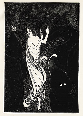
But his chef d’oeuvre is a series of lithographs inspired by the medieval folk song Heer Halewijn (Lord Halewijn), published in 1904 and exhibited in The Hague the same year, of which three are depicted here (from the collection Van der Peppel.) The most famous of the series is plate number sixteen in which Lord Halewijn’s head is decapitated by a charming lady. It is obviously inspired by Beardsley’s Salomé but is made with an entirely different technique and in colours. There is also a touch of Puvis de Chavannes and Carlos Schwabe to them. They are among the finest examples of Dutch fin de siècle graphic art.

Sander Bink

henricus5.jpg

henricus6.jpg

Previously on { feuilleton }
The art of Antoon van Welie, 1866–1956
The art of Simon Moulijn, 1866–1948
René Gockinga revisited
Gockinga’s Bacchanal and an unknown portrait of Fritz Klein
More from the Decadent Dutch

Illustrating Lovecraft again

dunwich.jpg

The Dunwich Horror (1972). Art by Victor Valla.

El horror de Dunwich y otros relatos is the last of the books I was working on earlier this year for Spanish publisher Editorial Alma. This was a more stimulating Lovecraft collection to work on than the previous two-story volume since three of the stories were ones I hadn’t dealt with before. The fourth story, The Dunwich Horror, I partly illustrated back in 1988/89, and I took the liberty of reusing the best of that set of pages showing Wilbur Whateley’s messy demise. This picture has been reprinted a few times elsewhere so I was reluctant to recycle it again, but the collision of deadlines earlier this year meant that once again I was pressed for time on this book, and having an illustration already done was a great help. It’s taken me 30 years to finally get round to depicting Wilbur’s monstrous brother.

hpl11.jpg

The Dunwich Horror 1.

hpl12.jpg

The Dunwich Horror 2.

hpl13.jpg

The Dunwich Horror 3.

hpl14.jpg

The Dunwich Horror 4.

Continue reading “Illustrating Lovecraft again”

Illustrating Sherlock Holmes

beeton.jpg

Beeton’s Christmas Annual, 1887.

The latest in the series of illustrated editions I’ve been working on for Spanish publisher Editorial Alma is a single-volume collection of two short Sherlock Holmes novels, A Study in Scarlet and The Sign of Four. Work on this book began immediately after I’d finished Dracula so maintaining the Victorian theme was easy enough, although the commission as a whole was an awkward one. The main problem was having barely enough time to create 20 new illustrations while I was finishing work on the huge Jim Cawthorn book. But even with enough time this would have been a difficult brief. I regard Sidney Paget‘s original Holmes illustrations as the definitive ones so trying to offer people a fresh take on the world’s greatest detective is difficult. (And, as with Dracula, there’s further competition from the innumerable screen adaptations.) Then there are the stories themselves which are often more cerebral than visual, offering little for an illustrator beyond successive views of rooms, streets, houses and so on. Even Paget has trouble with this aspect of the stories, with many of his illustrations showing the various characters standing or sitting in rooms. If I’d had more time I might have tried a lateral take on the content—two of the illustrations in Dracula avoided the people-in-rooms problem by showing collections of objects on tables—but I didn’t have the time…

paget.jpg

Watson and Holmes by Sidney Paget. From The Adventure of Silver Blaze, The Strand Magazine, December 1892.

As things turned out, the least satisfying of the novels from a story perspective, A Study in Scarlet, was easier to illustrate because much of the second half takes place in the United States. This was the first Holmes novel, and it doesn’t work as well as the others for precisely this reason, the narrative attention is removed from Holmes, Watson and London, but the change of scene is a benefit for an artist. The second novel, The Sign of Four, is a better story but was compromised in this edition because the publisher only wanted every other chapter illustrated. For this reason Holmes and Watson are elusive presences in their own books although given the problems outlined above this may be for the best.

There’s still one more volume to emerge from my recent round of work for Alma, a collection of four Lovecraft stories, three of which I hadn’t illustrated before. More about this in a month or so. In the meantime, the full run of Holmes pictures follows below, while all may be seen at a larger size here.

A Study in Scarlet

holmes01.jpg

holmes02.jpg

holmes03.jpg

Continue reading “Illustrating Sherlock Holmes”

Bibliothek des Hauses Usher

rottensteiner.jpg

As promised a couple of weeks ago, this book-cover post is one of several that originates with Franz Rottensteiner’s horizon-expanding The Fantasy Book: The Ghostly, the Gothic, the Magical, the Unreal (1978). Rottensteiner’s study was important for me not only for its introduction to many hitherto unknown writers but also for its wide-ranging collection of illustrations and cover designs. Most of the artwork has since become very familiar but a few examples were by artists or designers I hadn’t encountered elsewhere. Hans Ulrich Osterwalder was one of these, his art for a series of German horror titles appearing inside the book and, in the case of the US edition of The Fantasy Book, on the cover. Searching for Osterwalder’s work a few weeks ago I was delighted to discover that the German covers were part of a series of horror/dark fantasy reprints for the Bibliothek des Hauses Usher imprint from Insel Verlag, for which Osterwalder created many more striking and unusual covers.

Bibliothek des Hauses Usher published 26 novels or story collections from 1969 to 1975. I thought at first that this was a paperback series but all the books were hardbacks with uniform black covers and white spines. The imprint logo is a rather ordinary looking House of Usher cracking down the middle (a nod to Arkham House, perhaps) with a slogan on the back cover borrowed from Ambrose Bierce: “Can such things be?” Each volume was printed on light green paper, at least until the paper stock ran out. The last three volumes were printed on white paper then on green again when further stocks were found.

page.jpg

Osterwalder’s work on this series stands out for being innovative, surreal and free of the cliches that persist on horror titles. Most of the artwork is illustrative of the contents but it manages this without being too overt or obvious which isn’t an easy thing to do. The list of authors is an interesting mix as well (if you overlook the typically lamentable absence of women writers): many of the names are those you’d expect in a series such as this but there are also some such as Jean Ray and Stefan Grabinski who you wouldn’t find in an Anglophone series. Grabinski was a Polish writer of weird fiction who receives a mention in Rottensteiner’s book (and is a favourite of China Miéville) but whose work is still largely unknown to Anglophone readers. Just as obscure to English readers is Thomas Owen who was a Belgian writer (real name Gérald Bertot) and a friend of Jean Ray’s. Tartarus Press published a collection of Owen’s stories in 2012 but I’ve not read it so can’t vouch for their quality.

All 26 covers are shown below in their order of publication. Hans Ulrich Osterwalder still works as an artist and designer, and has a website here. Franz Rottensteiner was interviewed at 50 Watts a few years ago.

usher01.jpg

usher02.jpg

usher03.jpg

Continue reading “Bibliothek des Hauses Usher”