The art of Gordon Ertz

ertz01.jpg

November 1926.

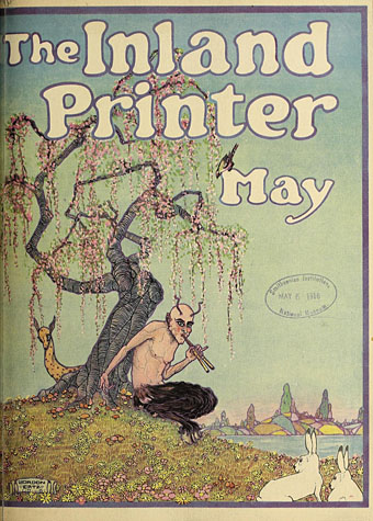
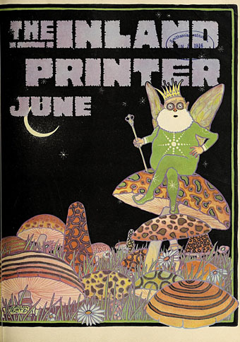
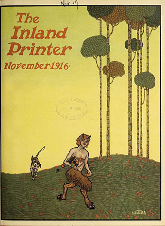
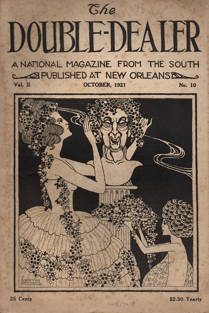
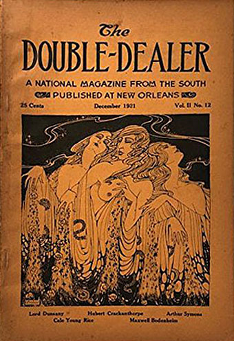
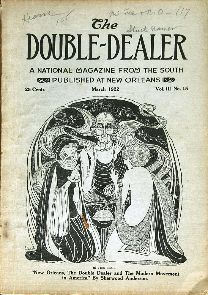
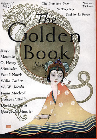
After posting a couple of magazine covers by American illustrator Gordon Ertz I thought he deserved a closer look, especially when documentation about his life is lacking; even the Library of Congress only lists his birth year, 1891, while nobody seems to know when he died. (Update: See the comment below by Douglas A. Anderson for biographical details.) Mr TjZ is to thank for this post (thanks!) after identifying one of the Double-Dealer covers as an Ertz. I said in a mail to Joe that I’d not seen Gordon Ertz’s name before, but a consequence of writing these posts for so many years is finding that I have mentioned somebody a decade or more ago then forgotten all about them. Thus it was with Ertz whose cover for The Golden Book first appeared here in 2010.

ertz02.jpg

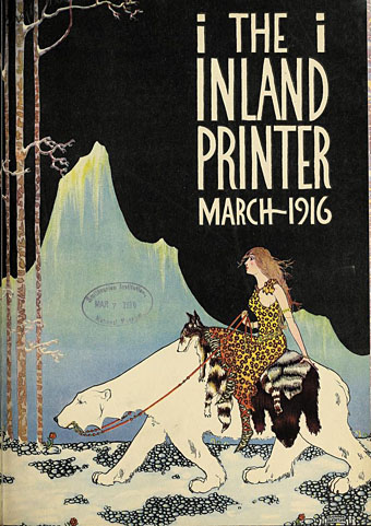
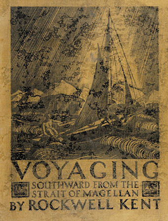
The Inland Printer was a magazine for the print trade which commissioned covers from illustrators, all of whom seem to have been given free reign. Or they were until the 1920s when the magazine abandoned this kind of frivolity. Most of the available Ertz oeuvre is magazine covers and book illustrations from the 1910s to the 1920s, but his later work includes this map from 1936 intended as a guide for the anglers of North America. The map was designed and annotated by Joe Godfrey Jr, a writer whose subsequent books about fresh-water and salt-water fish were also illustrated by Ertz.

ertz03.jpg

ertz.jpg

ertz04.jpg

Continue reading “The art of Gordon Ertz”

Weekend links 587

jetpac.jpg

Jetpac (1983) by Ultimate Play The Game. Lunar Jetman was the superior sequel but Jetpac had the better loading screen.

• RIP Clive Sinclair. Products made by Sinclair Research Ltd. were among the first electronic gadgets I owned: the Sinclair Scientific calculator which compelled you to learn Reverse Polish notation before you could use it; the ZX Spectrum computer, of course; and the pocket TV that came bundled with the computer, a machine with such feeble reception that it only ever worked outdoors. I’ve still got my Spectrum computer, and it still worked the last time I plugged it in although it’s hardly worth keeping when emulators proliferate. Spectacol for Android is a good example of the latter. Related: World of Spectrum; the early stages of the Spectrum design process by Sinclair designer Rick Dickinson; XL-1 by Pete Shelley, electro-pop with Spectrum-generated lyrics and graphics.

• Mixes of the week: A Lee “Scratch” Perry tribute mix by Dennis Bovell, and Blood Tide Station 1: Breakaway plus Blood Tide Station 2: Force of Life by The Ephemeral Man.

• “It’s not an easy time to be daring,” says Dennis Cooper, talking to Barry Pierce about his new novel, I Wished.

• London under London: Adam Zamecnik interviews Tom Chivers about searching for London’s lost rivers.

• New music: Ode To The Blue by Grouper, and A Shadow No Light Could Make by Nathan Moody.

• At Public Domain Review: 700 years of Dante’s Divine Comedy in art.

• At Wormwoodiana: The Mushroom Man—A Note on EC Large.

DJ Food trips out with a collection of psychedelic drug posters.

Nodnol (1969) by The Spectrum | Spectrum (1969) by The Tony Williams Lifetime | Spectrum (1973) by Billy Cobham

The art of Alexander Cañedo, 1902–1978

canedo15.jpg

September, 1947.

Harry Harrison used to enjoy referring to the “sexual dimorphism” of the cover art on pulp science-fiction magazines, by which he meant that male astronauts would usually be depicted wearing sturdy spacesuits or functional attire while their female counterparts would be given spray-on outfits with plunging necklines, if they were given any clothes at all. Sexism was still thriving in the future, in other words, with visible male flesh in short supply. This makes the handful of cover paintings produced by Alexander Cañedo for Astounding Science Fiction uncommon enough to be almost unique.

canedo16.jpg

February, 1948.

Cañedo was a Mexican-American, born Alejandro de Cañedo, whose covers for Astounding were simply credited to “Alejandro”. The editorial policy at the magazine favoured hard-headed, technology-oriented science fiction, with cover art that avoided the scantily-clad women (and, to be fair, shirtless men…) seen each month on the covers of swashbuckling rival, Planet Stories. Robots and rocket ships were still required at Astounding, however, and half the covers produced by Cañedo feature more predictable imagery. The first of the cosmic nudes appeared after editor John W. Campbell spotted an unsold painting during a visit to Cañedo’s studio. Campbell and his readership regarded the naked males as purely symbolic, which they are up to a point, and Cañedo was praised for his art in the magazine’s letters section. When seen in the context of his overtly homoerotic work the pictures evidently reflect more personal proclivities.

canedo17.jpg

October, 1949.

Cañedo is described today as a gay artist, a claim that can’t easily be verified when the available biographical details repeat the same few facts. But his art away from Astounding returned continually to the human body, a subject where his mastery was sufficient to warrant the publication in 1954 of a short guide for artists, How Cañedo Draws the Human Figure. Most of his drawings and paintings listed on auction sites are nude (or semi-nude) studies, with lovingly rendered male figures predominating. Several of his later paintings could easily have served as additional magazine covers. The manipulation of light and colour in these pictures is outstanding, unlike any treatment of male nudes that I’ve seen before, and by an artist worthy of greater attention.

(Note: Most of these pictures are untitled and undated. I’m also not an art dealer so please don’t ask for valuations.)

canedo18.jpg

July, 1954. “Inappropriate” is the title of the picture which doesn’t relate to anything inside the magazine.

canedo09.jpg

Continue reading “The art of Alexander Cañedo, 1902–1978”

Covers for The Double-Dealer

dd01.jpg

The Double-Dealer was a literary magazine “published at New Orleans” from 1921 to 1926 whose covers for the first two years of its run wouldn’t have been out of place twenty years earlier. In its written content the magazine wasn’t a throwback to the fin de siècle but was flying the flag for Modernism, an editorial stance that might seem at odds with the Beardsley-like cover art, at least until you notice the names of some of the contributors. Essayist and poet Arthur Symons had been a friend of Aubrey Beardsley’s in the 1890s, and the pair worked together on their own magazine, The Savoy, as editor and art editor respectively. Another contributor, Djuna Barnes, was a thoroughgoing Modernist in her writing but she was also an occasional artist who produced a number of drawings in a Beardsley-like style.

dd01.jpg

The covers of The Double-Dealer up to June 1922 were the work of Olive Leonhardt who doesn’t seem to have produced anything else in this manner. The magazine is notable today for having published early writings by William Faulkner and Ernest Hemingway but the first few issues also include contributions from Lafcadio Hearn, Lord Dunsany and James Branch Cabell. A press ad declared that “rebels and reactionaries rub shoulders” in the pages of the magazine, so maybe Leonhardt’s covers were a further example of editorial equanimity. Or maybe this type of art was more suited to New Orleans than New York City. The cover for July 1922 by Gordon Ertz continues in the Leonhardt manner, after which the magazine adopted the sober presentation common to literary magazines of the period, with a simple design based on a Janus-headed Roman coin.

Update: Added a credit for Gordon Ertz.

dd03.jpg

dd04.jpg

dd05.jpg

Continue reading “Covers for The Double-Dealer”

Rockwell Kent’s Voyaging Southward

kent01.jpg

Rockwell Kent’s 1930 edition of Moby Dick is one of those rare illustrated books where the drawings match the text so well that’s it hard to imagine it being improved upon. Kent’s familiarity with ships and shipboard life is explained in part by Voyaging Southward from the Strait of Magellan, his memoir of a journey to Tierra del Fuego in 1922. As with Moby Dick, the book is illustrated throughout with vignettes as well as larger pieces, all of them in Kent’s customary pen-and-ink style. There are over 90 illustrations in all, plus maps. See the rest of them here.

kent02.jpg

kent03.jpg

kent04.jpg

kent05.jpg

Continue reading “Rockwell Kent’s Voyaging Southward”