Readers of Alfred Kubin’s nightmarish fantasy novel, The Other Side, may like to know that a first edition was among the new uploads at the Internet Archive in December. The original printing is of note for the fine quality of its illustrations which—unlike subsequent editions—would have been taken from Kubin’s original drawings. Many of these are little more than vignettes but the book contains a number of full-page pieces that are densely cross-hatched, a technique that degrades the more the picture is copied, and which suffers even more if the picture is reduced in size, as these drawings have been in many paperback printings. I complained in an earlier post about the poor quality of the reproductions in my Dedalus reprint, and linked to a Flickr collection of scans from another first edition, but that set didn’t contain all 52 drawings. The pages of this new copy are rather discoloured but the sombre shade suits the increasingly dark tone of Kubin’s story. I imagine the author might approve.
Category: {illustrators}
Illustrators
Foss, Jodorowsky and low-flying spacecraft
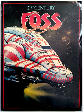
Discovered last week in a local charity shop (and for a fraction of the usual asking price), 21st Century Foss, the Dragon’s Dream collection of Chris Foss paintings from 1978. Foss’s book covers were impossible to avoid in the Britain of the 1970s, often to a ridiculous degree when publishers would stick a spacecraft by the artist or one of his imitators on a book containing no spaceships at all. His ubiquity made him the first cover artist who registered with me as exactly that, an identifiable name whose work suggested that this kind of artistic activity might be something worth pursuing.
I bought a few of the books published by Dragon’s Dream/Paper Tiger in the late 70s/early 80s but many of them weren’t interesting enough to warrant the exhausting of my meagre finances. Ian Miller, yes; Chris Foss, no. Architecture, whether real or invented, was generally more interesting than spaceships, even when the latter were unique designs like the typical Foss behemoth. (There is architecture in many of Foss’s paintings but I preferred Roger Dean’s aesthetics, the fluid and organic buildings, the vehicles modelled on birds, fish and insects.) Foss also suffered from that process of mental evolution whereby you reject an early enthusiasm when you find something that has a more obsessive hold. In musical terms, his paintings were like glam pop, the first music that made a deep impression but which was swiftly displaced by progressive rock and electronic music. Despite the repudiation I still get a weird charge when I see one of his paintings, an instant jolt back to an adolescent mental space. His cover for Midsummer Century by James Blish does this to an excessive degree, being one of a handful of Foss pictures that caused me to attempt some imitative drawings of my own circa 1975. Those drawings, which went astray years ago, caused a minor stir of appreciation among schoolfriends, a reaction that made me realise I was doing something right, however amateurish the attempt.
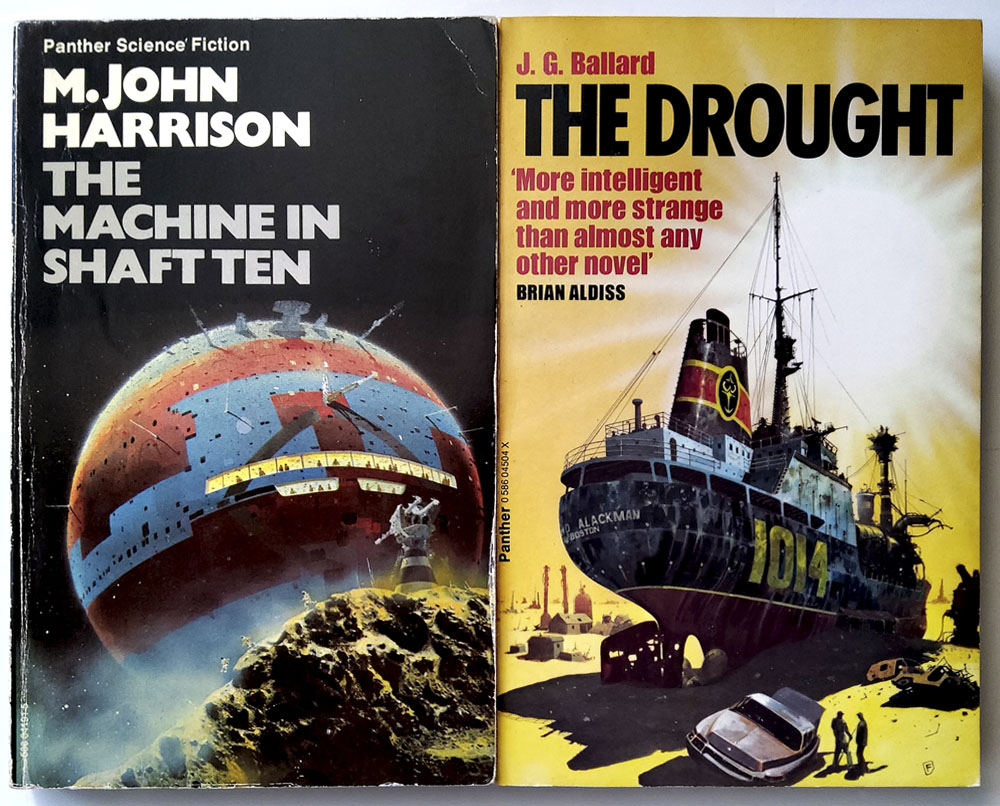
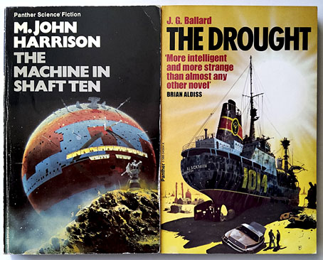
Ballard’s Low-Flying Aircraft collection is labelled on the rear as “Fiction”, and is spaceship-free, whatever the cover may suggest.
21st Century Foss belies its title by being more than a simple parade of spacecraft designs. There are Foss covers that you never see in internet galleries—pictures of submarines, ships and aircraft from the Second World War—together with a few pieces used on the covers of crank titles. Ballard aficionados may like to know that the cover for the Panther paperback of Crash is reproduced here on a full page. The latter is a good example of the thinking in paperback publishing at the time: “Ballard is science fiction so we need an SF artist for this one!” Foss had earlier illustrated two volumes of The Joy of Sex so must have seemed an ideal match. According to Rick Poynor, the artist hated the novel while the author disliked the cover.
Foss’s book opens with a section about his designs for three feature films: Jodorowsky’s Dune, Superman and Alien. None of his concepts ended up on the screen but it’s good to see the Dune designs in print. This section is also prefaced by two pages of hyperactive hyperbole for Foss and his art from Alejandro Jodorowsky. The same text may be found at Duneinfo but it bears repeating here as a further example of the manic director in full flight. Incidentally, the “English magazine” that’s referred to is most likely Science Fiction Monthly for February 1974, an issue which contained a collection of Foss paintings plus an interview with the artist.
Continue reading “Foss, Jodorowsky and low-flying spacecraft”
Weekend links 604
Poster by Chris Ware for Uncle Boonmee Who Can Recall His Past Lives (2010).
• “He is a proponent of “slow cinema,” which is to say, movies that inspire reflection because they are unhurried but fluid, clear but framed by mystery.” Hilton Als on the metaphysical world of Apichatpong Weerasethakul.
• “You could take off your clothes and lay in the sun, nude, with other guys looking for sex, right in Manhattan. And the police didn’t care. It was safe…” Stanley Stellar on his photographs of New York’s “Gay Piers”.
• At Wormwoodiana: An interview with RB Russell who talks about his new book, Robert Aickman: An Attempted Biography.
• New music: Mysterium by Held By Trees; A Journey by Hinako Omori; Waves by The Soundcarriers.
• Get some cosmic perspective with an updated version of Charles & Ray Eames’ Powers of Ten.
• You Cut Your Hair and Made a Friend: Richard Conway on Ladytron’s 604 and Light & Magic.
• At Unquiet Things: The Tawdry Technicolor Horrors of Vicente B. Ballestar.
• Alexis Petridis compiles a list of the late James Mtume’s greatest recordings.
• Steven Heller’s Font of the Month is Valvolina.
• Slow Motion (1978) by Ultravox | Slow And Low (1995) by Tetsu Inoue | Slow Burning Ghosts (1996) by Paul Schütze
René Bull’s Russian Ballet
L’Oiseau de feu.
I’m sure I’ve said this before but one reason I spend so much time scouring the Internet Archive is in the hope of turning up gems like this recent arrival. The Russian Ballet was a study by Alfred Edwin Johnson of the Ballets Russes, written for an English readership and published in 1913 shortly after Diaghilev’s company had staged their historic performance of Le Sacre du printemps in Paris. Johnson discusses this event, which he attended, but he gives equal space to examinations of the company’s other ballets, from earlier avant-garde pieces like L’après-midi d’un faune to that hardy perennial, Swan Lake. In place of production sketches or photographs we have René Bull’s many illustrations, in colour plates and black-and-white drawings, with the chapters being announced by a title in a graphic style that matches the theme of each ballet. I’d only seen a few of these before on a Flickr page so it’s a treat to see the whole book at last.
Schéhérazade.
Johnson’s discussion has a tendency to falter when faced with the difficulty of describing a wordless artistic medium. The problem is compounded by the radical nature of many of the ballets, so that Bull’s illustrations become an essential component of the book, giving a flavour of the costumes and dances while the author attempts to relate the emotional qualities of the performances. Bull’s work here isn’t as elaborate is in his illustrated Rubáiyát but then the drawings are serving a documentary purpose.
Schéhérazade.
Schéhérazade.
Narcisse.
The Knowles’ Norse Fairy Tales
More tales from the northern lands, and a book illustrated by two people this time. The Knowles were a pair of brothers, Reginald Lionel (1879–1954) and Horace John (1884–1954), who produced several illustrated editions together while also working independently. Sibling illustrators are unusual but not unprecedented; the Knowles’ contemporaries included the Robinson brothers—Charles, William (Heath) and Thomas—who worked together on an edition of Hans Christian Andersen’s stories. Norse Fairy Tales (1910) is a collection of folk stories that overlap in places with the more familiar tales from Denmark and Germany. The book was compiled by FJ Simmons from Norwegian collections by Peter Christen Asbjørnsen and Jørgen Moe which had been translated into English by George Webbe Dasent. Simmons says in his introduction that he edited (or bowdlerised) his selection a little in order to make some of the pieces suitable for a young readership although he doesn’t give any details. His book is one I ought to have gone looking for sooner after I swiped part of a related illustration for a CD design some time ago. A drawing by Reginald Knowles of a troll walking among trees appears in a source book of Art Nouveau graphics which I’ve borrowed from for many years. Reginald’s trees proved to be perfect for the CD. This was a lazy move on my part but I’d been asked to rescue a design which wasn’t working, and the deadline was a tight one.
Simmons may have trimmed some of the texts but Norse Fairy Tales still runs to 55 stories that fill 500 pages for which the Knowles’ provide full-page illustrations, a few colour plates and many smaller drawings. Each artist is identifiable by their initials. All the black-and-white art is pen-and-ink but Horace’s drawings imitate the style of early wood engravings, a look that works well with the material, while Reginald’s drawings would be identifiable even without his initials since his work tends to be a little more stylised, as with the sinuous trees that I borrowed. This is an impressive book that might be better known if there wasn’t such a profusion of illustrated Brothers Grimm and Hans Andersen collections. Find out what the trolls are getting up to here.
(Note: the Internet Archive scan has excessively browned pages. All the images here have been run through filters to remove the colouration.)