Equus and the Executionist

equus.jpg

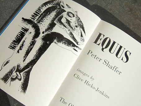
I wrote about Peter Shaffer’s fascinating play, Equus, in September last year, and in passing touched on the horse and Mari Lwyd-inspired paintings of Clive Hicks-Jenkins which seemed to complement the play’s themes of sexuality and passionate obsession. Callum James had been having similar thoughts about Clive’s art and urged his friends at The Old Stile Press to bring play and artist together. Clive was in touch last week to let me know that his illustrated edition of the play is now in print. The Old Stile Press produce limited collectors’ editions of books to the highest standard. Consequently these are expensive works but then they’re as much art pieces as books, as you can see from the care which has been lavished on this particular volume. Nice to see one of my favourite typefaces, Bodoni, used for the text.

scott.jpg

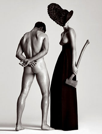
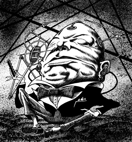
Also in touch last week was photographer Gray Scott with news of this striking picture entitled Executionist which also happens to be a limited edition print. This is another expensive piece—as limited prints tend to be—but there’s no law that says the best things have to be cheap, is there?

Elsewhere on { feuilleton }
The illustrators archive

Previously on { feuilleton }
Dark horses
Gray Scott

Blast

blast.jpg

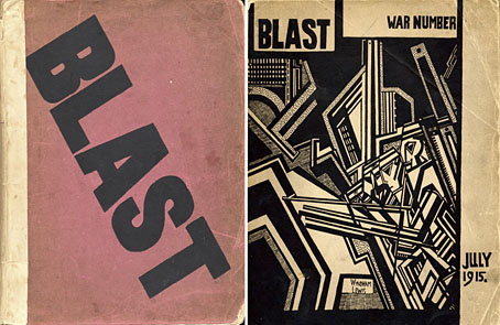
Both issues of Wyndham Lewis’s avant garde art and literature journal can be found in a collection of similar publications from the Modernist years at Brown University here and here. I’ve always liked the bold graphics of Lewis and his fellow Vorticists, and BLAST 2, “the War Number”, is especially good in that regard. The MJP site reminds us that BLAST is still under copyright control outside the US and is also available in facsimile editions from Gingko Press.

BLAST was the quintessential modernist little magazine. Founded by Wyndham Lewis, with the assistance of Ezra Pound, it ran for just two issues, published in 1914 and 1915. The First World War killed it, along with some of its key contributors. Its purpose was to promote a new movement in literature and visual art, christened Vorticism by Pound and Lewis. Unlike its immediate predecessors and rivals, Vorticism was English, rather than French or Italian, but its dogmas emerged from Imagism in literature and Cubism plus Futurism in visual art.

The original BLAST was published by Aubrey Beardsley’s first publisher, John Lane, and it’s fascinating to see Lane advertising back issues of The Yellow Book in pages which include Lewis’s anti-Victorian polemic. Meanwhile I’m still waiting for copies of the Art Nouveau journal Ver Sacrum to turn up somewhere. If anyone runs across quality scans, please leave a comment.

Via Things Magazine.

Previously on { feuilleton }
Wyndham Lewis: Portraits

Mervyn Peake at Maison d’Ailleurs

peake.jpg

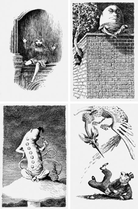
I should have mentioned this a lot sooner considering the museum sent me a copy of the exhibition prospectus. Maison d’Ailleurs is the Museum of Science Fiction, Utopia and Extraordinary Journeys in Yverdon-les-Bains, Switzerland, and their current exhibition is Lines of Flight—Mervyn Peake, the Illustrated Work. Yverdon-les-Bains is too out of the way for most of us but the event gives me another excuse to draw attention to Peake’s illustrations for Lewis Carroll; some of the drawings from Alice’s Adventures in Wonderland, Through the Looking-Glass and The Hunting of the Snark are among the works on display until February 14, 2010.

Mervyn Peake (1911–1968) is celebrated today as the writer of the extraordinary series of novels about Titus Groan (often referred to as the Gormenghast books). Yet, during his lifetime he was more known for his graphic work.

From 1939 and for almost two decades, Peake produced illustrations both for his own work (Captain Slaughterboard; Rhymes without Reason) and for classics (Household Tales by the brothers Grimm; Alice in Wonderland; Treasure Island). His mastery of the pen and the pencil were unrivalled. Visually, his style could be disarmingly economical, using very pure and clean single lines to create a striking sense of volume. But with cross-hatching and dots Peake could also make his drawings look like engravings, providing the characters and objects he depicted, or the background to them, with rich and varied textures and a wide range of shades. (More.)

For more of Peake’s illustration work, see Mervynpeake.org.

Elsewhere on { feuilleton }
The illustrators archive

Previously on { feuilleton }
Charles Robinson’s Alice’s Adventures in Wonderland
Humpty Dumpty variations
Alice in Wonderland by Jonathan Miller
The art of Charles Robinson, 1870–1937
Lovecraftian horror at Maison d’Ailleurs
The Illustrators of Alice

Charles Robinson’s Alice’s Adventures in Wonderland

robinson1.jpg

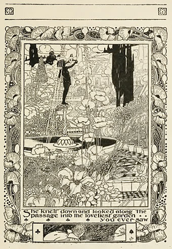
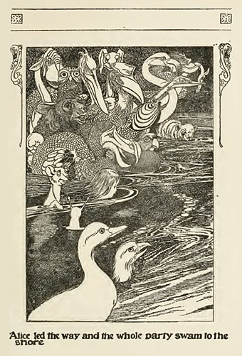
As you might expect, the Internet Archive has a lot of Alice in Wonderland adaptations, including a silent film version whose poor picture quality makes any attempt to watch it a chore. Among the many books in their collection one of the best is this illustrated edition from 1907 by Charles Robinson, brother of the equally talented William Heath. The full-page illustrations are especially good for their swirling embellishments, and I like the way he establishes the playing card motifs very early on. But the PDF version of the book also shows his inventive page layouts with narrow vignettes cutting through the text and the margins featuring tiny figures running about. The colour plates aren’t so impressive but his black-and-white work makes up for that.

robinson2.jpg

Elsewhere on { feuilleton }
The illustrators archive

Previously on { feuilleton }
Humpty Dumpty variations
Alice in Wonderland by Jonathan Miller
The art of Charles Robinson, 1870–1937
The Illustrators of Alice

Humpty Dumpty variations

thurstan.jpg

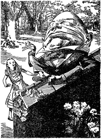
Humpty Dumpty by EB Thurstan (1930).

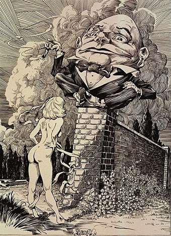
A preoccupation of the past couple of weeks has been Lewis Carroll’s Alice books as I’ve been working on an Alice in Wonderland project which I’ll unveil shortly. Looking around at some of the numerous visual interpretations of the stories I came across two portfolios I hadn’t seen before by comic artist Frank Brunner. These are from the late Seventies, and typically for that decade they work an erotic twist on the books by adding ten years to Alice’s age whilst depriving her of clothes. Nudity aside, Brunner’s drawings don’t depart from tradition very much—or add much, for that matter—but I did notice that he’d based his Humpty Dumpty figure on an earlier version by illustrator EB Thurstan.

brunner.jpg

Humpty Dumpty by Frank Brunner (1978?).

The reason Thurstan’s Humpty is so familiar is that I’d borrowed it myself for one of the many appearances by the character in the Lord Horror comic series, Reverbstorm. Humpty’s presence there would involve too much explanation so you’ll have to be satisfied with the character who explains Jabberwocky remaining inexplicable. As for Brunner’s drawings, you can see coloured versions on his website.

reverbstorm.jpg

Humpty Dumpty from Reverbstorm #3 (1994).

Previously on { feuilleton }
Alice in Wonderland by Jonathan Miller
The Illustrators of Alice