Painted devils

bewick1.jpg

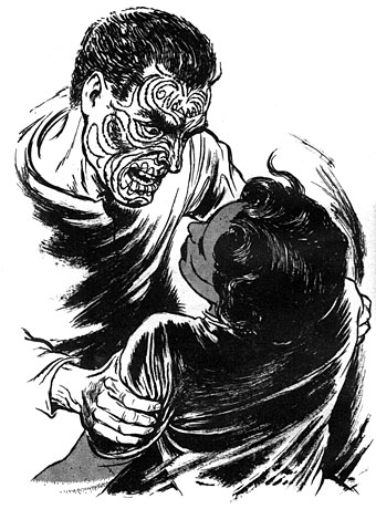
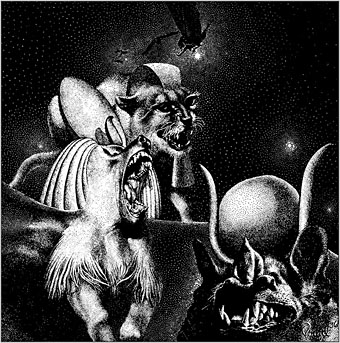
Alright, these devils are inked rather than painted, but the phrase is a memorable one from Macbeth which was also used by Robert Aickman as a title for one of his story collections.

bewick2.jpg

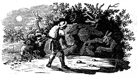
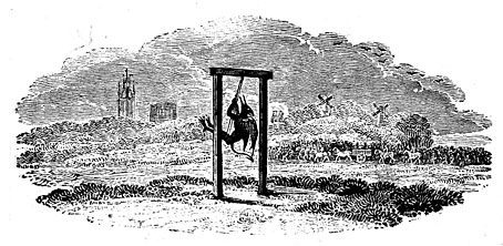
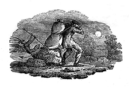
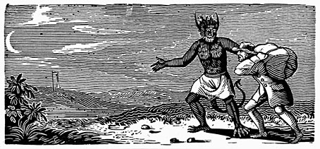
The devils in question are the work of Thomas Bewick (1753–1858), an English engraver referred to twice in Casting the Runes by MR James. I was reminded of this recently after I’d watched the excellent film adaptation, Night of the Demon, and decided to reacquaint myself with its origin. In James’ story, Karswell, a vengeful occultist with a vague resemblance to Aleister Crowley, torments a man he’s cursed by reminding him of the escalating supernatural threat and its potentially fatal outcome. One of the warnings is as follows:

…two things came for him by post during those weeks, both with a London postmark, and addressed in a commercial hand. One was a woodcut of Bewick’s, roughly torn out of the page: one which shows a moonlit road and a man walking along it, followed by an awful demon creature. Under it were written the lines out of the “Ancient Mariner” (which I suppose the cut illustrates) about one who, having once looked round—
walks on,

And turns no more his head,
Because he knows a frightful fiend
Doth close behind him tread.

bewick4.jpg

The Coleridge quote makes it into the film but there’s no mention of the woodcut, although we do see some other engravings of medieval devils. (Likewise, the ITV Playhouse adaptation from 1979 includes the quote but omits the woodcut.) Since the quote is a genuine one I was curious to know whether the Bewick picture also existed. Unfortunately, this doesn’t seem to be the case. I’m equivocating, as usual, because I’m not entirely certain, but in an article from 2006 Tom Lubbock had this to say about Bewick and James:

Like Borges, James delights in the fictional but plausible work of literature. In Casting the Runes, he also contrives a fictional work of art. Though a contemporary of Coleridge, the engraver Thomas Bewick never made any woodcuts illustrating The Rime of the Ancient Mariner, nor do any of his works quite correspond to the one described in this passage. Still, it’s a good fake. Many of Bewick’s woodcuts have travellers. Some of them have moonlight and demons, too. You can see what James had in mind.

bewick3.jpg

Continue reading “Painted devils”

Emshwiller illustrates Bester

emshwiller01.jpg

Having finished reading The Count of Monte Cristo I thought I’d, er jaunt from the 1840s into the far future by revisiting Alfred Bester’s Dumas-derived The Stars My Destination. I prefer the alternate title to Bester’s novel, Tiger! Tiger!, but Stars… is the one that’s more commonly used, with the unfortunate side-effect of making the book sound like a typical space opera of the 1950s. The story may begin in space but most of it takes place on Earth in the 24th century. Bester borrows the revenge theme and a couple of other details from The Count of Monte Cristo but wisely resists any attempt to imitate the labyrinthine plotting of the Dumas novel.

emshwiller02.jpg

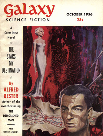
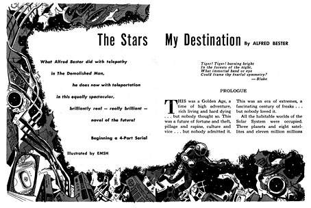
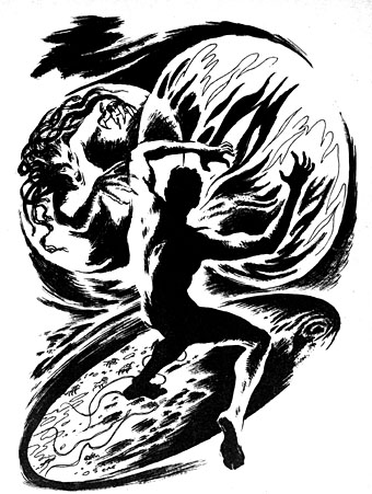
Before publication in book form, the story was serialised in four parts in Galaxy magazine, from October 1956 to January 1957; Ed “Emsh” Emshwiller illustrated each instalment as well as the cover of the debut issue. I’ve said before that one of the great benefits of being able to browse old magazines online is having the opportunity to turn up neglected illustrations like these. Bester’s novel has long been regarded as a genre classic—Michael Moorcock and William Gibson both refer to it as a favourite—but its print editions haven’t generated many memorable covers. Here we have Emshwiller illustrating the entire story, and doing an excellent job, yet his drawings have been buried for years.

emshwiller03.jpg

For the purposes of this post I’ve removed the text surrounding some of the illustrations in order to highlight the drawings. The original printings, plus the full text of the serialised story, may be found at the links below:

Galaxy, October 1956
Galaxy, November 1956
Galaxy, December 1956
Galaxy, January 1957

emshwiller04.jpg

emshwiller05.jpg

Continue reading “Emshwiller illustrates Bester”

Virgil Finlay’s magazine illustrations

finlay1.jpg

The Time Machine by HG Wells; Famous Fantastic Mysteries, August 1950.

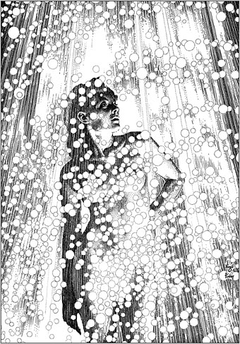
This one will be popular, I’m sure. One of the recent uploads at the Internet Archive is a massive collection of Virgil Finlay’s interior illustrations from the magazines that published most of his work—Weird Tales, Famous Fantastic Mysteries, Amazing Stories, etc, etc—together with the astrological illustrations he created later in his career, plus other material, including a few pieces that never appeared in print. Pencil drawings, lithographs and hundreds of meticulous renderings in ink on paper or scratchboard; 1888 illustrations in all. Whoever put the haul together has been much more thorough than I’d have expected. Rather than a stash of random drawings you get 10 separate folders (best appreciated in the cbz format; see the note below) with each illustration tagged with the name of the story it was illustrating, and the date of publication. The contents are a mix of reproductions from later reprints, together with cropped pages from magazine scans. Taken together, this must comprise almost all of Finlay’s published work excluding his magazine covers and other paintings.

finlay3.jpg

Earth’s Last Citadel by Henry Kuttner and CL Moore; Fantastic Novels Magazine, July 1950.

Virgil Finlay (1914–1971) can be a frustrating artist for anyone who admires his work. He was massively prolific, and maintained a high level of quality for almost 40 years; but his interior illustrations were often printed on pulp stock, the kind of paper that offers the worst kind of print reproduction, and which darkens and eventually crumbles into dust unless it’s carefully stored. Descriptions of his illustrations often note that his drawing style evolved to compensate for the deficiencies of the printing but much of his artwork was very finely rendered, and I’m not sure his minute stipple effects would have printed any better (or worse) than the traditional cross-hatching which he used from time to time. His drawings have at least been well-served by reprint collections, where the white art paper makes his striking compositions leap off the page. Inevitably, the best of these—Gerry de la Ree’s seven-volume collection from the 1970s, and a four-volume set from the 1990s—are all out of print. The sheer quantity of illustrations also presents a problem for any reprint collection: what to include…or leave out? All of which is a roundabout way of saying that this accumulation of his interior art may be unauthorised, and even frowned upon by some, but it benefits Finlay by keeping his work in circulation and showing the full range of his career.

finlay5.jpg

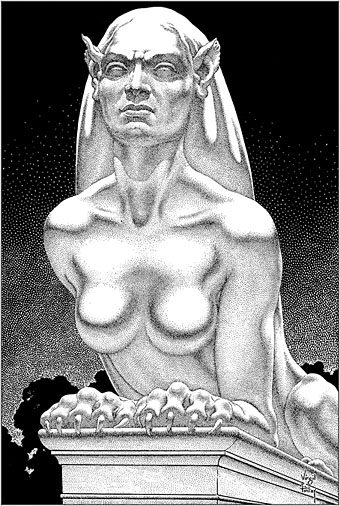
The Faceless God by Robert Bloch; Weird Tales, May 1936.

With 1888 illustrations to choose from, picking out a representative selection is a hopeless task, so what you see here are a few favourites. I said that Finlay maintained a high level of quality but there are unsuccessful Finlays, especially in the early years when his style was still evolving. (It should be noted that he was in his early twenties when he was creating pieces such as these. His errors are a lot less grievous than mine were at the same age.) One of the hallmarks of the Finlay style is a frequent use of photo-reference, especially for faces, and it’s the disjunction between faces and bodies which occasionally jars. Disparities between the size or angle of a head and a body are common in photo-collage but you don’t expect to see them in a drawing. Occasionally the disparities worked for him, as in his illustration for The Faceless God by Robert Bloch, a drawing that so impressed HP Lovecraft that he responded with a short poem praising both picture and artist. The reference images used for his later work are much more seamlessly integrated, and in the 1940s and 50s he seemed to be using posed models as frequently as the illustrators for the big American magazines.

finlay4.jpg

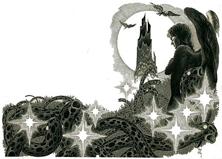
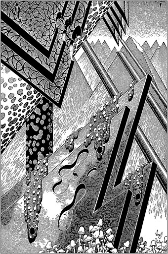
The Man Who Mastered Time by Ray Cummings; Fantastic Novels Magazine, March 1950. Remove the fungi from this illustration and you’d have an almost abstract image.

Regarding cbz or cbr files: these are simply folders filled with jpegs or pngs which have been zipped then given a new suffix. They can be browsed using a suitable comics-reader application; I use Simple Comic for the iMac and ComiCat for the tablet. The files can also be opened with any unzipping software to give you access to the images inside. I find these files so much easier to use than pdfs, especially for image-heavy publications, that I’ve taken to exporting pdf pages as jpegs then zipping a folder of the images into a cbr. One of the advantages of the cbr format is that the readers allow you to extract an image without unzipping the whole file. The only drawback with the Finlay files is that ComiCat doesn’t let you see the file name the way that Simple Comic does.

finlay6.jpg

Full Moon by Talbot Mundy; Famous Fantastic Mysteries, February 1953.

Elsewhere on { feuilleton }
The illustrators archive
The Lovecraft archive

Previously on { feuilleton }
Virgil Finlay’s Tarzan
Virgil Finlay’s Salomé
The monstrous tome

Gustav Meyrink’s Orchids

orchideen01.jpg

The orchids that concern us here are the “sonderbare geschichten”, or strange stories, which comprise Gustav Meyrink’s first story collection from 1905. I’ve not read any of these so can’t vouch for the strangeness quotient but they inspired their illustrator to provide an accompanying collection of head and tail pieces throughout the book, many of which would have been grotesque enough to find a place in Der Orchideengarten magazine a decade later. The illustrator is unfortunately uncredited so if anyone can identify the individual from the monogram (“JT”…?) please leave a comment. The illustrator is Ignatius Taschner. Thanks to Lutz for the identification!

orchideen02.jpg

orchideen03.jpg

orchideen04.jpg

orchideen05.jpg

Continue reading “Gustav Meyrink’s Orchids”

René Bull’s Russian Ballet

bull06.jpg

L’Oiseau de feu.

I’m sure I’ve said this before but one reason I spend so much time scouring the Internet Archive is in the hope of turning up gems like this recent arrival. The Russian Ballet was a study by Alfred Edwin Johnson of the Ballets Russes, written for an English readership and published in 1913 shortly after Diaghilev’s company had staged their historic performance of Le Sacre du printemps in Paris. Johnson discusses this event, which he attended, but he gives equal space to examinations of the company’s other ballets, from earlier avant-garde pieces like L’après-midi d’un faune to that hardy perennial, Swan Lake. In place of production sketches or photographs we have René Bull’s many illustrations, in colour plates and black-and-white drawings, with the chapters being announced by a title in a graphic style that matches the theme of each ballet. I’d only seen a few of these before on a Flickr page so it’s a treat to see the whole book at last.

bull01.jpg

Schéhérazade.

Johnson’s discussion has a tendency to falter when faced with the difficulty of describing a wordless artistic medium. The problem is compounded by the radical nature of many of the ballets, so that Bull’s illustrations become an essential component of the book, giving a flavour of the costumes and dances while the author attempts to relate the emotional qualities of the performances. Bull’s work here isn’t as elaborate is in his illustrated Rubáiyát but then the drawings are serving a documentary purpose.

bull02.jpg

Schéhérazade.

bull03.jpg

Schéhérazade.

bull04.jpg

Narcisse.

Continue reading “René Bull’s Russian Ballet”