Lussuria, Invidia, Superbia

lussuria.jpg

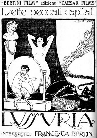
Or Lust (1919), Envy (1919) and Pride (1918). Very Beardsley-esque posters by Carlo Nicco for a series of Italian films from the silent era starring Francesca Bertini. Doubtless the prolific Ms. Bertini’s demonstrations of the Seven Deadly Sins inspired similar promotional artwork for the other films in the series but these are the only ones visible from this Flickr collection of Italian cinema memorabilia. As with Alla Nazimova’s Salomé (and Gabriel D’Annunzio’s excessive Salammbô-esque epic, Cabiria), this confirms again that fin de siècle Decadence lived on in the early days of cinema, having been banished (for a time) from the worlds of art and literature.

Via Fabulon. (Thanks Thom!)

Continue reading “Lussuria, Invidia, Superbia”

The art of Takato Yamamoto

yamamoto1.jpg

Takato Yamamoto was born in Akita prefecture (Japan) in 1960. After graduating from the painting department of the Tokyo Zokei University, he experimented with the Ukiyo-e Pop style. He further refined and developed that style to create his “Heisei Esthiticism” style. His first exhibition was held in Tokyo, in 1998.

There’s much that’s superficially familiar in Takato Yamamoto’s art—“Boy’s Love” tableaux with fey young men in various states of undress mooning over each other, then the perennial Japanese obsession with naked women bound by ropes. But closer examination reveals a degree of finesse and imagination that elevates his work away from the porn ghetto into the rarified realm of Decadence (as if those favourite Symbolist themes of Saint Sebastian [above] and Salomé [below] weren’t enough of a clue). For a start the drawing style is a great amalgam of influences from Beardsley through to Harry Clarke by way of the finest Edwardian pornographer, Franz von Bayros. Then there’s the curious details of severed heads, claws, sundry bones and eyeballs which decorate the otherwise florid arrangements supporting the figures. So far there don’t appear to have been any books of Takato Yamamoto’s work produced in the west and it’s possible that the sexual content and grotesquery limits that possibility. But you can some galleries here, here and here. His official site is mostly Japanese and has to be navigated from an interior page since there seems to be a file missing from the index.

yamamoto2.jpg

Continue reading “The art of Takato Yamamoto”

The art of John Austen, 1886–1948

austen1.jpg

A few drawings by British illustrator John Austen (1886–1948), like Patten Wilson another artist whose work is hard to come by today. Austen was one of the many young illustrators over whom Aubrey Beardsley’s etiolated shadow fell from 1900 onwards and it’s the first ten years of Austen’s work I find most interesting, mainly because of the Beardsley stylings. He’s not as original or as elegant as Harry Clarke but he’s a lot better than the frequently overrated (yet interesting for other reasons) Hans Henning Voigt, or Alastair as he preferred to be known.

Continue reading “The art of John Austen, 1886–1948”

My pastiches

rev3cov.jpg

Lord Horror: Reverbstorm #3 (1992).

Following from the post about an art forgery exhibition (and Eddie Campbell discussing his American Gothic cover for Bacchus), I thought I’d post some of my own forgeries, or pastiches as we call them when no deception is intended.

Reverbstorm was the Lord Horror comic series I was creating with David Britton for Savoy in the 1990s. The Modernist techniques of collage (as in the work of Picasso and others) and quotation (as in TS Eliot’s The Waste Land) became themes in themselves as the series developed, so it seemed natural to imitate the styles of various artists as we went along. Pastiche is also a chance to flagrantly show off, of course, and I can’t deny that this was also one of my impulses here.

Issue #3 of Reverbstorm had marauding apes as its theme, from the Rue Morgue to Tarzan and King Kong, so I had the idea of doing an ape cover in the style of the celebrated paintings by Giuseppe Arcimboldo (1527–1593) which make human heads out of fruit, flowers or animals. Easy enough to have the idea but making it work took a lot of effort and required careful sketching beforehand, something I rarely do. The painting was gouache on board, a medium I’d been using for years and this was about the last gouache work I did before switching to acrylics.

Continue reading “My pastiches”

T&H: At the Sign of the Dolphin

joyce.jpg

James Joyce and his World (1978).

dolphins.jpgDespite my earlier statement about not being much of a collector, today’s book purchase (above) was enough to confirm some well-established patterns (obsessions, even) that should make me reconsider any hasty pronouncements. Not so much for the subject in this case—I already have enough books by and about James Joyce—the significant thing here is the three magic words on the cover: Thames and Hudson. The sight of Joyce’s name on the spine above the old T&H dolphin logo (signifying the two rivers that comprise the company’s name; or maybe a discourse between London and New York via the Atlantic) was enough to demand further investigation. I realised I’d been hoping to eventually find this book after seeing it listed in the back of its companion title, Beardsley and his World by Brigid Brophy. Both books form part of a series that T&H produced in the Seventies, a collection of heavily illustrated mini-biographies of writers, with the odd artist among them. Very worthwhile they are too, with lots of photographs, paintings or drawings of the people and places relevant to their subjects’ lives.

Continue reading “T&H: At the Sign of the Dolphin”