Playhouse: Aubrey

aubrey3.jpg

Aubrey was a TV play for BBC 2’s Playhouse strand, an eighty-minute drama enacting events from the last three years of Aubrey Beardsley’s life. It was broadcast on 22nd January, 1982, and never repeated. After I digitised my own VHS copy in 2008 I wrote a somewhat taunting post about it, showing stills from the scenes that matched Beardsley’s drawings while refusing to make the video itself more widely available. I was subsequently surprised when the writer of the play, John Selwyn Gilbert, turned up in the comments to justifiably bemoan the BBC’s refusal to make so much of its vast archive publically available, an iniquity always compounded by the British public having paid for all those broadcasts in the first place.

aubrey1.jpg

Fast-forward seventeen years and here at last is a copy of Aubrey at YouTube, albeit in compromised form (see below). Since I wrote my original post I’ve become more acquainted with the TV productions of director Philip Hammond so it’s worth giving Hammond a little more credit for the success of the production than I did originally. Hammond’s directing career ran from the 1960s through to the 1990s, with significant contributions to Granada TV’s landmark adaptations of the Sherlock Holmes stories, and a very creditable three-part adaptation of Sheridan Le Fanu’s Uncle Silas which the BBC broadcast as The Dark Angel in 1989. Television has never encouraged the kinds of stylistic flair you find in cinema but Hammond’s later productions stand apart in their mise-en-scene and frequent use of artistic detail. Many of his later productions achieve unusual effects by shooting scenes through reflections in sheets of glass. Elsewhere you’ll often find characters framed in mirrors (as happens in the opening scene of Aubrey) or lit by saturated light from a stained-glass panel.

aubrey2.jpg

Hammond takes a different approach with Aubrey which was shot on video in studio sets. The production design is almost exclusively black and white; many of the sets and compositions frequently mimic Beardsley’s drawings, with decorative motifs framing the scenes. The general appearance is stagily artificial but the details of the script are nevertheless accurate. John Selwyn Gilbert was also the writer, producer and narrator of Beardsley and His Work, a documentary which had been broadcast on BBC 2 three days before Aubrey. Gilbert’s drama follows Beardsley from his dismissal as art editor of The Yellow Book in 1895, through the foundation of The Savoy magazine with Arthur Symons and Leonard Smithers, to his untimely demise in Menton on the French Riviera. Rula Lenska plays Aubrey’s sister, Mabel, with Sandor Elès as André Raffalovich, Simon Shepherd as John Gray, Ronald Lacey as Leonard Smithers, Christopher Strauli as Arthur Symons, Mark Tandy as WB Yeats, and Alex Norton as Max Beerbohm. John Dicks was evidently chosen for his facial resemblance to Beardsley but he’s a decade too old for the role, and looks too healthy for an artist enduring the final stages of a tubercular illness that would eventually kill him. But this is a minor complaint.

More of a problem is the way the play has been uploaded to YouTube in the wrong screen ratio. All TV broadcasts prior to the 1990s are 4:3 but this one has been horizontally compressed to something closer to a square. It is possible to rectify this if you download the video (I currently use 4K Video Downloader) then use Handbrake to write a new copy of the file with the picture size set to a 4:3 ratio. Or maybe you’d rather watch the squashed version…

And while I’m on the subject of Beardsley on screen, Chris James has made available a new copy of his short animated film, After Beardsley, which is now complete, and not chopped into three parts as it was before.

Elsewhere on { feuilleton }
The Aubrey Beardsley archive

The art of Nikolai Petrovich Theophilaktoff, 1878–1941

theophilaktoff07.jpg

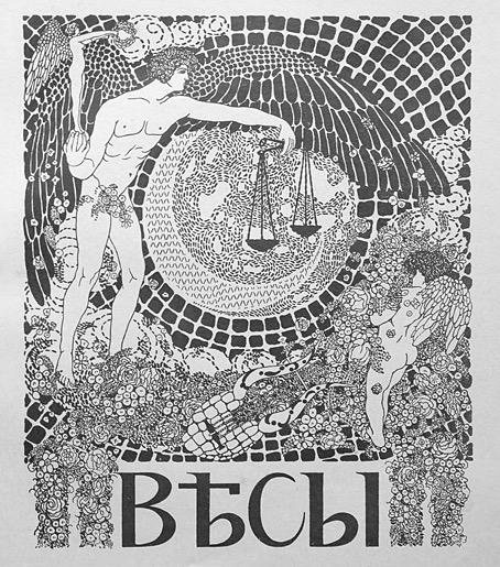
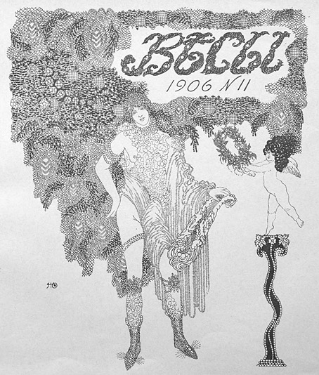
I’m taking the biographical details about this Russian artist from a Christie’s listing, accuracy being of particular importance to auction houses. The trouble with searching for information about Nikolai Theophilaktoff is that he’s one of those Russians whose name isn’t common enough to exist in a settled non-Russian form, so you may find his drawings credited to “Nikolai Feofilaktov” or even “Nikolai Theophylactus”. Whatever the spelling of his surname, Theophilaktoff is remembered today for illustrations with a distinct Beardsley influence, which is how he came to my attention. Aubrey Beardsley only had a few years for his art to impress itself on the world but he was known in Russia during his lifetime; Sergei Diaghilev was especially enthusiastic, using his position as editor of arts journal Mir Iskusstva (World of Art) to promote Beardsley’s work after the artist’s death. A later Russian arts journal, Libra, maintained the enthusiasm, devoting an entire issue to Beardsley in 1905. It was reading about Libra that led me to Nikolai Theophilaktoff, an artist who was sufficiently beguiled by Beardsley’s drawings to embark on his own variations on the Beardsley style.

theophilaktoff06.jpg

Theophilaktoff’s cover art for the Beardsley issue of Libra, November, 1905.

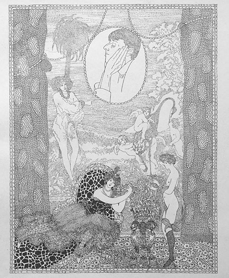
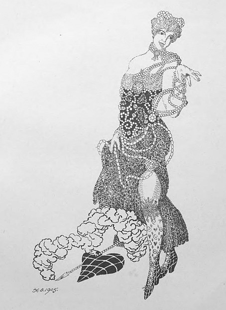
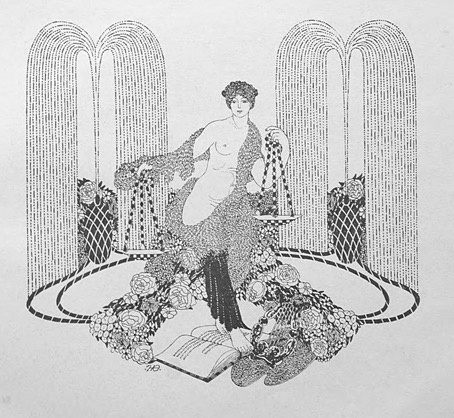
You can usually divide Beardsley’s followers into two groups: those who pick up on the striking contrasts that Beardsley created using areas of solid black against the white of the paper—Harry Clarke, Will Bradley and John Austen are good examples of this type. A second class would be those who favour the delicate, filigree style of Beardsley’s illustrations for The Rape of the Lock—Alastair (Hans Henning Voigt) and Nikolai Theophilaktoff are in this category. (Harry Clarke was also an expert filigree-ist but Clarke is really in a class of his own.) If you accept this artistic division it’s notable that the weaker artists are in the latter class. It’s easier to disguise deficiencies of figure drawing, say, with abundant stippling and decoration than it is when using nothing more than fine lines and masses of black ink. Theophilaktoff’s accomplishments are very uneven but they’re also rare examples of Beardsley’s style of Decadent art in a country that would soon have no time for such a thing at all.

theophilaktoff05.jpg

Most of the pictures here are from a book, 66 Dessins (1909), which collected many of the Theophilaktoff drawings published in Libra. The pornographic drawing at the very end is a swipe from an auction listing. Also near the end are drawings for Wings (1906), a novel by Mikhail Kuzmin which is one of the first literary works to openly deal with same-sex relationships. As for Libra, I thought copies of the magazine might be impossible to find but the trusty Internet Archive has what seems to be a complete run here. Mir Iskusstva, which seems rather staid by comparison, may also be found at the Internet Archive in a series of bound volumes.

theophilaktoff04.jpg

theophilaktoff08.jpg

Continue reading “The art of Nikolai Petrovich Theophilaktoff, 1878–1941”

The Golden Hind: A Quarterly Magazine of Art and Literature

golden01.jpg

Well, here we are at last… After years of waiting for scanned copies of The Golden Hind to turn up, now that they have done I’m still frustrated. The magazine was one of the many small arts periodicals being published in Britain during the 1920s. It had an erratic, eight-issue run from 1922 to 1924, and remains notable for being the second (and last) magazine to be co-edited by Austin Osman Spare. The artist’s first magazine venture, Form, had been edited by Spare and “Francis Marsden” (Frederick Carter), with the pair publishing two issues before the outbreak of the First World War, followed by a final issue in 1921. Spare co-edited The Golden Hind with writer Clifford Bax, creating a publication whose contents were less mystical than Form had been, while also providing more of a showcase for artists other than Spare himself.

golden02.jpg

Inevitably, it’s the artists that interest me the most in The Golden Hind, even though the magazine was running pieces by writers like Aldous Huxley and Edith Sitwell. Many of the artists have been featured here before, some of them on many occasions: Alastair (Hans Henning Voigt), John Austen, Harry Clarke, Garth Jones, Henry Keen, and Allan Odle. Spare’s own drawings have since been recycled in various books but most of the other drawings, woodcuts, linocuts and prints remain exclusive to the magazine. The John Austen contributions are especially fine, further examples of his decorated style which borrows heavily from Aubrey Beardsley and Harry Clarke, and which he used so well in his illustrated Hamlet. The spirit of Beardsley’s 1890s is very much in evidence in The Golden Hind, a demonstration, perhaps, that Spare was once again looking back to The Savoy magazine as an example to be followed; one of the essays concerns the poety of The Savoy‘s literary editor, Arthur Symons.

golden03.jpg

In addition to artists whose popular works are still reprinted today there are less well-known figures like Sidney Hunt whose drawings owed more to contemporary trends than many of the other contributors. Hunt later edited an avant-garde magazine of his own, Ray, while producing his own brand of homoerotic prints like the Ganymede with Zeus which may be seen in The Golden Hind’s final issue.

golden04.jpg

The frustration I referred to above is my usual complaint about image quality. All the copies of the magazine have been taken from microfilm archives which means the pages aren’t grey enough to be illegible but their general murkiness is enough to destroy a lot of the artwork, especially the lithographs and other prints. The samples you see here have been brightened a little which does improve some of the line art but can do nothing for the rest. But I’m not going to complain too much. It’s taken a long time to be able to browse a complete run of this magazine, and I feel fortunate to do so even in this compromised manner. Better copies may still surface eventually. Fingers crossed.

golden05.jpg

Continue reading “The Golden Hind: A Quarterly Magazine of Art and Literature”

Weekend links 730

beardsley.jpg

Cover Design for ‘The Yellow Book’ Vol.I (1894) by Aubrey Beardsley.

• “[Dorian Gray’s] version of Decadence filled the popular imagination when Decadence became an ostentatiously stylish zeitgeist—stylish being the operative word. For Decadent style encapsulated the attitude of being hellbent on thrilling experiences.” The danger of Decadence is also its value. We need more of it, says Kate Hext.

• At Swan River Press: Of Wraiths, Spooks and Spectres. Robert Lloyd Parry, in an interview with John Kenny, talks about the researches that led to the compiling of his latest ghost-story collection, Friends and Spectres.

• The latest pictorial accumulation from DJ Food is a collection of late-60s concert posters by Jim Michaelson, an artist whose designs look like Mad magazine going fully psychedelic.

• Old music: Future Travel by David Rosenboom; new music: Taking Shasta Mountain (By Strategy) by John Von Seggern & Dean DeBenedictis.

• At Public Domain Review: Hunter Dukes on Rückenfiguren, views of the human back as a subject in the history of art.

• In a week when Adobe has been in the news for pissing off its users, a list of alternatives for Adobe software.

• At Spoon & Tamago: Hokusai-inspired erasers reveal Mt. Fuji the more they get used.

• At Unquiet Things: A celebration of Annie Stegg Gerard’s enchanting worlds.

• Mix of the week: DreamScenes – June 2024 by Ambientblog.

• At The Quietus: The Strange World of…Diamanda Galás.

Wraith (2002) by Redshift | El Wraith (2002) by Amon Tobin | Wraith (2015) by John Carpenter

Weirdsly Daubery and friends

hearn.jpg

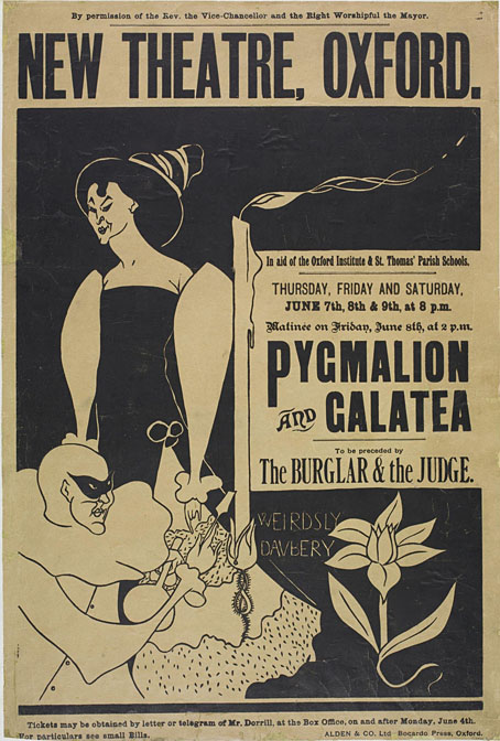
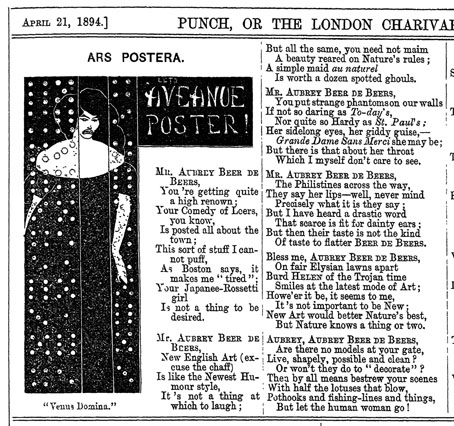
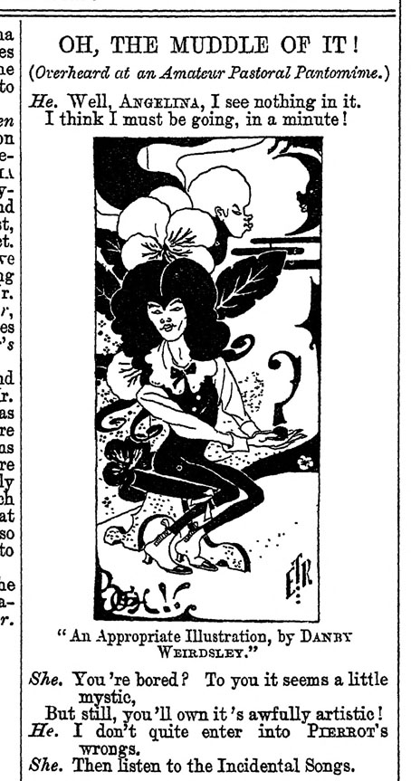
You think you’ve seen all of the Aubrey Beardsley parodies then another one turns up… This poster by James Hearn dates from 1894, the year that Beardsley’s art became a succès de scandale thanks to his illustrations for Oscar Wilde’s Salome and his covers for The Yellow Book. Beardsley’s art was so original that the parodies arrived swiftly and continued into the following year, until the downfall of Oscar Wilde affected the artist’s position at The Yellow Book and rendered his person, as well as his drawings, even less palatable to the general public. Hearn’s piece is rather poor in comparison to the jibes in Punch magazine, and unusual for being part of a functional design rather than a satirical item.

punch01.jpg

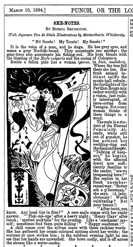
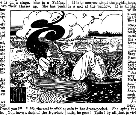
The Punch parodies, several of which worked their own transformations of the artist’s name, used to be available for viewing on a university website, but as I was saying in the previous post, these places have a tendency to vanish when you go to revisit them. The Hearn poster is part of the V&A’s collection but everything else here is from scans of Punch at the Internet Archive. Back issues of the magazine, even those from the 19th century, haven’t always been easy to find online. Punch only gave up the ghost in 2002, and it seems that the restriction on publishing its more recent contents has affected even the older issues, so that the copies at the University of Heidelberg, for example, can only be seen by visiting the university library. It was worth looking for all of these, however. In addition to the drawings you can also see whatever text came with them, while one of the volumes for 1894 also includes a parody of Oscar Wilde’s The Sphinx, together with an illustration that lampoons the poem’s illustrations by Charles Ricketts. The Beardsley parodies are by ET Reed and Linley Sambourne for the most part, although none are credited as such.

punch02.jpg

punch03.jpg

punch04.jpg

Continue reading “Weirdsly Daubery and friends”