Friends and Spectres

spectres1.jpg

Presenting my latest cover illustration for Swan River Press, and another story collection edited by Robert Lloyd Parry:

Friends and Spectres is a companion volume to Ghosts of the Chit-Chat (2020), an anthology of ghost stories by authors who had been members of the Cambridge University Chit-Chat Club along with M. R. James. Here the associations with MRJ are less formal, but stronger and more enduring: for it is the bond of genuine friendship that ties these writers to him.

The majority of pieces here were originally published under pseudonyms, and over half appeared first in amateur magazines or local newspapers. All deal with the supernatural, and several of the stories are themselves spectres—or more properly “revenants”, only now re-emerging into the light after decades of oblivion. There are rediscoveries here of “lost” tales by Arthur Reed Ropes, E. G. Swain, and the enigmatic “B.”

My cover for the earlier volume showed an imaginary interior for one of the meetings of the Chit-Chat Club where James first read his own ghost stories. The new cover shows a more accurate exterior view of the grounds outside the King’s College Chapel. Given the quantity of pictorial reference I thought this might be relatively easy to do but I had a problem finding a view that matched the one I had in mind, a twilight view of the west end of the chapel seen front-on rather than at a sharp angle. Views of the chapel from the banks of the river have been standing as an emblem of the university itself for a very long time but the majority of these are angled views. My solution was to work from a collage of three different reference photos in order to have enough drawing to fill out the spread of the jacket.

spectres2.jpg

Friends and Spectres is another of Swan River’s small hardbacks which in this case is limited to 500 copies. Given the following that Mr Parry has accumulated via his readings of James’ stories I imagine this one will go quickly, so anyone interested is advised to pre-order now.

Previously on { feuilleton }
Ghosts of the Chit-Chat

The art of Yuhan Ito, 1882–1951

ito02.jpg

Sacred Bridge in Nikko.

Sunsets, mist and moonlight. Yuhan Ito painted watercolours devoted to these subjects, a technique which he endeavoured to replicate in the less subtle print medium seen here. Those remarkable nebulous effects were achieved by avoiding the use of a black line-block although darker lines are still used to emphasise foregound shapes. Ito wasn’t a very prolific artist—you won’t find many more prints than this handful from the 1930s—but what there is of his work stands out immediately from that of his contemporaries.

ito06.jpg

Pagoda at Nikko.

ito03.jpg

Ukimi-do in Biwa Lake.

ito08.jpg

Boats in the Sunset Glow.

ito04.jpg

Sarusawa Pond.

Continue reading “The art of Yuhan Ito, 1882–1951”

Weekend links 726

ferriss.jpg

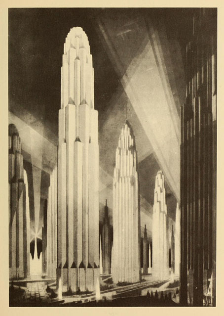
Verticals on Wide Avenues from The Metropolis of Tomorrow (1929) by Hugh Ferriss.

Megalopolis, the futuristic epic written and directed by Francis Ford Coppola, now has a trailer and a handful of mixed reviews. I recall Coppola saying years ago that he was the kind of director who would happily make films in any genre, science fiction included. I’ve wondered ever since what a full-on Coppola SF film might look like. (Captain EO and Peggy Sue Got Married don’t count). Now it seems we’re about to find out. Given his previous missteps I remain sceptical yet curious about this one. I’ve avoided his output since Bram Stoker’s Dracula but I’m still happy to see him being so ambitious while retaining his independence.

• And RIP Roger Corman who Coppola remembered as “my first boss, task-master, teacher, mentor, and role model. There is nothing about the practical matter of making movies I didn’t learn by being his assistant.” Related: It rained on the Sunday: a career interview with Roger Corman by Matthew Thrift.

• At Retro-Forteana: Fortean-themed music, from opera to metal. A difficult subject for a such short post, as the author admits. I’m amused to see one of my Hawkwind album covers in the list although the album itself doesn’t seem very Fortean to me.

• “Did you know that, if things had gone differently, the Pompidou Centre could have been an egg?” Oliver Wainwright on architecture that might have been.

• At Cartoon Brew: A closer look at great animated title sequences. I deplore the omission of Richard Williams’ titles for The Charge of the Light Brigade (1968).

• At Public Domain Review: Love Spells and Deadly Shrieks: Illustrations of Mandrakes (ca. 650–1927).

• At Wormwoodiana: “That Strange Little Book”: Ding Dong Bell by Walter de la Mare.

• At Unquiet Things: The latest collection of Intermittent Eyeball Fodder.

• Mix of the week: DreamScenes – May 2024 by Ambientblog.

Mandrake Root (1968) by Deep Purple | Mandrake (1975) by Gong | The Mandrake’s Hymn (2019) by Earth

Weekend links 723

manrique.jpg

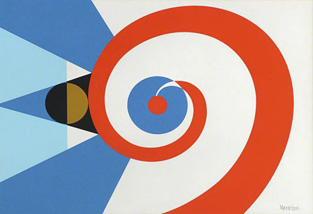
Flags of the Undiscovered Planets: 3 (1985) by César Manrique.

• “That mysterious font is Festive, not Stymie.” Ray Newman goes looking for a typeface that immediately says “Britain in the 1950s”. I used to refer to one of its relatives as “the launderette font”, although it was also a common sight on shopfronts, public buildings and other mid-century signage. Today I know it as the slab serif named Profil (aka Decorated 035), although as Newman demonstrates, this is only one of several slab-serif variants popular in the 1950s and 60s.

The Man Who Killed Google Search is a deep dive by Ed Zitron into why Google’s search has turned to shit. I recently changed the search option for all the browsers on my machines to DuckDuckGo. It’s not perfect but it’ll do for now.

• New music: Daddy’s Gonna Tell You No Lie, music by Sun Ra performed by Laraaji and the Kronos Quartet; Chroma by Loscil / Lawrence English; Homage To Hennix (The Electric Harpsichord Reinterpreted) by Dave Seidel.

• At Colossal: Tune into your own brain waves with Steve Parker’s suspended constellations of salvaged brass.

• At Bajo el Signo de Libra: Caspar David Friedrich (1774–1840): Icono del Romanticismo Alemán.

• At Public Domain Review: Maria Catharina Prestel’s Printed Cabinet of Drawings (ca. 1780s).

• At Unquiet Things: The teeming, tumbling, tangled cosmos of Madeline Von Foerster.

• Mix of the week: A mix for The Wire by FUJI||||||||||TA.

• At Dennis Cooper’s: 77 planetariums.

Planet D (Portishead Remix) (1994) by The Sabres Of Paradise | Planet Munich (1998) by Add N To (X) | Planet Vega (2000) by Air

Liber Artificiosus Alphabeti Maioris

merken01.jpg

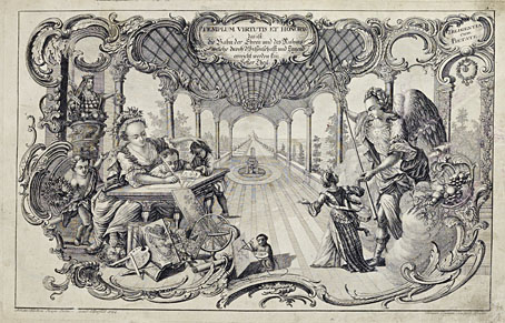
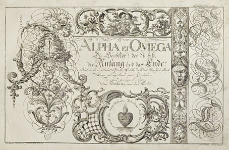
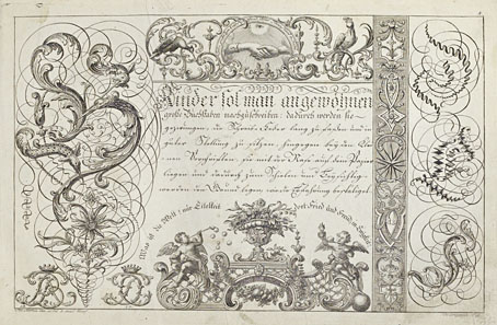
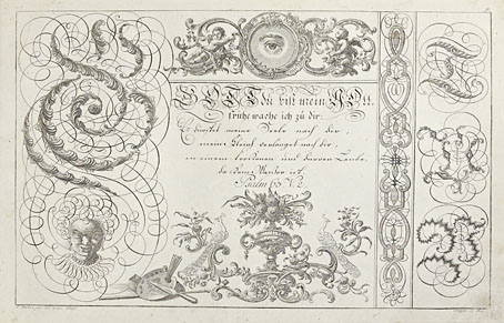
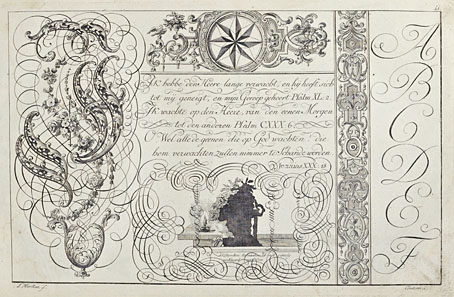
The previous post reminded me of this, one of my favourite examples of ornamented alphabets from the 18th century. Liber Artificiosus Alphabeti Maioris (“Artistic Book of the Major Alphabet”, 1782) was written and designed by Johann Merken, with the book’s 56 plates being engraved on copper by Heinrich H. Coentgen. I first saw these in a post at the now-defunct (and much missed) BibliOdyssey where Mr Peacay had found copies of the alphabet plates at some library archive or other. Happily, the Getty Research Institute made a scan of their own copy of the book a few years ago which includes all of the plates plus the accompanying German text.

merken02.jpg

The first part of Merken’s volume is unique in its combination of abecedarium with a variety of objects, emblems, symbols and other designs: silhouette figures, plants and flowers, ornamental gardens, coats of arms, calligraphic doodles, trophies (those accumulations of military paraphernalia), birds and animals (eg: a pair of monkeys playing the drums), monograms, mathematical figures, etc, etc, all festooned with the familiar swags and foliage of baroque decoration. In the second part of the book there’s more emphasis on science and technology, with plates devoted to astronomy, alchemy/chemistry, the orders of Classical architecture, and so on. The later pages are interesting but it’s those in the first section that really stand out. Many of the alphabet designs push their elaboration and embellishments to such a degree that the letters appear to be mutating to resemble their own decorations. The book as a whole is a curious blend of the 18th-century enthusiasm for taxonomy and categorisation combined with the baroque love of the grotesque and the arabesque. I wish there was more like it.

merken03.jpg

merken04.jpg

merken05.jpg

Continue reading “Liber Artificiosus Alphabeti Maioris”