Downtime over the weekend was caused by a database server malfunction at the web host end. I lost a couple of posts as a result although nothing major, thankfully.
Author: John
My Life in the Bush of Ghosts
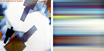
Brian Eno and David Byrne’s 1981 album gets a remastered reissue this month, something I’m looking forward to hearing as all the early Eno albums sounded pretty crappy on their initial CD release. My Life in the Bush of Ghosts is being given an added publicity push this time round with much being made of its status as an inspiration to later generations of musicians and DJs. The album site includes tracks that will be available for anyone to download (after signing a Creative Commons form) for purposes of remixing.
While the album’s wonderful grooves certainly deserve their reputation, I still get rather aggravated by claims made for its landmark status as “the first sampling album” or similar. These assertions derive from the way most of the tracks mix recordings taken from American radio or from Arabian “world music” albums in a manner that was unusual at the time, but certainly not without precedent. I think Eno and Byrne would be first to acknowledge that they were popularising a technique that already existed, just as Eno brought Terry Riley’s tape loop experiments to a wider audience on recordings such as (No Pussyfooting), Evening Star and Discreet Music.
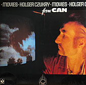 There are at least two Terry Riley-like figures behind the genesis of My Life…. One is Holger Czukay, bass player from the German band Can, and editor and tape collagist for all of Can’s music. Czukay released a solo album in 1979 called Movies which does exactly what My Life… does but considerably better for the most part (there’s even a track entitled Persian Love that mixes Middle-Eastern radio singers with Czukay’s guitar). My Life… overlays the voices (almost all from a single source only) on the music in a manner which isn’t particularly inventive; Czukay on the other hand not only interleaves multiple recordings across his tracks but even makes it sound as though the radio recordings have been made specially for each track. Cool in the Pool contains a lengthy sax solo taken from the radio that matches Czukay’s music so perfectly he must have planned the entire track around the place where the solo would occur. Eno would have been well aware of this album seeing as he’s a lifelong Can aficionado and played with Czukay on a couple of the Cluster releases in the late-Seventies.
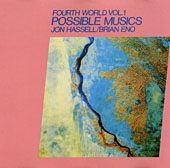 The other eminence gris behind My Life… is Jon Hassell, a composer and musician I’ve had the good fortune to work as a designer recently. Eno was very impressed by Hassell’s early “Fourth World” albums and helped Hassell produce the third of these, Possible Musics, in 1980. He also invited Hassell to play trumpet on Houses in Motion when he was producing Remain in Light for Talking Heads in the same year. Hassell has always maintained that My Life… came out of this period of his association with Eno and Byrne and that the album was originally intended to be a three-way Fourth World collaboration. Whatever the veracity of this, Peter Gabriel recognised the lineage in 1982 when he compiled the first WOMAD album, Music and Rhythm. Among a number of acknowledged talents from different countries playing what people still class as “world music”, there was Jon Hassell with a version of Ba-Benzélé from Possble Musics, and Holger Czukay with Persian Love. Oh yes, and a piece by David Byrne…
If this sounds like a denigration of My Life… it isn’t intended as one. I bought this album when it came out and still have the original vinyl copy. The criticism is addressed to lazy journalists whose assertions about musical history don’t always stand up to close scrutiny. To his credit, Paul Morley in the sleevenotes to the reissue acknowledges both Can and Jon Hassell but then he always was a journalist capable of thinking for himself, rather than parroting the platitudes of others.
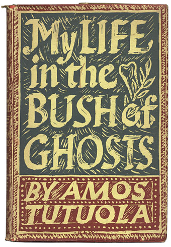
Finally, here’s my copy of the book that gave the album its title. I’ve had this for years and still not read it. Maybe now would be a good time.
Enormous structures II: Tatlin’s Tower
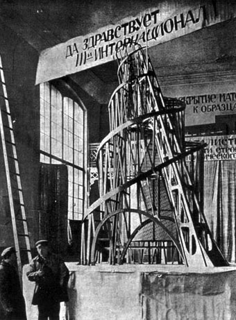
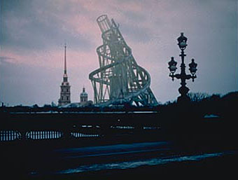
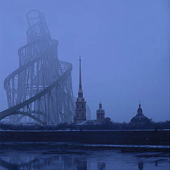
The Monument to the Third International would have loomed 400 metres over St Petersburg (100 metres taller than the Eiffel Tower) had it been built after the Revolution of 1917. The building was intended as a monument, exhibition space and location for the Comintern offices, and included several blocks within its structure, a cube, pyramid and cyclinder, that would revolve at different speeds. Unfortunately for architect Vladimir Tatlin, the Civil War put paid to his plans, although it was estimated that even if the country had been peacable enough to allow its construction, the vast frame would have used up all the steel in the Soviet Union.
All unbuilt structures tend to evoke a “what if?” response and Tatlin’s Tower has been given virtual life through this impulse in Takehiko Nagakura’s 1999 film of the same name. Nagakura uses CGI to show how the building would look against the skyline of the real St Petersburg.
Solaris
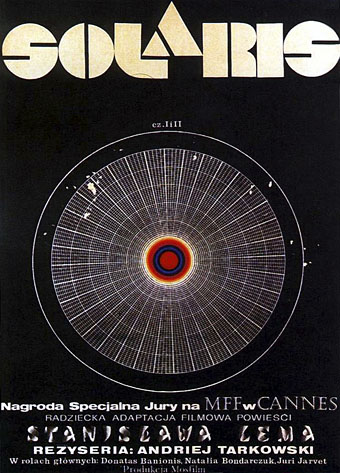
This wonderful poster was designed by Andrzej Bertrandt for the Polish release of Andrei Tarkovsky’s 1972 film of the novel by Stanislaw Lem. Lem didn’t like the film, referring to it as “Crime and Punishment in space”, which is a fair description seeing as it’s filled with the same lengthy moral discussions as Tarkovsky’s other films.
There are more posters and pictures at the great Tarkovsky site Nostalghia.com. Also lengthy quotes and interviews about all his films:
I don’t like science fiction, or rather the genre SF is based on. All those games with technology, various futurological tricks and inventions which are always somehow artificial. But I’m interested in problems I can extract from fantasy. Man and his problems, his world, his anxieties. Ordinary life is also full of the fantastic. Life itself is a fantastic phenomenon. Fyodor Dostoievsky knew it well. That’s why I want to focus on life itself—everyday, ordinary. Because within it anything can happen. My Solaris is not after all true science fiction. Neither is its literary predecessor. What counts here is man, his personality, his very persistent bonds with planet Earth, responsibility for the times he lives in. I don’t like your typical science fiction, I don’t understand it, I don’t believe in it. The fact is when I was working on Solaris I was concerned with the same subject as in (Andrei) Rublev. Human being. These two films are only separated by the time the action is taking place.

