A rather substantial fault in either the WordPress software or a problem at the server end has resulted in two folders of images being deleted today, hence the image-less posts. Not the end of the world but I’m not looking forward to restoring things I don’t have a backup for.
Author: John
The Apple logo
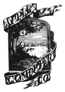
The original company logo from 1976 depicts Isaac Newton sitting under a tree with the fateful apple glowing above his head and looks about as far removed from a computer company logo as it’s possible to get. The picture frame contained Wordsworth’s description of Newton, “A mind forever voyaging through strange seas of thought, alone.”

Rob Janoff designed the more familiar Apple at about the same time. The typeface used was Motter Tektura.
According to the logo designer…the typeface was selected for its playful qualities and techno look, in line with Apple’s mission statement of making high-technology accessible to anyone.
As with many old typefaces, there doesn’t seem to be a font of Motter Textura available today apart from this Cyrillic clone.
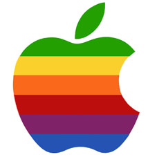
The original apple was streamlined and given coloured bars at
Steve Jobs’ behest in order to “humanise the company”.
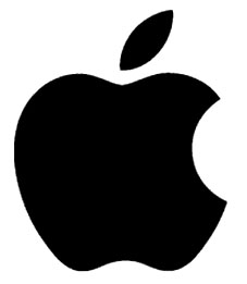
Ironically, it was Jobs who also decided to remove the colour bars in 1998. The current logo is now a typical piece of flexible contemporary branding, easily reproduced in any colour, at any size or shape.
Australian government censors satire
I wrote about the great Oz magazine a couple of weeks ago. Former editor Richard Neville has maintained his anti-authoritarianism and sense of mischief since the 1960s and this week provoked more controversy with a fake website, johnhowardpm.org, that includes an “apology” for his part in the Iraq war supposedly written by egregious Australian PM John Howard. The response from the freedom-loving government of Australia has been to shut down the site using the kind of spurious and nonsensical justification usually favoured by the Chinese authorities. As usual with these kind of actions, this story will now get far more publicity – and the “apology” will be read by a lot more people – than it would have done had the wretches left it alone.
News story below from The Sydney Morning Herald. Richard Neville’s site is here and includes a pdf transcript of the offending material.
A spoof John Howard website that featured a soul searching “apology” speech for the Iraq war has been shut down under orders from the Australian Government.
Richard Neville, an Australian futurist and social commentator was “mystified” to discover his satirical website johnhowardpm.org had been blocked on Tuesday with no explanation from either his web hosting company, Yahoo or the domain name registrar, Melbourne IT.
He said that after two days of silence, a customer service representative from Melbourne IT today informed him by telephone that the site had “been closed on the advice from the Australian Government”.
Mr Neville’s satirical “apology” speech ran on a mocked-up version of a spoof website that resembled Mr Howard’s own, and after going live on Monday, received 10,500 visits within 24 hours.
Bruce Tonkin, the chief technology officer at Melbourne IT, said the site had been shut down in response to a request from the Prime Minister’s office on basis that it looked too similar to its own site.
“If we receive a complaint from an intellectual property basis claiming that a website directly infringes the rights of another site we would check it, and if it is a direct copy we would suspend the site,” he said.
He said the issue of whether or not the content was satirical was of no consequence to Melbourne IT. “To us it looks like a phishing site,” he said.
Mr Neville contests that there are any similarities between a satirical website and a phishing operation, which would typically carry an intent of data or financial theft.
“I don’t see how you can make judgements that ignore the content or intention of the site. To give the satire more impact it was important to make it look like an official speech. Obviously there was no hacking of the original site, and I did not choose to make it too close to the actual design, and my name and address were readily accessible,” he said.
He added that one of the reasons he had chosen Yahoo’s hosting service was because it did not have any obvious policies that restricted the nature of content that could be published.
“If there were objections to the content on the site, isn’t there a democratic tradition that I be informed of it,” he said.
Mr Neville describes the parody as an act of satire and culture jamming, and is now running a link to a PDF copy of the speech on his website.
He has been involved in satirical publishing since the 1960’s when he edited Oz magazine, which covered contentious issues of the time. However some of the subject matter led to obsenity charges for him and his colleagues, that were later overturned.
Surrealist cartomancy
 Reworking the illustrations of the standard fifty-two card playing deck has become quite a common thing in recent years with numerous themed decks being produced in costly limited editions. The same goes for decks of Tarot cards which have now been mapped across a number of different magical systems and produced in sets that often add little to the philosophy of the Tarot but merely vary the artwork. This wasn’t always the case, and certainly not in the 1940s when André Breton and a group of fellow Surrealists produced designs for a fascinating deck of cards that hybridises the Tarot and the more mundane pack of playing cards in an attempt to create something new.
The Jeu de Marseilles was named after the city of its creation, and it’s no coincidence that one of the most well-known medieval Tarot designs is the Marseilles deck. Breton and his artist friends—Wifredo Lam, Max Ernst, Jacqueline Lamba, Oscar Dominguez, Victor Brauner, Jacques Hérold, André Masson and Frédéric Delanglade—were stranded in the French port along with many other artists, writers and intellectuals attempting to escape Nazi-occupied Europe and gain passage to the America. The creation of the card deck became a way of passing the time during several months of anxious waiting.
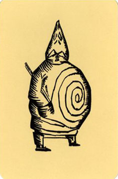
Typically for a group that had already spent a decade analysing and deconstructing all available artistic media, it wasn’t enough to merely redecorate an existing pack of cards, Breton wanted a thorough reinvention along Surrealist principles. So the traditional suits were renamed accordingly: Flames (red) for love and desire, Stars (black) for dreams, Wheels (red) for revolution, and Locks (black) for knowledge. Even though the number of cards was kept at fifty-two, this highly symbolic structure places the deck closer to the Tarot arrangement of Wands, Cups, Swords and Discs, rather than the usual Clubs, Hearts, Spades and Diamonds. Breton’s socialist sympathies meant that having a royal hierarchy of King and Queen lording it over a humble Jack was quite unacceptable; these were subsequently re-named Genius, Siren and Magus. Again, the name Magus here is interesting for the added occult reference it gives to the design. Alfred Jarry’s grotesque Pa Ubu (above) was nominated as the Joker.

Flames: Ace; Genius: Baudelaire; Siren: Mariana Alcofardo; Magus: Novalis.
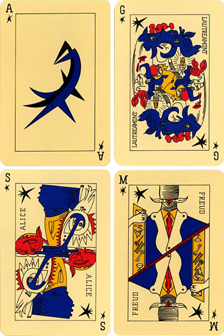
Stars: Ace; Genius: Lautréamont; Siren: Alice (from Lewis Carroll); Magus: Freud.
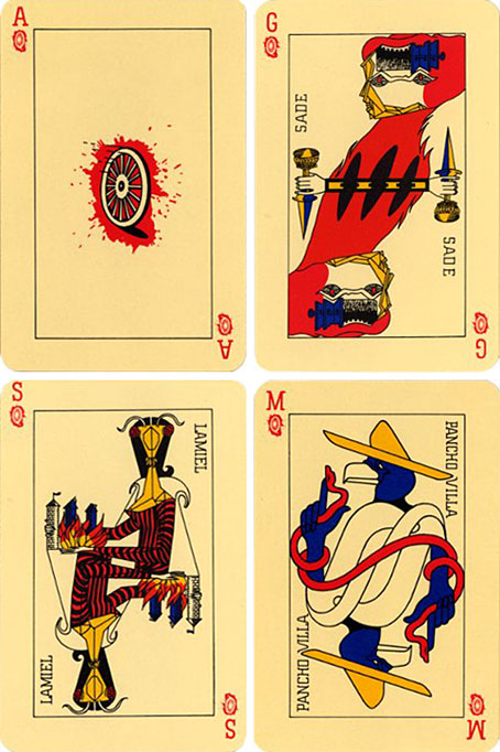
Wheels: Ace; Genius: De Sade; Siren: Lamiel (from Stendhal); Magus: Pancho Villa.
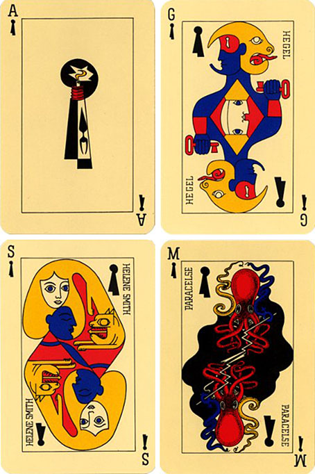
Locks: Ace; Genius: Hegel; Siren: Hélène Smith; Magus: Paracelcus.
The Jeu de Marseilles was eventually produced as a proper deck of cards (with the original sketches being reworked slightly) and has been reprinted several times since. Copies can still be found at reasonable prices from specialist card dealers.
Thanks to Eroom Nala for research assistance!
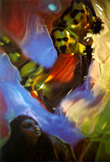
The Invasion of Thunderbolt Pagoda
 ANNOUNCING THE AKASHIC RECORD DVD SERIES – A BASTET EXCLUSIVE
“THE INVASION OF THUNDERBOLT PAGODA” DVD FEATURING “BRAIN DAMAGE” & “FROM THE MYLAR CHAMBER” SLIDESHOW
BASTET, in collaboration with SATURNALIA and THE IRA COHEN AKASHIC PROJECT, is proud to announce the launch of THE AKASHIC RECORD DVD SERIES.
Celebrated internationally for more than 40 years, and screening this Friday, March 17 as part of the “Day for Night” program at the 2006 Whitney Biennial, Ira Cohen’s THE INVASION OF THUNDERBOLT PAGODA director’s cut DVD is now available for pre-order exclusively through BASTET / ARTHUR magazine.
Ira Cohen, director: “It was in 1968, the year before Woodstock, between the giant bottle of liquid mercury Tony Conrad found in a doorway on 42nd St. and the Mylar chamber, we experienced a shared voyage conceived in three parts: The Opium Dream, Shaman and Heavenly Blue Mylar Pavilions, an alchemical journey born of out common consciousness – culminating in the akashic bindu drop swirling in the sky’s reflected azure. No minimalism here, but a maximalist adventure…”