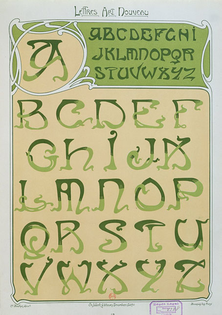
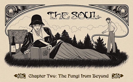
These lettering designs were posted at Wikimedia Commons in the summer but I’ve only just noticed them this week. I’d been searching for Étienne Mulier’s designs while working on the six-part story about Miss Adeline Carr, aka “The Soul”, in the Bumper Book of Magic, the idea being to have each chapter open with the character’s name in a different Art Nouveau lettering style. If you look at enough bookselling sites you can eventually find one or two large photos of Mulier’s pages which is what I used when creating the heading for the second chapter of the story; but I still would have preferred to have had access to the whole collection. As it happens, most of the Wikimedia plates have also come from bookselling sites but they’re a slightly better collection than the ones I found.
Mulier’s plates were published in 1901, presented not in book form but as a collection of loose lithographs in a card portfolio; the “Enseignes” in the title are suggestions for shop signs. Mulier also throws in a couple of less practical designs showing alphabets created by posing flamingos. The loose-leaf format is a useful one for something intended to be consulted by artists and craftspeople. Books could be awkward things in the days before digital scanning and photography if you wanted to trace something from a page which wouldn’t lie flat. The Mulier design I used for The Soul isn’t a perfect alphabet—the letters K and M could do with improving—but it’s a good example of the French approach to Art Nouveau lettering (and Art Nouveau design in general) which tends to be more loose and plant-like than equivalents from Germany or the Netherlands. The organic appearance of the letterforms suited the chapter I was illustrating which opens with a hunt for magic mushrooms.
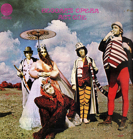
Mulier’s plates don’t appear to have been turned into printable fonts until the 1960s when the revival of interest in Art Nouveau prompted the creation of filmtype adaptations. Fontsinuse shows a rare print example on the cover of an album by Scottish prog band Beggar’s Opera, a version of the typeface which filled in the bi-chromatic letters and slightly altered their forms. “One of the ugliest typefaces ever created,” says Mr Hardwig. I can think of worse. More recently we have the inevitable digitisations, with Art Nouveau Caps being the closest to Mulier’s original. I was tempted to use a digitised version for the story but I find that many amateur (or semi-professional) digitisations of old typefaces are often crude things compared to the originals. I also liked the bi-chromatic effect so I ended up drawing my own copies of the letters I needed.
Previously on { feuilleton }
• Bergling’s Art Alphabets
• Typefaces of the occult revival


Beggars Opera Act One. Truly one of the strangest covers in my record collection. Font virtually unreadable.
Now playing to the irritation of everyone else in the house.. Thanks!
Ha. That album is one I’ve never heard, so many of those early Vertigo albums were scarce in later years. And many of them had covers by “Keef” (Keith MacMillan), as the Beggar’s Opera one does. Keef was very fond of unusual photo effects–infra-red film or some other treatment–paired with antique typefaces. The first two Black Sabbath albums are his work, hence the bloke in the crash helmet on the cover of Paranoid.
Great album. ‘Raymond’s Road’ is an absolute banger. A delirious frenzy of keyboards. There used to be a live version knocking about on YouTube. Don’t know if it’s still up.