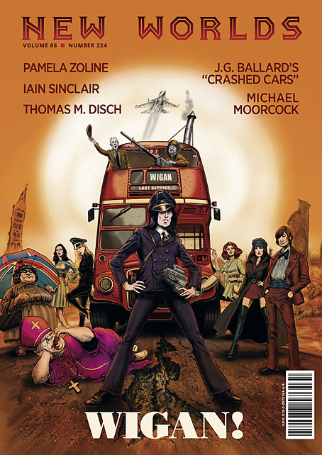
New issues of New Worlds magazine have been rare things in recent years so the announcement last week of issue number 224 was a special moment:
New Worlds Vol. 66 No. 224, ed. Michael Moorcock (to commemorate the sixtieth anniversary of his taking over editorship of the title), 09/’24, 978-0-9575764-6-9, a new full-colour A4 stapled outsized paperback/magazine, 72pp., illustrated by John Coulthart, Mal Dean, Herbert Sydney Foxwell, Allan Kausch, Mark Reeve, Julius Stafford-Baker; fiction/non-fiction anthology, contributors: John Clute, Coulthart, John Davey, Thomas M. Disch, Kausch, Roz Kaveney, Moorcock (a brand-new Cornelius story), Iain Sinclair, John Sladek, Pamela Zoline; first edition: £20.00 (for pre-ordered signed copies [while stocks last]).
N.B. This title is published on 30th September, 2024. Pre-ordered copies will be signed by Michael Moorcock and the magazine’s publisher.
See: https://jaydedesign.com/products_new.php
Copies in the U.S.A. will soon be available via www.ziesings.com @ $25 (for pre-ordered signed copies [while stocks last]).
If you’re in the mood for a spoilerish review you can see the entire issue leafed through and described here. In addition there’s also the New Worlds Annex which I’m hosting on these pages, a small repository of supplementary material.
There’s no need for me to recount the history of New Worlds, you can read about it in detail here. If you do know the history then you’ll know that the magazine under Michael Moorcock’s editorship acquired a considerable reputation in the late 1960s, upsetting politicians, the proprietors of WH Smiths, and the more conservative readers and writers of science fiction while publishing many important stories. In the 1970s New Worlds became a paperback series for a few years, managing ten numbers before resuming magazine format and increasingly sporadic publication.
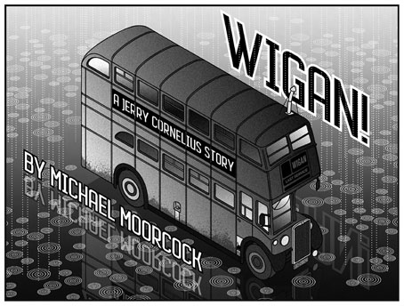
Mike Moorcock’s Jerry Cornelius story is a Holiday on the Buses scenario set in the usual Cornelius landscape of geo-political chaos. Mark Reeve and Allan Kausch also illustrated this one. I think my piece may be the first time I’ve ever had reason to draw a bus despite being a regular user of public transport. In order to create a contrast with the other illustrations I opted for something in the isometric manner of George Hardie. Not as severely styled as Hardie’s drawings often are but it’s heading in that direction.
The last Moorcock-edited number prior to the present one was in 1996, an issue which included a drawing of mine from the Reverbstorm comic series. The new issue sees Moorcock returning to the editor’s chair for what he insists will be the final time so I feel fortunate to be able to contribute more substantially to this issue than I did in 1996. As well as designing the magazine I’ve illustrated four of the stories, and also wrote a page about the hundredth anniversary of Surrealism which provides a loose theme for the issue as a whole. In a reversal of the usual state of affairs the writing was commissioned first, the design having been offered to other parties earlier this year. This didn’t work out, however, so Mike asked if I could take over, something I was more than happy to do. Rather than follow any pre-existing layouts I started with a blank slate, something I prefer in these situations. The erratic nature of the magazine schedule has meant that many of the recent issues have been standalone items even though each one bears an issue and volume number. The issues that followed the paperback series in the 1970s differed widely from one another, a trend that continued up to 1996; consequently I didn’t have to worry about retaining any attributes of the previous issues.
Iain Sinclair’s story is another piece of fiction featuring his alter ego, “Norton”, which takes in Surrealism (or the British rejection of the same), poet/Surrealism advocate David Gascoyne, and JG Ballard who lurks in absentia in the issue as a whole. My illustration is a reworking of the first picture from my abandoned Atrocity Exhibition series of the 1980s.
Issue 224 may be a one-off but I tried to approach the design as though this was going to be a template for a new run of the magazine. There’s a tendency in the design of small-run publications to pull out all the stops, filling the pages with disjunctive layouts and very new, often barely legible headline fonts. This isn’t so bad if you’re creating an avant-garde art or design magazine but a literary title should aim for clarity and readability. The body text for the new issue is Open Sans, a sans-serif face that reads well at small point sizes. (It’s also a Google font but don’t hold this against it. Google are increasingly iniquitous today but their font commissions are first rate.) The title and some of the headings are variants of FF Pullman, a typeface I haven’t used before. It’s a design based on old railway lettering which stood out for being stylised and distinctive without being too eccentric. Elsewhere I’ve varied the headings in order to create variety.
The most overt reference to the magazine’s history is in the title design for John Sladek’s The Poets of Millgrove, Iowa, a story which is also the only reprint in the issue. Sladek’s near-future piece, which was published in 1966, concerns an astronaut returning to his home town for a celebration of his landing on the Moon. The title font is a contemporary variant of Deutsche Black, a type design released the year the story was published. Eduardo Paolozzi used Deutsche Black a year later for the title page of his print portfolio, Moonstrips Empire News. If you’re familiar with the New Worlds of the late 60s you may know that one of the prints from Moonstrips Empire News appeared on the cover of issue 174, while Paolozzi himself was credited there and in subsequent issues as “Aeronautics Advisor”. So the Sladek title design manages to allude simultaneously to Paolozzi, the Moon, and the magazine as it was during its influential heyday. I don’t expect a reader to make any of these connections but I’m often looking for significant associations when making design choices.
All of those influential issues are currently available as PDF downloads at The Luminist Archives, together with many other issues of the magazine going back to 1946. I’d suggest downloading anything that looks of interest, you never know how long a site like this will remain active.
Previously on { feuilleton }
• Ballard’s sextet
• Very tasty
• Eduardo Paolozzi at New Worlds


More 100th anniversary of Surrealism stuff…
https://vimeo.com/1009071488
Great stuff, John. Did you know there’s currently a big Surrealism show on in Paris?
Thank you John – I had no idea this was coming, ordered immediately! By some coincidence I’ve been re-reading my copy of ‘Eduardo Paolozzi at New Worlds’ (Savoy Books), I love your design work for that book but note it is very scarce now and actually rather valuable – only one UK copy on ABE, none on the dreaded Amazon.
Thanks, everyone.
Paul: That one’s been previewed for a while. I actually have two print of older work of mine in a forthcoming Surrealism show in Swansea next month. Not quite the City of Light but Surrealism can lodge anywhere.
Jeremy: Yes, the Paolozzi book sold out very quickly, surprisingly so for something that’s more of an academic text than anything else in the Savoy catalogue. I doubt it’ll ever be reprinted either–not in that form anyway–so those editions will increase in value.
Ah, memories of battles past. Old Guard vs new Wave. Over here we thought New Wave, as with Punk, was an American phenomenon. Forgive us. We were children.
I do remember discovering Ballard. Terminal beach, with the Pelham cover, a volume I still possess. I still prefer ‘The Illuminated Man’ to the novel.
Somewhat related I suppose, the Harlan Ellison estate is on the move. Following a recent “best-of” collection…gulp…Last Dangerous Visionsis slated for an October release!
The US New Wave was evident on the bookshelves over here: I still have the UK editions of Dangerous Visions and its sequel, also Spinrad’s New Tomorrows collection. And Harlan’s A Boy and His Dog was published in New Worlds.
The only Pelham covers I own are the two he did for Alfred Bester and his most famous design for A Clockwork Orange. All my Ballard paperbacks have covers by other artists, unfortunately, even though I have some of them, like The Terminal Beach, in multiple editions.