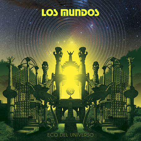
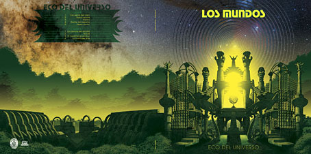
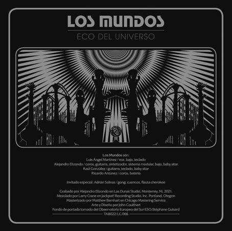
Eco Del Universo, the ninth album by Mexican band Los Mundos, was released last month on Acid Test Recordings. I designed and illustrated the outer and inner sleeves for an album whose music is described on the group’s Bandcamp page as psychedelic rock. I’ve not seen a physical copy yet but the vinyl disc is available in two pressings that complement the colours of the cover.
The brief for this one was for something based on the concrete fantasia known as Las Pozas, an overgrown park with accompanying hotel that Edward James spent many years and a great deal of money building in the Mexican jungle. James was a British aristocrat who fell for Surrealism in a big way in the 1930s, using his inherited wealth to support artists such as Salvador Dalí, René Magritte and Leonora Carrington, while creating Surrealist-styled homes for himself, first at Monkton House in West Sussex then at Xilitla in Mexico. James and his jungle resort have been recurrent subjects here so I didn’t need much encouragement to create something based on his constructions. In the past I’ve described Las Pozas as unfinished but this suggests a scheme with a final goal in mind. I don’t think this was ever James’s intention. His creations are more like very large concrete sculptures rather than architecture, even though some of them have a recognisable architectural form. Finished or not, the structures are a unique hybrid of the purposeless architectural folly—a popular indulgence for British landowners of the 18th and 19th centuries—and caprices like the Palais Idéal of Ferdinand Cheval.
My cover art is a fantasy on the fantasy which makes James’s improvisations look a little more planned than they are by mirroring their disposition. I also crowded together several of the constructions which at Las Pozas are in separate areas of the complex. Looking at the artwork again I’m reminded of some of Roger Dean’s views which wasn’t my intention originally. I think it’s the combination of unusual architecture, layered foliage and the treatment of light and shade. If the structures weren’t outlined and the sky was a Dean-like gradient there’d be even more of a similarity. The beautiful stellar photo is from the European Southern Observatory (ESO) whose images of the cosmos are free to use so long as you give them credit. This one was by Stéphane Guisard.
Previously on { feuilleton }
• The Secret Life of Edward James
• Palais Idéal panoramas
• Las Pozas panoramas
• Return to Las Pozas
• Las Pozas and Edward James


Very impressive! When I first saw the image, I thought it was a rare vintage early-70s album, the artist for which you would be discussing. Of course, I had not heard of this band before. Did you originate the “Los Mundos” font, or did the group bring that with them? I would think the client would be very happy with this work.
Thanks, Jim. The font is Stop, a design that first appeared in 1971: http://www.identifont.com/show?374 Very popular in that decade for its vaguely space-age feel.
The font was a request from the band after they’d seen my cover for Joe Banks’ Hawkwind book. I’ve always like Stop but I’d never found an opportunity to do anything with it before. It’s one of those fonts that’s so distinctive and tied to a particular era that you can’t use it anywhere, the content has to be a good match for it.