Now It’s Dark by Lynda E. Rucker; cover art by John Coulthart; jacket design by Meggan Kehrli; introduction by Rob Shearman; edited by Brian J. Showers and Timothy J. Jarvis; copyedited by Jim Rockhill; typeset by Steve J. Shaw; published by Swan River Press.
Hardback: Published on 27 January 2023; limited to 400 copies of which 100 were embossed and hand numbered; signed by Lynda E. Rucker, Rob Shearman, and John Coulthart; xii + 225 pages; lithographically printed on 90 gsm paper; dust jacketed; illustrated Wibalin boards; sewn binding; head- and tail-bands; ISBN: 978-1-78380-043-8.
Dust jacket.
Printed boards.
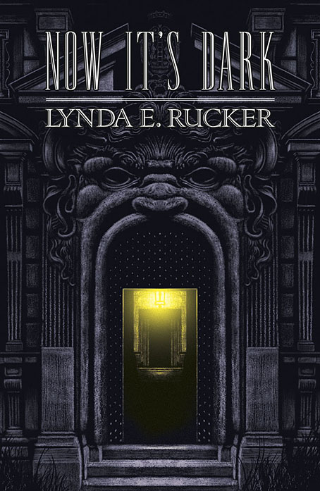
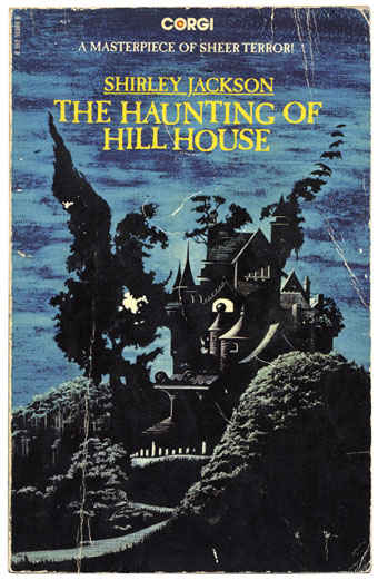
This is the last of the books I was working on last year, and being another design for Swan River Press means that once again the artwork is a wraparound cover with printed boards under the wrap. Now It’s Dark is a collection of horror stories (or possibly “strange stories” à la Robert Aickman), and a very fine collection it is. I was given carte blanche with this one so the cover is a mood piece rather than anything directly illustrational. One of the stories concerns the god Pan, which tempted me at first to do something with a satyr-like face, possibly as an architectural feature like a mascaron. But focusing on a single story in this way usually makes me worry about giving that story too much attention if it hasn’t also provided the title of the collection. Thinking about mascarons and their positioning above arched doorways led to the design you see here, a gesture towards a minor trend in horror illustration that makes use of the Arcimboldo effect, as with my battered Shirley Jackson paperback.
Corgi Books, 1977. No artist credited.
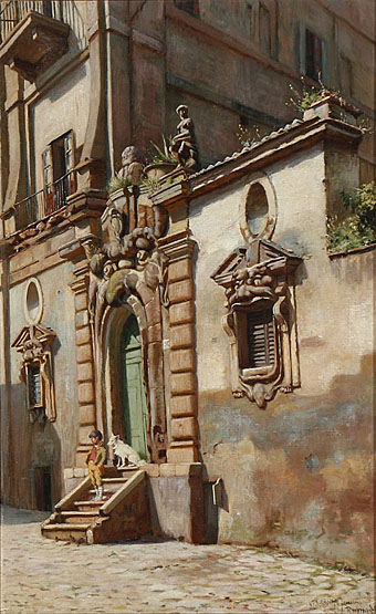
A Boy and His Dog on a Staircase in Rome (1886) by Niels Frederik Schiøttz-Jensen.
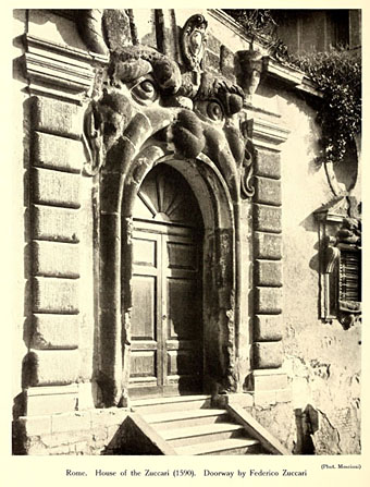
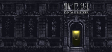
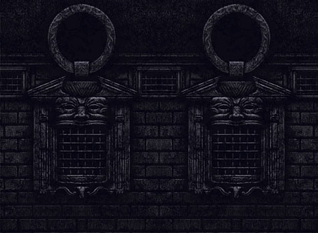
My cover is a variation on a real place, the “House of Monsters” entrance of the Palazzo Zuccari in Rome which today houses the Bibliotheca Hertziana. I placed the portal into an extended Baroque facade while moving the monstrous windows to the boards of the book. Given the way the grotteschi concept was a common feature of the Baroque you’d expect there to be more doorways like this but the palazzo street entrance seems to be unique. Equivalents such as the Ogre’s Head at Bomarzo are more like theme-park attractions than architectural features. I’ve never seen Umberto Eco mention the Palazzo Zuccari but I imagine he would have enjoyed seeing an infernal mouth as an entrance to a library.
Previously on { feuilleton }
• Infernal entrances

Nice work! Probably a good decision to leave the transom window out; the “gaping maw” effect is much stronger this way. I wonder how many people seeing the book will realize there is a real-life example…
That 1886 Schiøttz-Jensen painting is great–never saw it before…your track record on Swan Press books alone is fairly matchless.
Thanks, Jim. Those windows aren’t as striking as the door so that was another reason to replace them. And I also needed more wall to fill out the wrap. I think Italians would recognise the place, it’s in the centre of the city so it’s quite well known.
Joe: Thanks! That painting was a good find, it shows the Via Gregoriana when it looked a little uncared for, before the international institutes took over.
Excellent art and design, John – I wish all libraries could welcome readers in such a way! The Ogre’s Head is indeed a different matter, although Anna von Hausswolff uses it to good effect on her All Thoughts Fly album. Enter Freely and of your own will!
Thanks, Martin. I’ve got that Anna von Hausswolff album. In fact this has reminded me that the same friend of mine who used to work in an office two doors away from the monster doorway gave me a collection of postcards from the Bomarzo park. I’d love to visit that place myself.
No relation to SF writer and mathematician Rudy Rucker I assume?
https://www.rudyrucker.com/
…although they both have a connection to Philip K Dick
She wrote an essay on him and Rudy won the first Philip K Dick award way back in 1982
That hadn’t occurred to me. She’s an American writer but that’s all I know about her. I’ve not seen a printed copy of the book yet so I don’t know if it contains any biographical details.
re: my earlier comment, I was referring to the fan window that is directly above the double doors of the entrance in the actual architecture…though come to that, you also jettisoned the double doors themselves, and the “door” you provided looks as if it might be more astral portal than mere door. I also detect a bit of a phallic look to the “nose” of the actual entryway, haha.
Oh yeah, I missed the mention of the transom. The whole door interior was based on something from another building. I never considered using the doors as they used to be, and if I had I would have rejected them for the reasons you mention: the transom would be stuck there if the doors were shown open.
Well that was interesting/jolting! Brought back to mind certain dreams/nightmares that I was having a bit ago! Also, that Shirley Jackson is Wonderful! Not seen that before. As always, said or unsaid, many thanks.
Very interesting! Thank you for this glimpse into your process!
My copy arrived on Monday and i will he boarding a plane with it in a few hours, the the contents are as good as the package I’ll be in very good shape indeed!