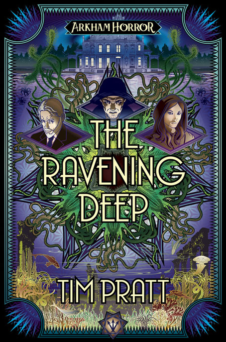
Presenting my latest cover in the Arkham Horror spin-off series for Aconyte. The Lovecraftian menace this time is oceanic:
When dissolute fisherman Abel Davenport discovers an ancient temple in the deep ocean, he falls under the influence of a long dead god. In his attempts to restore the god’s cult, Abel unleashes a plague of twisted doppelgangers on Arkham. Horrified by the consequences, Davenport realizes that he alone cannot stop the monsters from resurrecting the Ancient One.
Sometimes the only way to end one cult is to start another… Teaming up with redeemed cultist Diana Stanley and notorious thief Ruby Standish is the first step. The second is convincing Carl Sanford, the powerful leader of Arkham’s Silver Twilight Lodge, to join their cause. Together they might be the only hope of averting a cataclysmic eldritch invasion.
This was more of a challenge than some of my earlier covers for the series since there was a lot to fit in. That star shape in the background is an interlaced pattern like the sigil underneath the author’s name but it ended up being covered over, something I wasn’t intending but I always let these things grow organically rather than try and force everything into a preconceived design. As before, everything has been put together in Illustrator which presents its own challenges when you’re trying to achieve Photoshop-style airbrush effects. I like the way Illustrator restricts the graphical treatment to shapes, colours and hard edges, something which is perfect for these Deco-style covers. With Photoshop there’s always the temptation to start making everything more like a painting. A few of the aquatic details are adapted from Maurice Verneuil’s L’Animal dans la Decoration (1897), a book for artists showing stylised treatments of various animals and plants. I’ve had Verneuil’s book for a while as a Dover reprint but never found much use for it before.
This isn’t the last cover I’ve done this year, there’s another one still to be made public but it won’t be ready now until early in the new year. The Ravening Deep will be published in August 2023.
Elsewhere on { feuilleton }
• The Lovecraft archive
Previously on { feuilleton }
• Diamonds
• The Devourer Below
• Litany of Dreams
• The Last Ritual


Why is the image of a mansion or a castle or even a house with a well-lit interior viewed from the dark outside so compelling? The image is effective in so many different contexts that there must be some psychology at work.
I guess the question to ask, John, is what does it express for you?
John
I’m a longtime regular here and wanted to say thank you for your always engaging posts. I learn something new with every email you send out.
And your art work is mindblowingly gorgeous.
Happy holiday to you!
FW
Stephen: Where these book covers are concerned, the buildings have been a continual presence–there’s a different one on each cover–and a part of brief in each case. And since horror is the theme, night scenes are favoured so you end up with illuminated windows. Not much of a conscious thing, in other words.
More generally, illuminated windows usually suggest security, or even “home”, don’t they? Hence the endless paintings produced by Thomas Kinkade’s production lines where the Christmas-card houses have so many illuminated windows that people would refer to them as “burning cottages”. A stereotype like this becomes open to subversion if all the associations are weighted in one direction. A single lit window can have sinister associations if the rest of the building remains dark.
Frederick: Thanks, and the same to you!
Can’t quite say why, but I really like the cover.
Thanks :)