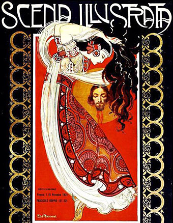
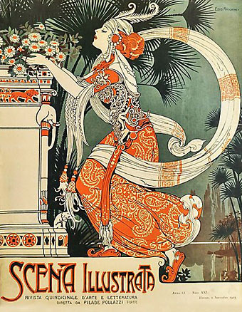
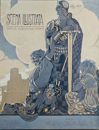
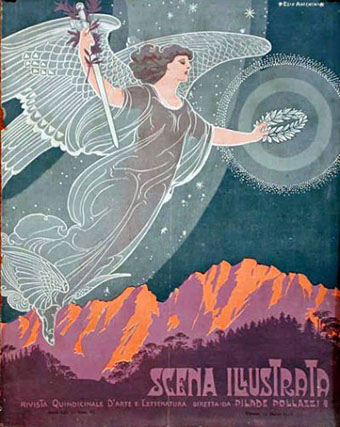
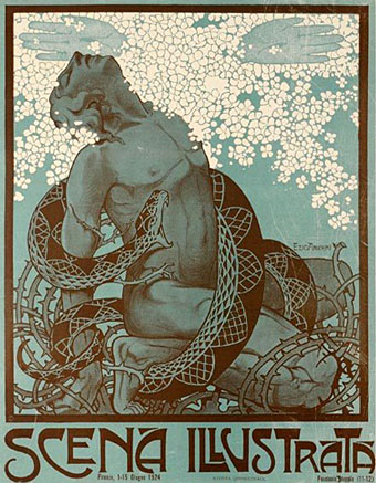
Art by Ezio Anichini, one of the magazine’s regular illustrators.
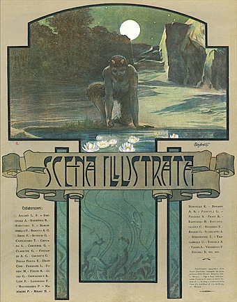
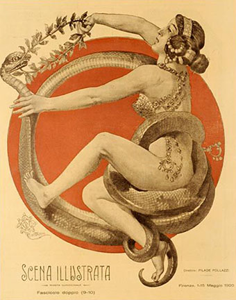
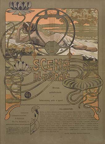
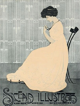
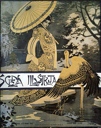
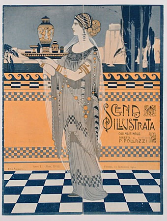
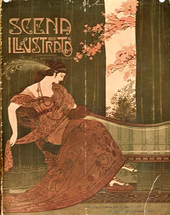
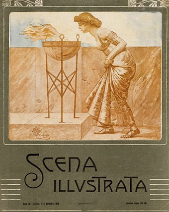
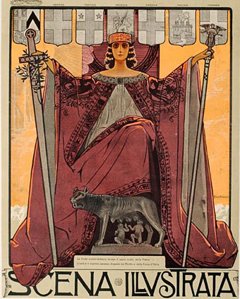
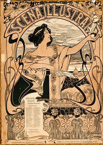
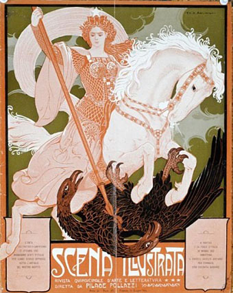
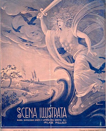
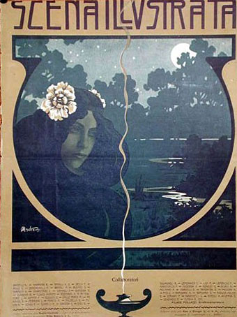
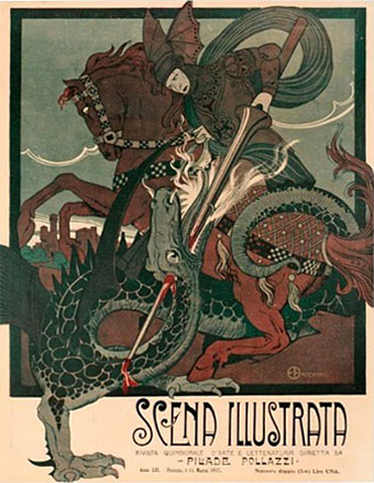
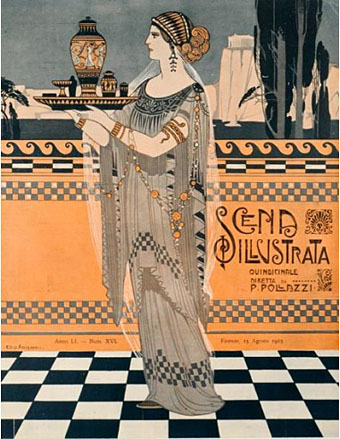
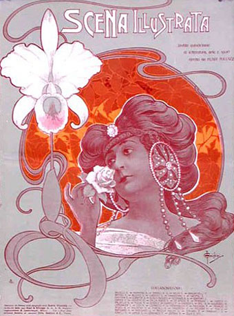
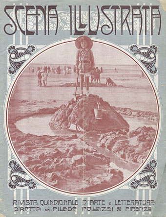
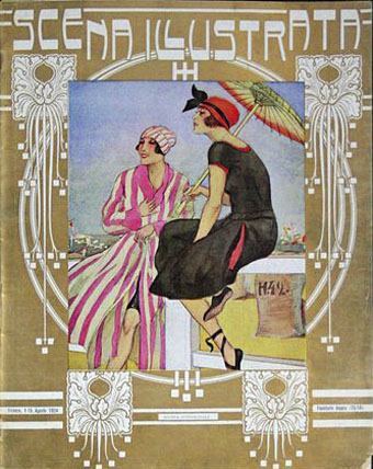
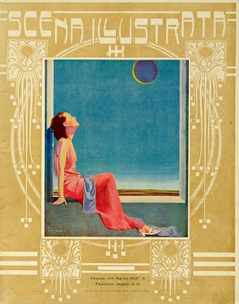
Scena Illustrata, an Italian culture magazine launched in 1884, was a prime exponent of the variant of Art Nouveau that Italians call stile Liberty. Or it was on its covers… To date there isn’t a substantial archive of back issues so I can’t say how much of the cover style was carried through to the interior. But since this was a fortnightly magazine there are many covers to be found. The examples here inevitably concentrate on the two decades either side of 1900 although a few are later; elements of the stile Liberty persisted into the 1920s, as did versions of that marvellous logo design.
Previously on { feuilleton }
• Ezio Anichini postcards
• Ezio Anichini’s Salomé
• Lussuria, Invidia, Superbia

Those are wonderful covers. Any one of them would make a great poster. John do you know the original format size of the magazine? If I’m not mistaken modern magazines tend to follow a German standard established in the 1920s. Were these larger formats?
Issues from the 1930s are listed as being 28 x 36 cm, or about 11 x 14 inches which is slightly narrower than tabloid. All the covers are the same ratio so I guess this may be the size of the earlier issues as well.