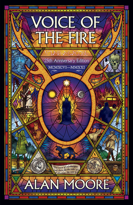
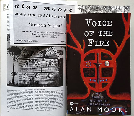
“History is a heat,” says Alan Moore at the end of his first novel, Voice of the Fire, when the author takes centre stage to add his own voice to those of his characters. History is a heat, and fire is its agent, the element that provides a connecting thread between the twelve people whose voices comprise the text of the book. Late last year I was asked to design a new cover for Voice of the Fire which will be published by Knockabout in a 25th anniversary edition later this year. I’d read the book when it was first published, and even saw Alan read some of the opening chapter in 1993 at an event at the Arts Theatre Club in Soho. That event, which took place on November 5th, was titled “Treason and Plot”, and the pages from the work-in-progress novel had been collected from the offices of Gollancz after Alan left the unfinished manuscript of Yuggoth Cultures—which he was supposed to be reading from that evening—in the back of a cab. I was in London that day to talk to Alan about illustrating Yuggoth Cultures, so to find myself illustrating Voice of the Fire many years later feels a little like being caught by one of the acausal connecting threads that he weaves through his novel.
The first edition: design by Gary Day-Ellison, illustration by Robert Mason. The photo on the left shows Thomas Tresham’s Triangular Lodge, a folly outside Northampton encoded with references to the Holy Trinity via a profusion of triangles and tripartite details. Tresham’s Lodge is described in the Gunpowder Plot chapter of Alan’s novel; the triangles on my cover may be taken as a reference to this.
November is the dominant month in Voice of the Fire, and the ritual fires of November 5th are one of many recurrent motifs. The novel’s twelve characters live in Alan’s home town of Northampton at different periods of history, from 4000 BC to 1995, a span of time that charts the town’s foundation and growth, taking in the Viking invasions, the Roman occupation, the Crusades, the treason and plot of Guy Fawkes and his conspirators, witch trials, the poet John Clare, and Alan himself. A lot of history and a wealth of incident to try and symbolise in a cover design. Author and publisher both liked the stylised outline of a horned head that Robert Mason painted on the cover of the first edition, a reference to the opening chapter of the novel in which a Neolithic shaman performs a ritual that marks the land as the site of the future town. I liked the original cover but felt it made the novel seem too much like something by Henry Treece or Alan Garner, with no indication of more recent history. A stained-glass window seemed like a good solution to the problem of how to bring together so many disparate elements into a single design. Stained-glass windows are often things from the distant past still visible in the present day, and they have the additional convenience of being a single container for many small pictorial details.
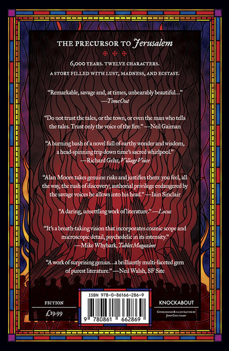
It’s Bonfire Night on the back cover.
My design doesn’t attempt to illustrate all the characters or events from the novel but shows the more salient moments together with smaller details, some of which (the noose, for example) appear in multiple chapters. The horned shaman is at the centre of the design which radiates out from his ritual fire. I avoided making the window design too much like a church window; the book contains many references to churches and Christian history but there’s also a strong pagan element in many of the chapters. Magic, in the occult sense, is a recurrent thread, and Alan’s favourite Elizabethan magus, Dr. John Dee, is present (albeit offstage) in the Angel Language chapter. To acknowledge this I placed an inscription in Enochian—Dee’s “Angel Language”—underneath the title. There’s more magic in the font used for the title and author’s name, Albertus, which was named after Albertus Magnus, a philosopher and theologian often described as an alchemist. The main reason to use Albertus is for its timeless styling and its readability, an important quality for such a busy cover design; the font is a common one on London street signs.
The creature with the floppy ears in the lower centre is another recurrent motif, the sinister “shagfoal”, or Black Dog, whose presence is a sign of the darker energies that seem to thrive in that part of the world. Black Dogs appear in folklore all over Britain but there are few pictorial examples to be found in old texts. I based my hound on the “Straunge and terrible Wunder” depicted in 1577 on the title page of Abraham Fleming’s account of the Black Dog of Bungay. Other details are more obvious for those who read the novel so I won’t spell out everything here. If you haven’t read it then I’d urge you to do so, it’s one of Alan Moore’s major works, and a book I’m hoping might receive more attention than it did in 1996 when Gollancz only saw fit to publish it in paperback. Voice of the Fire will be published by Knockabout in May in paperback and a limited edition hardback which will include a card signed by the author. Top Shelf will be doing something similar for the US but I don’t think they’ve announced any dates or other details as yet. Anyone looking for further information is advised to keep an eye on the Knockabout news page or the publisher’s social media accounts.
Previously on { feuilleton }
• The Blake Video
• The Cardinal and the Corpse
• Mapping the Boroughs
• Tresham’s Trinities
• The Triangular Lodge again
• Art is magic. Magic is art.
• Alan Moore: Storyteller
• Alan Moore: Tisser l’invisible
• Dodgem Logic #4
• The Triangular Lodge


One of your best, John. I like the way the individual panes are self-contained but mirror each other’s imagery. And the central sun/moon/star is cool. If you’ve never had the opportunity someday I hope you can design a stained glass window.
Inevitable question. Print/poster?
Thanks, Stephen, this one was a lot of work but enjoyable all the same. I looked through the book about Harry Clarke’s stained-glass work before starting anything to get an idea of how his drawings were converted into window designs. I tried to follow the procedure for dividing up the smaller spaces but a window maker might pull a face at some of the liberties taken. Imitating stained-glass in this way is doomed to failure because you can never get the intensity of light passing through coloured glass when you’re limited to the colour gamut of inks. If it was a real glass creation it would be quite something.
I’d not thought about a print but it’s a possibility now I have access to a good print manufacturer. I’ll give it some consideration. I’m just finishing a huge drawing that I want to do as a poster fairly soon (more about this later). It’ll be an expensive item since I’ll be having them made at a large size. Prints of the book cover would be smaller and more reasonably priced, I imagine.
A lovely cover, but I’m posting because the second photo answers a question that’s been bothering me for 28 years. I remember seeing posters for an Alan Moore and Aaron Williamson event in Brighton between 93-95, have wondered what it was (and regretted not attending) ever since, and have Googled the names many times to no avail. Now I know that such an event happened and my recollection was correct, at least in part. Any idea who Aaron is or what role he played?
Thanks, Tom. I get nagged at by similar things on occasion, something you can remember that nobody else has heard about. There may have been two events, as it happens, since the Treason and Plot event was organised by Creation Books who had offices in London and Brighton at the time. Aaron Williamson is a profoundly deaf poet who was (and maybe still is) part of the Iain Sinclair circle. He appears with Sinclair and Alan Moore in Chris Petit’s TV film, The Cardinal and the Corpse, which I wrote about in a previous post, and also had a volume of his work published by Creation.
Aaron read some of his poems at the event which I think he manages to do like many deaf people by feeling the words in his body rather than hearing them. Alan recited Old Gangsters Never Die from memory then apologised for losing the thing he was supposed to be reading and read the opening of his novel instead.
Aha, so it wasn’t just a stray memory. I’d wrongly assumed Aaron was a visual artist so perhaps that’s why I never found his work. Plausible there were events in London and Brighton, and unlikely that a London one would be advertised in the North Laines. I’ve read a whole lot of Sinclair so I’m surprised I’ve never come across the name before – I haven’t seen The Cardinal and the Corpse though I almost feel I have, so frequently does Sinclair reference it. Thanks for filling in this gap. It would surely have been interesting to hear Alan read that first chapter, difficult and rewarding as it is with its 500-word vocabulary. Don’t think I’ve read it since my first time through because it is a slog, though ultimately one that pays off by giving such a powerful impression of the difficulty of thought before there was language to express it. The other chapters of Voice of the Fire are far more rereadable and accessible, so it’s those I’ve returned to more frequently. Great that it’s being reissued with such a striking cover; it was rather buried at the time, with only a metaphorical foot sticking out for the curious to find…