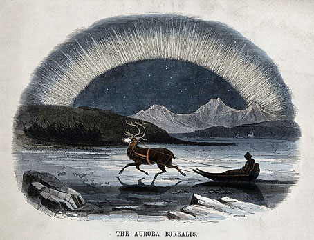
The Aurora Borealis by Charles H. Whymper.
• “In 1829, when the celebrated Japanese artist Katsushika Hokusai was almost 70 years old, he created more than 100 drawings of a dazzling array of subjects: playful cats, serene landscapes, even severed heads. Hokusai’s fame continued to grow after his death in 1849, and the suite of small, elaborate drawings was last purchased a century later, at a Paris auction in 1948. Then it disappeared from the public eye.” The British Museum now has the drawings which may be seen here.
• The week in cover design: Emily Temple compares US and UK covers for the same books, while Vyki Hendy collects recent titles with objects as the main feature of the cover designs. One of my recent covers (which will appear here soon) is less minimal than these but also features an arrangement of objects.
• The compilation experts at Light In The Attic Records have put together another collection of obscure Japanese music. Somewhere Between: Mutant Pop, Electronic Minimalism & Shadow Sounds Of Japan 1980–1988 will be released in January.
“A Jamesian world is one of cursed artefacts, endlessly subsuming landscapes, forgotten manuscripts and tactile beings that punish the curious and intellectually arrogant.” Adam Scovell visits the grave of MR James.
• Dragons and Unicorns: John Boardley on the lost art of the Hieroglyphic Bible.
• I almost missed John Waters’ favourite films of the year.
• At Dennis Cooper’s: Sade’s Castle, Cardin’s House.
• Northern lights photographer of the year.
• Aurora Hominis (1970) by Beaver & Krause | Aurora (1971) by Tonto’s Expanding Head Band | Soft Aurora (1979) by Tod Dockstader


“something slightly fusty…” I guess that would be me since I didn’t like most of the book covers in the article. I dislike photographs on novel covers and blurbs of any description. For god’s sake, keep the blurbs on the back or even better, inside! A cover shouldn’t be simply an advert for the book. It should be a gateway leading us in. I suppose I’m completely out of touch with current styles. Contemporary novels about “life as we live it now” bore me to tears.
I think most designers would be happy to limit the text on a cover to the title and author name alone. Those who work for the bigger publishers have to deal with pressures from the marketing department as well as the art director, and it’s marketing that usually wants a blurb on the front. US cover design suffers from an additional intrusion that I refer to as Blob Disease, whereby large round decals appear on the covers of titles that win some award or other.