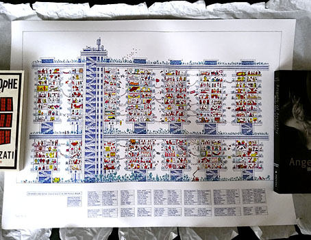
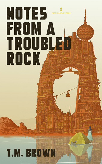
The post this week included a poster print by Toby Melville-Brown, an artistic response to the lockdown of April and May. Toby has a colourful graphic style that favours architectural views in the mode of Archigram and other futurists, past and present; at the end of February I featured one of his invented book covers (below) in a weekend post. The title of the cover—Notes from a Troubled Rock—seemed darkly humorous at a time of political turmoil and a growing pandemic. Four months on it reads like a summary of 2020.
The lockdown poster, Life Indoors: A Cross-Section, is more positive, a cutaway elevation of a high-rise block, with each apartment showing the response of a real person or group of people to the viral situation. To fill out the rooms Toby sent an email to 175 households asking for a photographic reflection of lockdown life. I’m in one of the rooms but if you want to know where you’ll have to buy a copy of the poster which is available here. All profits go to Refuge, a charity supporting those at risk from domestic violence. When I first moved to Manchester I spent four years in a Brutalist flatblock that would have had JG Ballard’s wealthy high-rise denizens fleeing for the suburbs. Toby’s elevation looks like a better place to be.
(And I’ve just been informed that the poster sale will end at midnight [UK time] on Friday 12th June.)


Thank you for spotlighting Melville-Brown’s work! Life Indoors reminds me of an oversized German picture book I loved as a child: “Rundherum in meiner Stadt” by Ali Mitgusch that featured a Brutalist block of flats with big windows in which each occupant’s activities could be seen – watching TV, taking a shower in a shower cap, fighting with siblings.
By the way, I really like the beautiful view of Prague you ran across the top of your blog! Is it your own photography work? If so, well done! If not, well-chosen!
Thanks, Karel. I’ve always liked cutaway views so Toby’s drawing had an immediate appeal.
The view of Prague isn’t my own. I have several picture books of Prague but I still haven’t managed to visit the city. The photo is the work of another Karel, Karel Plicka, from a book whose title in English is Prague in Pictures (1968). I think it was first published in the 1940s but was reprinted many times. Plicka’s photography looks gorgeous in photogravure form , you can’t really judge it properly on a web page. I’ve been immersed in Eastern European culture for the past year or two so Prague feels like a spiritual home.
And speaking of which, your Gravatar appears to be from Marketa Lazarová. I watched that one a few months ago.
Thank you, John – I will look up Karel Plicka’s work.
With your good taste, you seem like someone who would resonate well with the cultural background frequency radiating from Prague’s bricks and plaster.
Of course, you’d have to scrape off layers of dross atop the soul of the city. When I was a teacher there from 1994 to 1999, I could see cultural shift in the topics students would choose for their essays. “The Three Layers of an Individual’s Soul,” “A Way Forward After Civic Forum,” “I Researched the Ghost in My Flat,” and “Jewish Heritage and the Legend of the Golem” gave way to “Snovboardink” and “What It Means: Grunge.” My Czech ex wrote me a few years ago: “The city has changed. You would not like it any longer.” I see what she means somewhat with the current glut there of Thai Massage parlors, Trdelnik pastries, escape rooms, Starbucks.
You’re right about my Gravatar – I did swipe it from Marketa Lazarová . Did you enjoy the film?
I’m prepared to accept Prague as it is today, I’m sure it will be as cluttered with the same shops as other European cities. Paris is the same but I still enjoyed my visits there.
I thought Marketa Lazarová was a tremendous film. I watched Valley of the Bees shortly after which was a fitting companion piece.