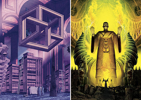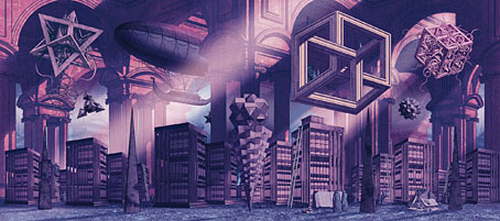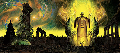
Two of the books whose covers I was working on late last year have been announced so here they are. This is more work for PS Publishing where wraparound covers are the standard, so once again I was able to work in a pictorial, landscape format. (PS also do their design in-house so I only did the art this time. Click on the pictures below for larger views.)
Apostles of the Weird is a collection of contemporary weird fiction edited by ST Joshi:
Weird fiction is an incredibly rich and varied genre, running the gamut from supernatural horror to imaginary-world fantasy to psychological terror. This anthology seeks to exhibit the wide range of themes, motifs, and imagery that weird fiction allows, as embodied in the work of some of the leading contemporary writers in the field. (more)
“Weird” is indeed a very broad category so rather than try and create something that represented a single genre I opted for a weird view instead. The idea was to do something like Borges’s Library of Babel in a space that was a hybrid of Piranesi and MC Escher. I was hoping originally to make this more Escher-like, with a number of gravity-defying staircases, but the underlying drawing took so long that I didn’t have time.
His Own Most Fantastic Creation: Stories About HP Lovecraft is also edited by ST Joshi:
HP Lovecraft (1890–1937), the pioneering writer of weird fiction, has himself become an icon in popular culture. Stories, novels, and other works featuring the gaunt, lantern-jawed gentleman from Providence, Rhode Island, have proliferated. These works have been triggered by the incredible amount of knowledge we have on the writer—his family, his friends, his idiosyncrasies and eccentricities—as found in his thousands of surviving letters. (more)
This was much easier to achieve since HP Lovecraft is familiar territory. The idea here was to do a portrait of Lovecraft situated in a Lovecraftian zone, a colossal idol of a type that might be found in some of his Cyclopean ruins. Lovecraft and his Weird Tales colleagues had a habit of referring to each other in their stories and letters as though they were ancient priests or sorcerers so portraying Lovecraft in this manner is fitting. The combination of perspective and lighting worked against creating an accurate likeness, however—it doesn’t help that Lovecraft’s features are weird in themselves—so the “HPL” icon is there to affirm the identity.
Both books will be published next month if Great Cthulhu hasn’t risen from the depths by then.
Elsewhere on { feuilleton }
• The Lovecraft archive
Previously on { feuilleton }
• Something from Below


John, those are really cool. They would make fine posters, hint hint.
And looking at the wrap around art I was suddenly filled with nostalgia for those dear old days of LP album covers.
Thanks, Stephen. I generally prefer designing the whole jacket but sometimes it’s good to only do a picture instead. And PS don’t make many demands with the content. I did have posters in mind while I was working on these although I can’t say when I might get round to this. I really need to revamp my online sales. CafePress seems increasingly useless.
Needless to say I’d love to do some gatefold album covers but such things are still uncommon. I’ve done a couple but they were mostly layout jobs. Even when people do double-disc releases today they tend to package them in a slightly wider single sleeve.
Wow, these are terrific! Congratulations, John!
Thanks, Thom. :)