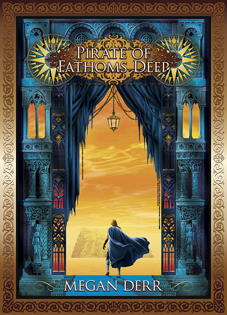
Despite having been busy throughout this year I’ve not updated my website for a while so this is the first of several posts intended to remedy the situation. It’s also a dismaying entry since it not only sees the end of this series of gay romance titles by Megan Derr but also the end of the publisher, Less Than Three, who closed their doors a couple of months ago. The sombre appearance of The Fallen King’s Penitent Soldier (which I completed late last year) seems in retrospect like an omen. Gloom aside, I was pleased with the way this series evolved, with each cover posing a challenge in how to maintain the format while working a new variation on the theme.
There are more new book covers still to come, and—when I can find the time—some news of a personal project of my own. As with previous posts about Megan’s series, I’ve included the rest of the covers below.
Previously on { feuilleton }
• The Mercenaries of the Stolen Moon
• The Heart of the Lost Star
• Tales of the High Court


These are absolutely gorgeous, John!
Thanks. :)
So Muddy Colors ran a post the other day with a bunch of reason covers and gotta say I was underwhelmed. Design and execution disappointed. Layouts were meh, or at least the same old, same old. Execution seemed, well, tired. (Confession: I have a thing for post-WWII covers, some for design, some for execution, so as I dotard I demand a comparable golden age now.) Maybe there’s just no need for old time cover excellence given the decline of book stores. For digital sales, I suppose the only thing that’s important is font and font size; and not even that because maybe an online buyer’s reading the title alongside the image of the cover.
The covers here, on the other hand, suffer from none of the above. They’re imaginative and delightful. Make me happy.
Thanks, Mitchell. There are still designers out there doing interesting and distinctive work but they’re few, and many covers from the big publishers have had all the creative excitement drained from them by conflicting demands from art directors and marketing departments. Trend-following is endemic in cover design, and some blogs like Caustic Cover Critic delight in pointing out the latest trend that everyone is following for a given type of novel. I always try to match the design to the content, and generally ignore whatever the current trend may be. If you get things right then you’ll not only have a cover that stands apart from the crowd but it also won’t look so dated in five or ten years’ time.