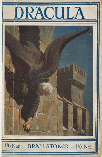
Cover art by Edgar Alfred Holloway for the Rider edition of Bram Stoker’s novel, an edition reprinted many times during the early 20th century. Holloway’s Count is shown as Stoker describes him in the early chapters of the book, white-haired and bearded.
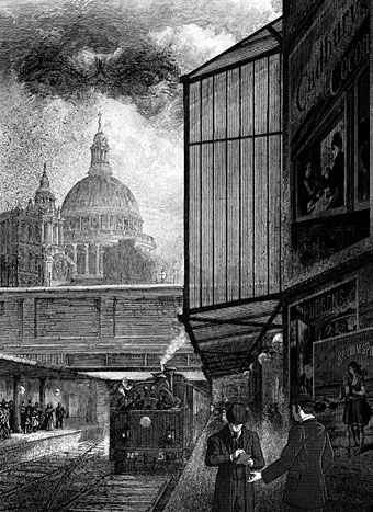
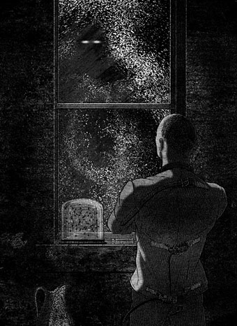
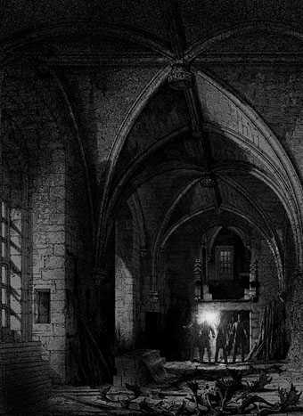
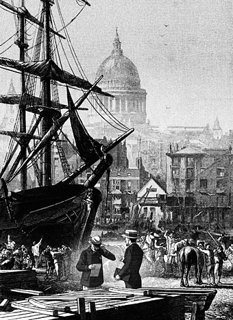
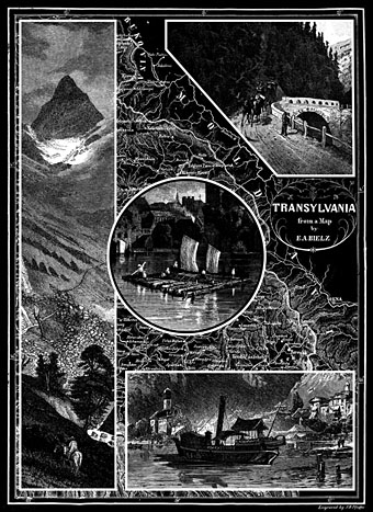
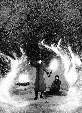
Last year I illustrated a number of stories by Edgar Allan Poe, and the entirety of Mary Shelley’s Frankenstein for Spanish publisher Editorial Alma. Earlier this year I was illustrating Dracula for the same publisher; now the book is in print I can show the results here. This was another difficult task since I had a few weeks to illustrate all 27 chapters of the novel while trying to do something new (or at least slightly different) with a very familiar story.
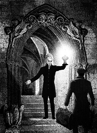
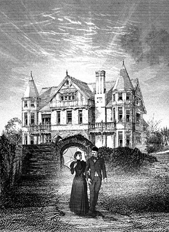
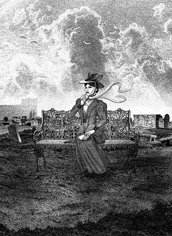
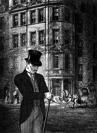
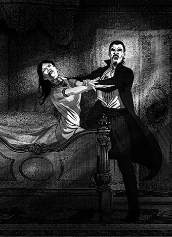
As with Frankenstein, I opted for fidelity to the text and period details. Despite its epistolary form, Dracula is much more readable (in a contemporary sense) than Frankenstein, so more people will have read Stoker than Shelley; but the sheer scale of cultural mauling that Dracula has been subject to means that—as with Frankenstein—even the allegedly faithful adaptations often deviate from the novel. The lounge-lizard vampire that everyone knows was a creation of Hamilton Deane’s 1924 stage adaptation, the success of which led to Tod Browning’s film and Bela Lugosi’s performance (which I’ve never liked); film and theatre may have made Dracula universally popular but the Lugosi stereotype has overshadowed the more powerful and violent character that Stoker gives us, with his bearded face, hairy palms and glowing eyes. So that’s who you see here, although the restrictions of time and brief (one picture per chapter) meant that some of the moments I’d have liked to illustrate had to be forfeit. Poor old Renfield gets short shrift, and some of the minor male characters are out of the picture altogether.
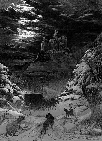
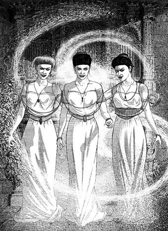
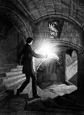
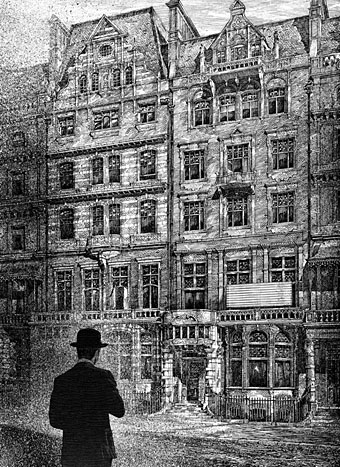
On the plus side (I hope), many of the background details are well-researched even if they’re not at all obvious. The castle in the first picture (above) is Bran Castle, known today as “Dracula’s Castle” even though the building in the novel is Stoker’s invention; it certainly looks the part. As before, the full run of pictures follows below. All may be seen at a larger size here.
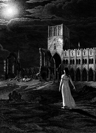
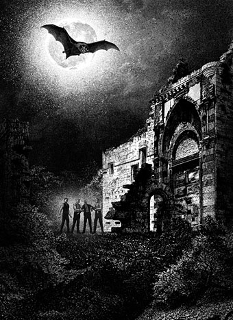
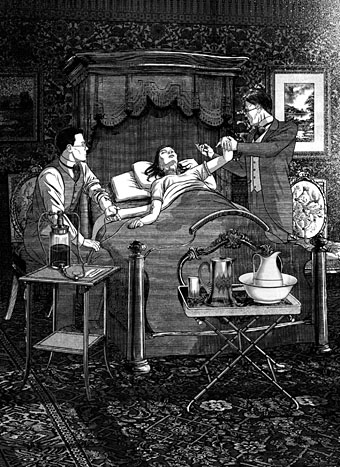
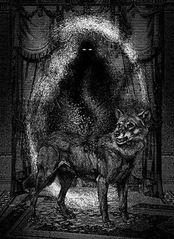
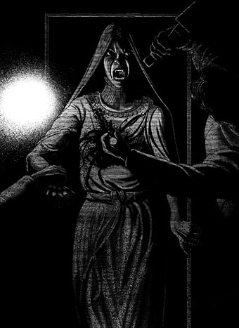

Previously on { feuilleton }
• Illustrating Frankenstein
• Dracula and I by Christopher Lee
• The Dracula Annual
• Nightmare: The Birth of Horror
• Albin Grau’s Nosferatu
• Count Dracula
• Symbolist cinema

The cover for DRACULA and other Alma editions–while not by John–are here:
>https://www.editorialalma.com/colecciones-editorial-alma/cl%C3%A1sicos/
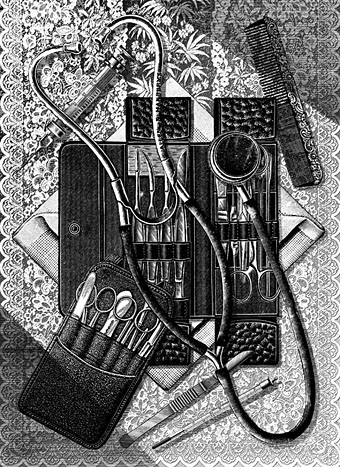
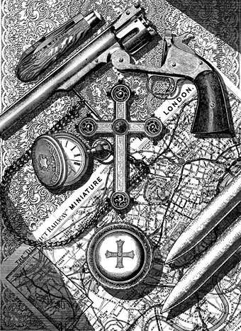
The…flow of this suite is palpable (you could see these animated). A standout is Lucy’s ‘staking’ which looks to be a classic version, with a chiaroscuro recalling Fritz Eichenberg or Virgil Finlay. The tabletop vampire killers’ still life would have gotten MY vote for the cover at any rate.
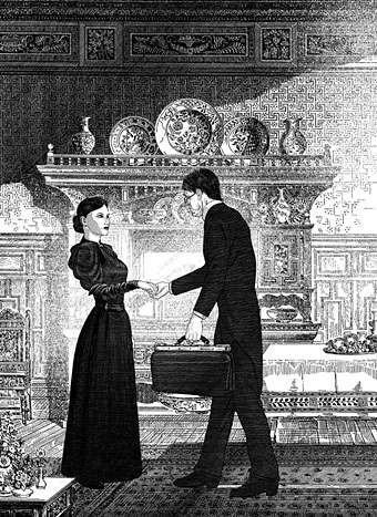
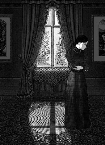
Thanks (again). The table views were a result of expediency as much as anything since they could be done more quickly than a scene with figures. Haste aside, I was also trying to avoid too many pictures of people standing in rooms, which there’s a lot of in the middle of the book. It’s okay to have one or two pictures of that sort but not a whole run.
As for Lucy’s staking, that was a result of trying to add something (anything!) to the many staking scenes in films and TV. I was hoping to do a similar view looking down on Renfield’s body but that scene occurs at the same moment that Dracula is with Mina so the latter took precedence.
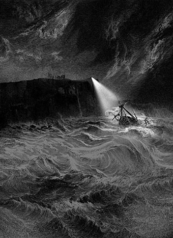
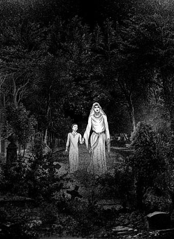
And I love all these nightscapes.
Thanks :) The printing of the darker pictures has been a bit variable in some instances but there’s always the chance that they may be reprinted elsewhere one day.