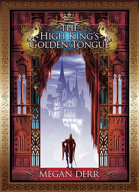
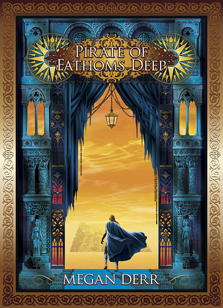
I thought I’d already written something about my cover for Megan Derr’s gay fantasy novel, The High King’s Golden Tongue, but it seems not. This appeared last year from Less Than Three Press, and the next volume in the Tales of the High Court series, Pirate of Fathoms Deep, has been published this week. My earlier omission allows me to show both covers together.
When working on the first volume I didn’t expect I’d also be working on a sequel so there was no need to consider whether the design could be carried over. The architectural frame is from a book about French architect Eugène Viollet-le-Duc, taken from one of Viollet-le-Duc’s illustrations for a study of the architecture of old France. I added the windows and curtains before colouring the stones and providing shadows and highlights. This became a problem for the second cover because my Viollet-le-Duc book only had one example of this kind of stonework. After some lengthy searches at Gallica I was able to find enough scans of other pages from the books that Viollet-le-Duc illustrated to piece together a new frame. The Gothic window frames on both covers are from another French volume, and I’ve now exhausted all those examples so a third volume in this series will no doubt present further challenges.


Dig around in Fulcanelli, something similar (or other useful references) may well turn up.
WOW.
The modeling on the figure standing in each ‘doorway’ is also exceptionally fine.
A similar approach would work well should Savoy or somebody else ever do new editions of Moorcock’s Melnibonean oeuvre and have the good taste to Go Coulthart…
JB: My edition of Fulcanelli contains a handful of photos, none of which are much use for this kind of work. Older books are better.
The joey Zone: Thanks! Moorcock’s books are always the preserve of larger publishers who I seldom get to work for. The recent covers from Gollancz weren’t very impressive at all but that’s the way things often go in those places: books get passed to unsympathetic designers/illustrators or the cover design gets reduced to Muzak after being passed back and forth between marketing and art dept.